Choosing the right grout color really comes down to three main paths: you can match the tile to create a seamless, monolithic look; you can contrast it to make the tile shape and pattern the star; or you can choose a neutral shade for a classic, go-with-anything vibe. The path you take will completely define the final look of your space.
Why Your Grout Color Is a Critical Design Decision
Don’t be fooled—grout is so much more than just the stuff that fills the gaps between your tiles. It’s a powerful design tool that can completely alter the look and feel of a room. The lines it creates form a grid that can either fade into the background or jump forward as a bold graphic element.
Think of it as the final frame for your tiled artwork. The right color can make a small room feel bigger, turn a simple tile installation into a statement, or create a serene, unified surface.

This decision is especially critical when you’re working with handmade cement tiles. Their beautiful matte finish and rich, subtle color variations mean they interact with grout in a totally unique way, making your choice even more impactful. To get the most out of it, it helps to have a handle on the basics of mastering home design color and how different hues play together.
The Shift From Function to Fashion
Historically, grout was purely practical. Not anymore. Today, it’s a key part of the design conversation. Since around 2015, we’ve seen grout transform from a simple filler into a deliberate color choice, with decorative options driving demand in high-end projects.
The numbers back this up. The global tile grout market is expected to grow from about USD 3.1 billion to roughly USD 4.5 billion by 2030. A big reason for this is that grout visibly frames every single tile, especially in the large-format and patterned installations that are so popular right now. For heritage-style materials like our vibrant colorful floor tiles, grout is a small detail that can make or break the entire design.
Three Fundamental Approaches
Your journey begins by picking one of three core philosophies. Each one creates a completely different mood and serves a distinct design purpose.
Before we dig into the details, here’s a quick cheat sheet to help you see how these strategies compare.
Quick Guide Grout Color Strategies at a Glance
| Strategy | Visual Effect | Best For |
|---|---|---|
| Matching Grout | Creates a seamless, unified surface. Minimizes grout lines. | Making a space feel larger; highlighting the tile’s texture over its shape. |
| Contrasting Grout | Emphasizes the tile shape and pattern. Creates a graphic look. | Showcasing intricate tile shapes (like hexagons or arabesques); bold, modern designs. |
| Neutral Grout | Provides balance and complements the tile without competing. | Timeless looks; complex, multi-colored tile patterns where you don’t want the grout to distract. |
Now, let’s explore what each of these looks like in the real world.
- Matching Grout: When you select a grout that’s nearly identical to your tile color, you get a cohesive, uniform surface. This is a fantastic strategy for making a space feel bigger and less cluttered.
- Contrasting Grout: Choosing a color that really pops against the tile—think dark grout with a light tile or vice versa—puts all the focus on the shape of each tile and the pattern they form together.
- Neutral Grout: A soft gray, beige, or off-white acts as a quiet supporting player. It complements the tile without stealing the show, offering a timeless and versatile look that works almost anywhere.
Your grout choice is the final brushstroke that completes your tile installation. It can either unify the canvas or add a defining line that draws the eye, so it’s essential to consider its impact from the very beginning of your design process.
Match, Contrast, or Go Neutral? The Three Grout Philosophies
When you’re choosing a grout color, you’re really deciding how your tiles will talk to each other. Do they blend into one seamless surface, or does each tile get its own frame? The grout line is the single most powerful tool for controlling the final look.
Think of it as setting the visual rhythm for your floor or wall. It’s not just about picking a color you like—it’s about choosing a story. Let’s walk through the three core approaches and see where they fit best.
The Matching Grout Approach: For a Seamless, Serene Surface
Want the tile to be the hero? Match your grout color as closely as possible. This technique makes the grout lines visually recede, creating a monolithic effect where the tile’s texture and subtle color shifts take center stage.
The result is a unified, continuous surface that feels calm and expansive. It’s an especially smart move when you want to:
- Make a Small Space Feel Bigger: With no grid lines chopping up the view, matching grout creates an unbroken plane of color. This trick works wonders in cozy bathrooms, narrow entryways, and compact kitchens.
- Showcase Tile Texture: If you’ve chosen a tile with a beautiful finish—like the silky, chalky surface of our handmade cement tiles—matching grout lets that texture shine without distraction.
- Create a Quiet Backdrop: When your room already has a lot going on (think patterned wallpaper or bold furniture), a seamless tile installation provides a clean, calming foundation that doesn’t compete for attention.
Imagine pairing our ‘Mist’ cement tile with a light gray grout. The individual tiles practically dissolve, leaving behind a soft, cloud-like floor that feels more like a beautifully textured canvas than a grid.
The Contrasting Grout Approach: For a Bold, Graphic Statement
This is where the grout line itself becomes a design element. By picking a color that intentionally stands out—dark grout with light tile, light with dark, or even a pop of color—you’re turning your installation into a graphic pattern. Each tile gets its own distinct frame, celebrating its shape.
This is the perfect choice when you want to:
- Emphasize a Unique Tile Shape: Hexagons, fish scales, and our star-and-cross patterns absolutely come alive with a contrasting grout. A classic white hexagon with dark charcoal grout, for instance, creates that timeless and striking honeycomb pattern everyone loves.
- Add Punch to Simple Tiles: Even a standard subway tile can become the star of the show. White subway with black grout is an iconic look for a reason—it’s industrial, chic, and always in style.
- Inject Energy into a Space: The sharp lines and defined shapes created by contrast bring a dynamic, modern feel to a room. It adds movement and a certain architectural crispness.
Designer Insight: The idea of using grout as a design tool isn’t just a niche trend anymore. A recent analysis found that nearly 41% of designers now intentionally choose colored grout to create bold contrast. You can find more insights into these premixed grout market trends here.
The data is clear: contrast is a mainstream strategy for making a powerful statement. This is especially true in commercial projects, where about 33% of designers use it to define shapes or even reinforce a brand’s color story.
The Neutral Grout Approach: For a Timeless, Balanced Look
So what if you don’t want the grout to vanish, but you don’t want it to shout, either? That’s where a neutral grout comes in. A soft, neutral shade like a light gray, a warm beige, or a subtle taupe offers a sophisticated middle ground.
A neutral grout complements the tile instead of competing with it. It gently defines the tile’s shape without the harshness of a high-contrast choice. This makes it an incredibly versatile and forgiving option, especially for our intricate, multi-colored cement tile patterns.
Take a vibrant, colorful patchwork of our handmade cement tiles. A stark black or bright white grout could easily make the whole installation feel too busy. But a soft, warm gray? It will beautifully tie all the different colors together, giving just enough definition to honor the pattern without overwhelming it. It’s the safe bet that almost always looks fantastic.
Practical Factors That Influence Your Grout Color Choice
Beyond the big three strategies—matching, contrasting, or going neutral—a few on-the-ground factors will steer your decision. These technical details are just as important as the color chip because they dictate how your chosen grout will actually look and perform once installed. Getting these right is the key to avoiding common and costly mistakes.
The first thing to consider is the tile material itself. This is especially vital for porous materials like our handmade cement tiles. Unlike ceramic or porcelain, cement tile acts like a sponge, and it can absorb pigments from dark grout if it isn’t properly sealed before the grouting begins. This phenomenon, known as “pigment bleed,” can permanently stain the edges of the tile.
Sealing is a non-negotiable first step to protect your investment and ensure the color of the tile remains pure and exactly as you intended.
This quick decision guide can help visualize which path aligns with your main design objective.
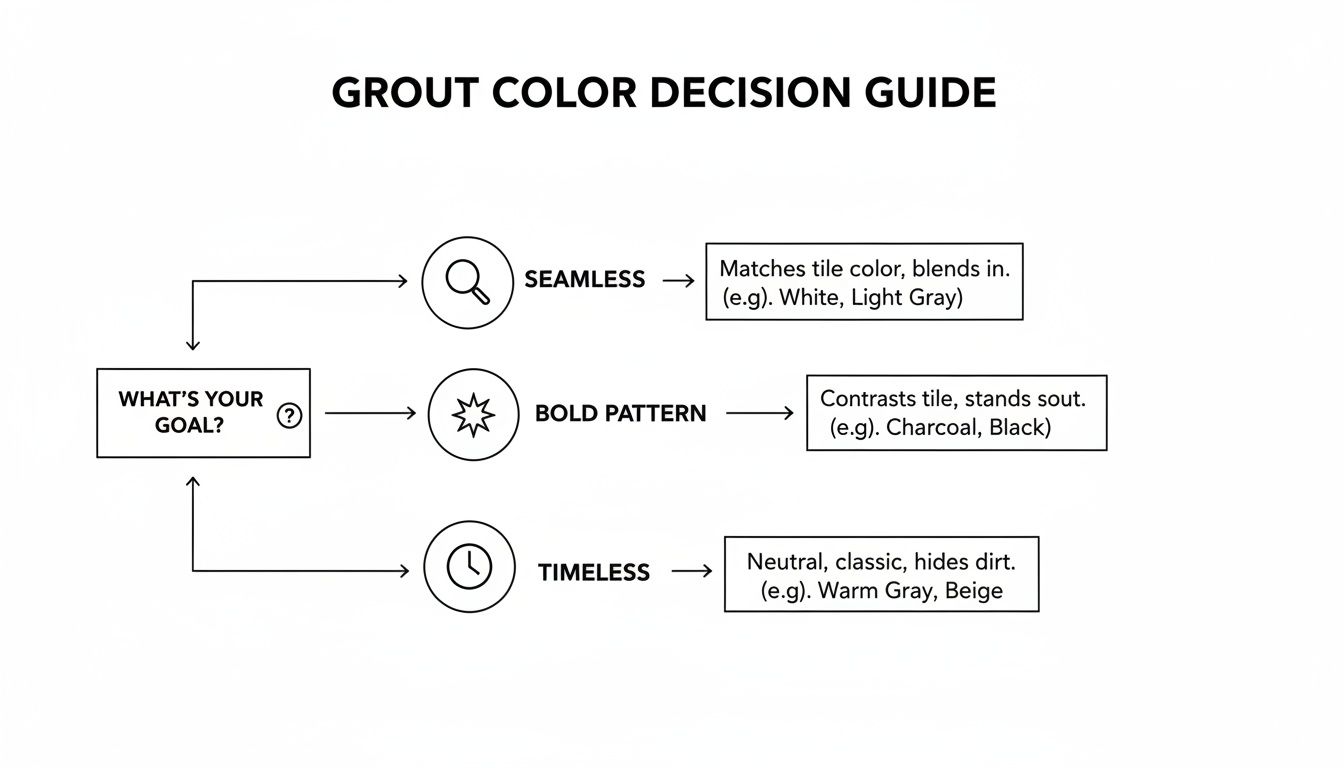
As you can see, your primary goal—whether creating a seamless look, a bold pattern, or a timeless feel—is the best starting point for narrowing down your grout color options.
How Grout Joint Width Changes Everything
The width of your grout joint dramatically alters the visual impact of the grout color. A thin, 1/16-inch line of dark grout will look entirely different from a thick, 1/4-inch line of the same color. Wider joints make the grout a more dominant feature of the overall design, essentially creating a thicker, more prominent grid.
- Narrow Joints (1/16″ to 1/8″): These create a subtle, refined look. The grout line is less of a feature, making this a great choice when you want the tile itself to be the focus. This width typically requires unsanded grout to ensure the mixture can properly fill the tight space.
- Wider Joints (3/16″ and up): These make a much bolder statement, turning the grout into a significant part of the pattern. For these applications, you’ll need sanded grout, which contains fine sand to add strength and prevent shrinking or cracking in the wider gap.
Remember this simple rule: the wider the joint, the more the grout color will influence the final look. A bold contrast in a wide joint is a major design statement, so be sure it’s one you want to make.
The type of grout itself also plays a role. The fine sand in sanded grout can give the color a slightly lighter, more textured appearance compared to the smooth, consistent color of its unsanded counterpart.
Tile Finish and Edge Type Matter
The way a tile is finished also influences your perception of the grout color. The interplay of light and shadow across the surface can make a single grout color look surprisingly different depending on the tile it’s next to.
Matte vs. Glossy Finishes
A matte finish, like that of our cement tiles, absorbs light rather than reflecting it. This creates a soft, chalky look that can make the accompanying grout color appear deeper and more saturated. A glossy finish, on the other hand, reflects light, which can make the grout lines appear brighter and more defined due to the sharp contrast between the reflective tile and the non-reflective grout.
Rectified vs. Natural Edges
The edge of the tile introduces another variable.
- Rectified Tiles: These have been mechanically cut to be perfectly straight, allowing for very tight, crisp grout lines.
- Natural or Pressed Edges: Handmade tiles often have a slightly softer, more rustic edge. This creates a gentler transition into the grout line, which can soften the overall look and feel of the installation.
Thinking through these practical details ensures you’re choosing a grout color not just from a swatch, but for how it will behave in your specific installation with your specific tile. It’s this level of attention that elevates a good project to a great one.
How to Test Grout Color and Avoid Costly Regrets
You’ve analyzed your tile and weighed the ideas of matching, contrasting, and neutral tones. But here’s the single biggest mistake you can make: trusting a tiny color swatch on a plastic stick or a printed chart.
Those are just suggestions. They aren’t a guarantee of how the final color will look in your home, with your light, next to your tile. The only way to know for sure is to see the real grout next to the real tile. This one step moves your decision from theory to reality, preventing the kind of permanent regret that can haunt a project for years.
There’s a reason the market for fixing grout mistakes is so large. The tile grout industry is projected to grow from USD 2.73 billion to USD 5.14 billion by 2035. A big part of that is dedicated grout colorants, which are often used to fix a poor initial choice. This tells you just how many projects end up with a color the owners wish they could change. Testing is your best defense against becoming part of that statistic.
Create Your Grout Mockup Board
The best way to test is by creating a physical mockup board. It’s a simple process that gives you invaluable insight. All you need are a few spare tiles (at least three or four), a small piece of plywood or sturdy cardboard, and sample packets of your top grout color contenders.
My advice is to always test at least three options to cover your bases:
- Your Match: The one you believe is the closest match to your tile.
- Your Contrast: A bolder choice, either lighter or darker, that you’re considering.
- Your Neutral: A safe, versatile option like a soft gray or beige that just works.
Arrange the tiles on your board, leaving the same joint width you plan for your final installation. Mix each grout sample according to the manufacturer’s directions and apply it between the tiles. For an accurate preview, follow the same techniques outlined in our guide for properly installing cement tiles.
The Waiting Game: Curing Is Crucial
Once your board is grouted, the most important step is to wait.
Wet grout looks dramatically different from cured grout—almost always darker and more saturated. You have to let the samples dry completely, which typically takes at least 24 to 48 hours, to see the true, final color.
Rushing this is a recipe for disappointment. A dark charcoal might look nearly black when wet but cure to a much softer, medium gray. A light beige could appear muddy, only to dry to the perfect warm off-white. Patience here is non-negotiable.
Pro Tip: Never, ever make a final decision based on wet grout. The color shift during curing is significant. Let your sample board dry for two full days to get the most accurate preview of the finished look.
Test in Place: The Ultimate Litmus Test
After your mockup board has fully cured, it’s time for the final and most revealing test. Take your board into the actual room where the tile will be installed. Don’t just glance at it—live with it for a day or two.
Place it on the floor or lean it against the wall where the tile will go. Watch it under different lighting conditions throughout the day:
- Morning Light: See how the bright, cooler light of the morning affects the colors.
- Afternoon Sun: Notice how direct, warm sunlight changes its appearance.
- Artificial Evening Light: Check how it looks under your lamps and overhead fixtures at night.
This process will reveal nuances you could never see in a store. You might find that the “perfect” gray looks too blue in the morning light, or that a neutral beige appears washed out under your kitchen’s warm LED bulbs. By testing in the actual environment, you can make a final, confident choice you’ll love for years.
Thinking Long-Term About Cleaning and Maintenance
Your tile is an investment, and the grout color you choose plays a huge part in how much you’ll love it years from now. This is where we get real about what it’s like to live with your grout choice day in and day out.
While it’s easy to get swept up in the aesthetics, thinking about future cleaning is the one thing that will save you the most frustration. It usually boils down to the classic debate: light versus dark grout. Both have their place, but their maintenance realities are worlds apart.
The Reality of Light-Colored Grout
There’s no denying it—white, off-white, and pale gray grouts look fantastic. They create that bright, clean, seamless look that can make a space feel bigger and more airy. It’s a classic for a reason.
But that beauty comes with a serious commitment. Light grout is a magnet for everything: dirt, grime, coffee splashes, you name it. In a high-traffic spot like a kitchen floor, an entryway, or a busy shower, it will highlight every little speck. If you’re not prepared for regular, detailed cleaning, those crisp lines can quickly turn dingy, stained, or mildewed.
A Word of Caution: Before you commit to brilliant white grout in a hardworking area, have an honest chat with yourself about your cleaning habits. Keeping it pristine isn’t magic; it’s maintenance.
The Case for Dark-Colored Grout
On the flip side, dark grouts—think charcoal, espresso, or even black—are incredibly forgiving. They are masters at hiding everyday dirt and splashes, which makes them a go-to practical choice for busy households or commercial spaces.
But dark grout isn’t perfect, either. While it’s great at hiding dirt, it can be prone to showing efflorescence—that chalky, white mineral deposit that can appear as moisture evaporates. Another thing to watch out for is fading. Harsh cleaners with bleach can strip the pigment over time, leaving the grout looking patchy and uneven.
No matter which way you go, finding the best floor tile grout cleaner for your specific type is key to making life easier down the road.
Smart Solutions for Lasting Beauty
So, how do you get the look you want without signing up for a lifetime of scrubbing? You plan for it from day one.
1. Choose a High-Performance Grout
Grout technology has come a long way. Instead of basic cement grout, look for high-performance options like epoxy or advanced cementitious formulas. These are built to be stain-resistant and much less porous, which makes a world of difference in preventing discoloration, especially with lighter colors.
2. Never, Ever Skip the Sealer
This is probably the single most important step for long-term success, especially with porous, handmade materials like our cement tiles. Once the installation is fully cured, a high-quality penetrating sealer needs to be applied to both the tile and the grout.
This creates an invisible shield that repels water, oil, and dirt, giving you time to clean up spills before they can soak in and stain. It makes routine cleaning so much easier. We’ve got a whole guide on how to clean your cement tiles that walks you through the best practices.
Remember to re-seal every few years, depending on how much traffic the area gets. It’s a small task that pays huge dividends in keeping your tile and grout looking brand new.
Still Deciding? Your Top Grout Color Questions, Answered
Even with a solid plan, a few questions always pop up right before you commit. That’s perfectly normal—choosing grout is a big deal. Think of this as the final check-in, where we tackle the most common dilemmas we hear from designers and homeowners just like you.
Let’s get these last few details sorted so you can lock in your choice and move forward with total confidence.
Should My Grout Be Lighter or Darker Than My Tile?
This is the classic grout dilemma, and honestly, there’s no single “right” answer. It all comes down to the look you’re trying to achieve.
- Go Lighter: Choosing a grout that’s lighter than your tile will make each tile’s shape pop. It creates a crisp, clean grid that feels bright and fresh. This is a go-to strategy when you have a colorful or dark tile and you want the pattern itself to be the star of the show.
- Go Darker: Opting for a darker grout also highlights the pattern, but with a much more graphic, dramatic effect. It can ground a design, adding a sense of depth and sophistication. And from a practical standpoint? Dark grout is a lifesaver for hiding dirt in high-traffic areas like mudrooms and kitchens.
The Bottom Line: Lighter grout brightens and defines the tile shape. Darker grout adds drama and practicality. It’s all about whether you want a light, airy feel or a bold, grounded statement.
What Is the Most Popular Grout Color?
Trends will always come and go, but if there’s one undisputed champion, it’s light gray. Its popularity is all about its incredible versatility.
A soft, neutral gray is the ultimate chameleon. It’s dark enough to hide the daily grime that pure white grout shows instantly, yet it’s light enough to keep a room feeling open. It provides just enough definition to make tiles stand out without creating the harsh contrast you’d get with black or white.
This makes it a safe, timeless choice that works with nearly any style. It’s especially brilliant for our handmade cement tiles, as it ties together complex, multi-colored patterns without ever competing for attention.
Can You Change Grout Color Later?
Yes, you can—but it’s a job. If you find yourself wanting a change down the road, you have two main options:
- Grout Colorant or Stain: This is the easier route. A grout colorant is basically a specially formulated paint that soaks into and bonds with your existing grout. It’s a great way to refresh stained grout or completely change the color. Going from light to dark is pretty straightforward, but going from dark to light might take a few extra coats.
- Grout Removal: This is the labor-intensive choice. It means physically scraping or grinding out all the old grout and starting over with a new color. We typically only recommend this if your grout is already damaged, crumbling, or in really bad shape.
While it’s good to know you have options, this really highlights why testing your grout color from the start is so important. Getting it right the first time will save you a ton of work later on.
How Does Grout Color Affect the Perception of Space?
Grout has a surprisingly big impact on how large or small a room feels. That grid of grout lines can visually expand or shrink a space.
If you want to make a room feel bigger, your best bet is to match the grout color to the tile as closely as you can. When the grout lines disappear, the floor or wall reads as one seamless, continuous surface. With fewer visual breaks, the eye is tricked into seeing a much larger, more expansive area.
On the other hand, a high-contrast grout color does the opposite. It slices the surface into a clear grid, drawing attention to each individual tile. This makes a space feel busier and can make it seem smaller. It’s a fantastic way to make a design statement, but it’s something to be mindful of in very compact rooms.
Ready to find the perfect tile to pair with your ideal grout color? Explore the endless possibilities with Original Mission Tile. From timeless patterns to custom creations, our handmade cement tiles provide the perfect canvas for your design vision. Discover our collections and start building your dream space today at https://originalmissiontile.com.