Sure, black goes with almost everything. But the real magic happens when you pair it with intention. The most unforgettable combinations—think white, metallics, and rich jewel tones like emerald green—don't just happen by accident. The secret is learning to balance black's powerful presence with the right contrast, temperature, and texture to set the exact mood you're after.
The Power of Black in Modern Interior Design
In the hands of a designer, black isn't just a color; it's an anchor. It provides strength, definition, and an instant dose of sophistication. Far from being an empty void, black is a powerful canvas that makes other colors pop. When you know how to use it, you can craft spaces that feel anything from dramatic and modern to warm and inviting.
This guide goes beyond simple color matching. We'll dive into the core principles that make a black-centric palette work, focusing on tile applications for floors, walls, and backsplashes with real-world examples that prove just how versatile this timeless color can be.
Key Principles for Pairing Colors With Black
Think of it like a chef balancing flavors. Mastering a few key concepts is all it takes to unlock black's full potential and create a result that feels harmonious and intentional.
- Color Temperature: This is all about mood. Pairing black with warm colors like terracotta or gold creates a space that feels inviting and luxurious. On the flip side, cool colors like crisp white or slate gray deliver a sharp, modern, and minimalist vibe.
- Contrast and Proportion: The amount of black you use completely changes a room. High-contrast pairings (like classic black and white) are pure drama. Low-contrast combinations (like black and charcoal gray) feel much more subtle and sophisticated. Decide if you want black to be a bold accent or the grounding foundation.
- Texture: Texture is the game-changer that adds depth. A silky, matte black cement tile absorbs light for a soft, contemporary look, while a glossy black tile reflects it, instantly dialing up the glamour.
Consider how specific black elements, like striking black ceiling fans, can serve as a powerful focal point that defines the entire room.
Black is the ultimate anchor in design. It provides a visual weight that allows other colors and textures to stand out with greater clarity and purpose. It doesn't compete; it elevates.
To get you started, here's a quick guide to some of the most popular and effective color pairings with black.
Quick Guide to Pairing Colors With Black
This table breaks down what mood each combination creates and where it works best, giving you a springboard for your next project.
| Color Pairing | Resulting Mood & Atmosphere | Best For |
|---|---|---|
| Black & White | Classic, Dramatic, Timeless | Graphic floors, modern bathrooms, entryways |
| Black & Gold/Brass | Luxurious, Warm, Opulent | High-end kitchens, powder rooms, boutique spaces |
| Black & Green | Natural, Grounded, Serene | Biophilic designs, tranquil bathrooms, living areas |
| Black & Terracotta | Earthy, Rustic, Modern | Modern-rustic kitchens, cozy living spaces, patios |
These pairings are just the beginning, but they show how easily black can be adapted to fit any style, from timelessly traditional to sharply contemporary.
Mastering the Fundamentals of Color Pairing
Great design doesn’t happen by accident. It’s built on knowing why certain color pairings just work. Think of it like a chef balancing flavors—a few key principles can completely transform how you see and use colors with black. This isn't about chasing trends; it's about making timeless choices.
Once you get these fundamentals down, you can build palettes that feel beautiful and intentional. You'll know exactly how to use black to get the effect you want, whether it's a bold focal point or a quiet, grounding anchor.
This diagram breaks down the three core elements—temperature, contrast, and texture—that dictate how black behaves in a space.

As you can see, black’s real power is its ability to amplify these concepts. It gives you precise control over the mood and energy of any room.
Understanding Color Temperature
Color temperature is the fastest way to set a room's mood. Every color has an underlying warmth (red, orange, or yellow undertones) or coolness (blue, green, or purple undertones). Black, a true neutral, acts like the perfect canvas, making those temperatures pop.
- Warm Tones: Pairing black with colors like terracotta, gold, or beige creates an atmosphere that feels inviting, cozy, and rich. A black floor tile grounded by warm wood furniture and brass fixtures is a perfect example of this in action.
- Cool Tones: Combining black with crisp white, shades of gray, or deep blues delivers a look that is sharp, clean, and modern. Think of a minimalist bathroom with black hexagon tiles and cool gray walls for that serene, spa-like feel.
This principle is the main reason black is so incredibly adaptable. In a 2025 Pantone survey of 1,200 designers, over 85% said black pairs seamlessly with their go-to palettes, and 68% cited its adaptability as essential for high-end projects. You can dive deeper into its role in design by checking out this insightful article on the meaning of black through the ages.
The Role of Contrast and Proportion
Contrast and proportion are all about the drama. They control the visual energy of a space. It’s not just which colors you pair with black, but how much of each you use. Think of it as a sliding scale from subtle and moody to bold and graphic.
High contrast is the most dramatic choice. You can’t get more classic than black and white. It creates an attention-grabbing look that feels confident and timeless—use it when you want to make a strong statement.
Low contrast, on the other hand, involves pairing black with darker shades like charcoal gray, deep navy, or forest green. This approach creates a sophisticated, nuanced atmosphere. The effect is more textural and intimate, perfect for making a space feel cozy and enveloping.
Proportion is everything. Using black as a small accent—on light fixtures, hardware, or a single piece of furniture—adds a touch of sophistication without taking over. But when you use it as the dominant color on a floor or an entire wall, it creates a bold, grounding foundation for the whole room.
Why Texture Is the Secret Ingredient
If color sets the mood and contrast creates the drama, then texture adds the soul. The exact same shade of black can feel completely different depending on its finish. This is especially true with tile, where the surface itself plays with light.
Just imagine these two scenarios:
- Matte Black: A matte surface, like you’d find on a handmade cement tile, absorbs light. This creates a soft, velvety appearance that feels modern and understated. It also hides minor smudges and reduces glare, making it a fantastic choice for large surfaces like floors.
- Glossy Black: A glossy or polished finish does the opposite—it reflects light, creating sharp highlights and a sense of glamour. This adds instant energy and a touch of luxury, making it perfect for backsplashes or accent walls where you want to catch the eye.
By deliberately choosing your textures, you can fine-tune your design down to the smallest detail. A matte black tile can ground an earthy, natural palette, while a glossy black tile will elevate a room filled with shiny, metallic accents. Once you master temperature, contrast, and texture, you have all the tools you need to create truly stunning designs with black.
Creating Drama with High-Contrast Palettes
Want to dial up the drama and sophistication in a space? Nothing does it faster than a high-contrast palette. Black and white is the original power couple of interior design for a reason—it’s confident, clean, and creates a visual foundation that always feels intentional.

While the pairing is a classic, the real magic happens in how you use it. By playing with pattern and proportion, you can guide the eye, set a mood, and take the look from nostalgic to unapologetically modern. A simple shift in tile shape can change the entire feel of a room.
The Modern Checkerboard and Beyond
The black and white checkerboard floor is an icon. It brings to mind everything from retro diners and grand hotel lobbies to charming Parisian flats. But this high-impact look is anything but a one-trick pony. Swap out the traditional squares, and you've got a fresh classic for a contemporary home.
- Classic Checkerboard: Using 8×8 cement tiles in a standard grid layout gives you that timeless, grounded feel. Its familiar pattern is both engaging and calming, making it a go-to for kitchens and entryways.
- Modern Graphic Patterns: For an edgier, more artistic vibe, think in bold geometrics. Stripes, chevrons, or even asymmetrical layouts can turn the floor itself into a statement piece.
- Unique Tile Formats: Shapes like star-and-cross or hexagon tiles in a black and white mix introduce texture and complexity. The interplay between color and form creates a dynamic surface that becomes an instant focal point.
This isn't just about looks; it has a real impact. A 2026 Houzz analysis found that white complements black in 92% of modern minimalist schemes. Even more impressive, homes featuring black-and-white floors saw property values increase by an average of 18% in major markets.
Introducing a Powerful Accent Color
A black and white base is stunning on its own, but adding a single, powerful accent color can take the design to a whole new level. It’s a technique designers use to inject personality and prevent a high-contrast room from feeling too stark or clinical. It gives the space a heartbeat.
Think of a classic black and white tiled bathroom. Now, picture it with a vanity painted in a deep emerald green. Or imagine a modern hotel lobby with a graphic black and white floor, anchored by a sculptural armchair in a rich ruby red. That pop of color does more than just add interest—it creates a destination for the eye.
A single, well-placed accent color in a high-contrast room acts like a spotlight, drawing the eye to a key feature and creating a memorable design moment.
Choosing the right accent is everything. You need a color that can hold its own against the strength of black and white, which is why bold, saturated jewel tones work so beautifully.
Effective Accent Colors for High-Contrast Palettes:
- Emerald Green: Brings a touch of natural opulence and life.
- Sapphire Blue: Creates a sense of deep, luxurious calm.
- Ruby Red or Bright Orange: Infuses a room with warmth and vibrant energy.
- Canary Yellow: Adds a cheerful, optimistic punch of sunshine.
For more inspiration on how to bring these bold statements into a room, check out these inspiring accent wall color ideas. And for more on creating the perfect black and white foundation, our guide to black and white tile is full of striking patterns and layouts.
Designing Warm and Luxurious Spaces with Metallics
Want a designer’s shortcut to instant opulence? Pair black with warm metallics like gold, brass, and copper. This combination speaks a language of warmth and luxury, turning a simple room into something truly stunning. It’s a go-to move in high-end hospitality and custom homes because it feels both classic and boldly modern at the same time.

The secret to keeping this look sophisticated—and not flashy—all comes down to one word: texture. A matte black surface provides the perfect non-reflective, silky backdrop. It grounds the space and lets the metallic elements, whether a faucet or a few tile accents, shine without overwhelming your senses.
The Power of a Matte Black Canvas
Think of a matte black cement tile as the velvet box a diamond is presented in. Its job is to absorb light, creating a deep, rich foundation that makes every metallic detail pop. A glossy black surface, on the other hand, would compete for attention with its own reflections, creating a lot of visual noise.
This is exactly why you see designers using matte black tile on floors or as a full backsplash where brass or gold hardware is the star. The tile’s soft, silky finish provides a quiet but powerful anchor for the whole design.
By pairing a non-reflective black surface with a reflective metallic, you create a beautiful textural dialogue. The matte black grounds the space, while the metallic elements add warmth and a touch of light-catching glamour.
Imagine how you could use this in a few key spots:
- Kitchen Backsplash: A black fish-scale or subway tile in a matte finish, set behind gleaming brass cabinet pulls and a gooseneck faucet.
- Bathroom Floor: A black and gold hexagon cement tile that feels both historic and totally contemporary.
- Boutique Hotel Lobby: Large-format matte black tiles on the floor, anchoring a room filled with sculptural brass lighting and furniture.
This combination of colors that go with black isn't just a trend; it creates a powerful feeling. A 2026 Color Marketing Group study of 800 interior architects found that 76% of upscale projects worldwide integrated gold and yellow with black. The study even reported a 41% mood elevation from the pairing's inherent optimism. You can discover more about the cultural significance of these powerful color combinations from The Black Voice.
Choosing the Right Metallic Tone
Not all golds are the same. The specific metallic you choose can subtly shift the entire atmosphere of a room, bringing its own personality to a black-dominant space.
- Polished Brass & Gold: This is your classic, opulent choice. It delivers a bright, warm glow that feels both luxurious and timeless. It’s perfect for warming up a cool black and white scheme.
- Antique & Aged Brass: This finish has a more understated, historical feel. Its darker, richer tones create a moody, sophisticated look that pairs perfectly with deep charcoals for a low-contrast, high-impact design.
- Copper & Rose Gold: These metals introduce a warm, pinkish hue that feels more contemporary and a little softer than traditional gold. Copper is fantastic for creating a modern-industrial or rustic-luxe vibe.
You can even weave gold directly into your surfaces with metallic inlays. Our Terrazzo Gold tiles are a perfect example, scattering flecks of gold within a neutral base to create a dynamic, shimmering effect on floors or walls. By balancing the depth of black with the radiant warmth of metallics, you craft a space that is not just visually striking but deeply inviting.
Building Earthy Palettes with Natural Tones
Pairing black with colors pulled straight from the natural world is the secret to a space that feels both grounded and deeply sophisticated. When you mix black with lush greens, warm terracotta, and soft, sandy beiges, you’re not just choosing colors—you’re building a bridge to the outdoors.
This approach creates an atmosphere of calm serenity, making it one of the most versatile ways to design with black.

This kind of palette isn't just beautiful; it's incredibly practical. Black grounds the space, offering a durable and forgiving foundation that expertly hides wear in high-traffic areas. Meanwhile, the natural tones soften the look, reduce visual noise, and promote a sense of tranquility. It's an ideal combination for spaces meant for relaxation and focus.
Lush Greens and Biophilic Design
Introducing green into a black-based palette instantly breathes life into it. This is the cornerstone of biophilic design, an approach focused on connecting us back to nature within our own homes. The deep, grounding presence of black makes any shade of green feel even more vibrant and alive.
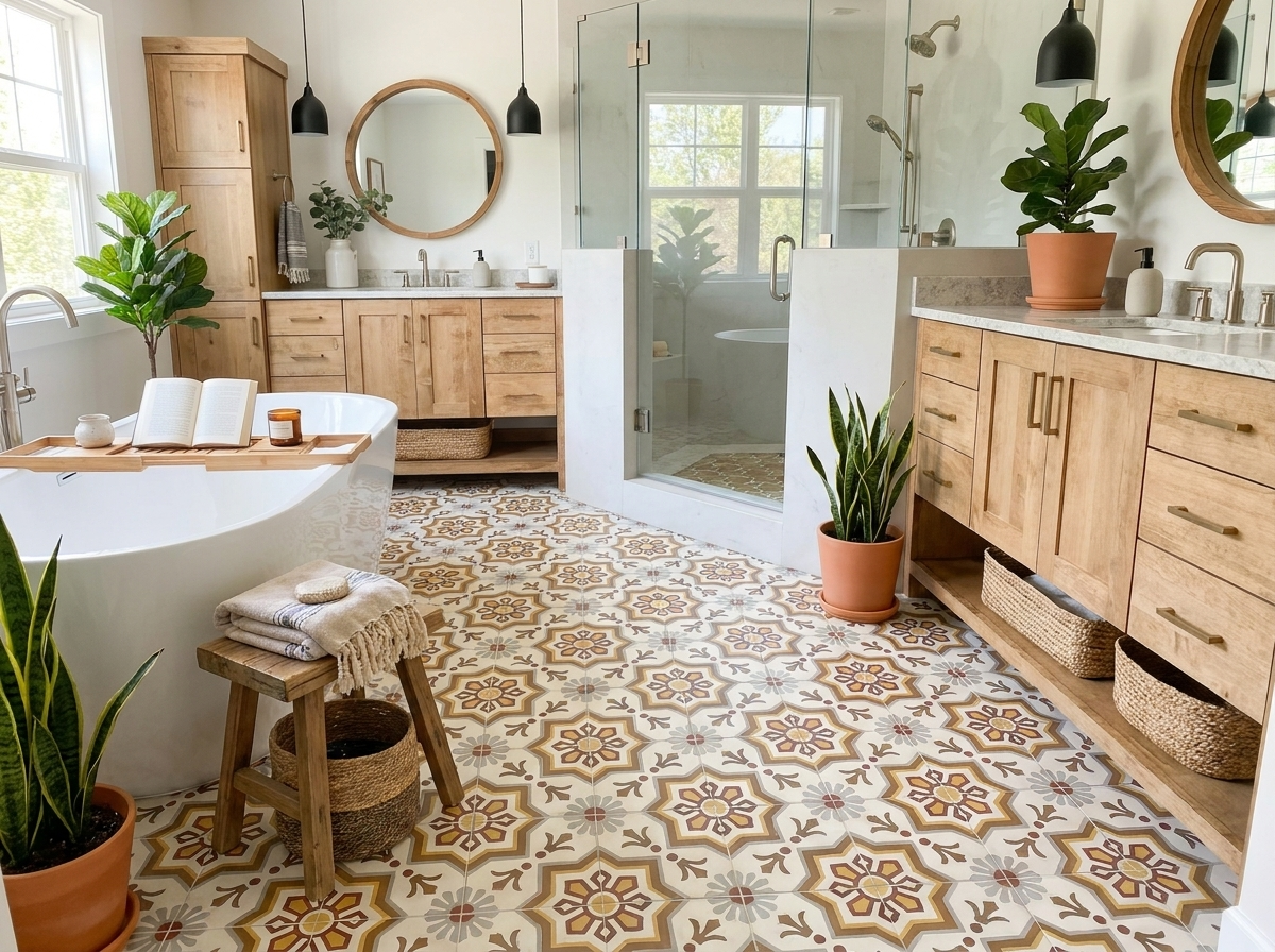
Imagine a bathroom with a bold, black hexagon tile floor. Now, picture the walls covered in green zellige-style pieces. The handmade texture of the zellige catches the light, mimicking how sunlight filters through leaves, while the black floor provides a solid, earthy anchor. This pairing is perfect for creating a personal sanctuary that feels refreshing and calm.
An earthy palette built on black and green does more than just look good; it taps into our innate connection to nature. The contrast between deep black and vibrant green creates a dynamic yet soothing environment that promotes well-being.
Warm Terracotta and Modern Rustic Style
For a look that’s both modern and full of rustic warmth, few pairings beat black and terracotta. The rich, sun-baked earthiness of terracotta offers a beautiful warm counterpoint to the cool, graphic strength of black. It’s a combination that feels both ancient and completely of the moment.
Consider a kitchen floor with black cement brick tiles laid in a classic herringbone pattern. When you pair that with a backsplash of warm, handmade terracotta tiles, the space gains an inviting, modern-rustic feel. The black grounds the design, keeping it from feeling too quaint, while the terracotta adds character and a welcoming glow.
This pairing works wonderfully in a variety of applications:
- Entryways: A durable black tile floor with a terracotta-colored accent wall creates an instantly warm welcome.
- Patios and Outdoor Spaces: Combining black and terracotta tiles outdoors connects the design directly to its natural surroundings.
- Living Areas: A black fireplace surround becomes a stunning focal point when set against a wall of soft, textural terracotta.
Soft Beiges for Understated Sophistication
If you’re aiming for a softer, more understated look, pairing black with sandy beiges and warm off-whites is a perfect choice. This low-contrast approach creates a serene and sophisticated atmosphere where texture becomes the main story.
Here, the black provides just enough definition to keep the palette from feeling washed out, adding a quiet strength to the design.
Think of a living room with a floor of large-format black cement tiles, softened by a plush, beige-toned area rug and light, sandy-colored walls. The combination feels open, airy, and incredibly chic. The key is to layer different textures—a matte black floor, a nubby wool rug, and maybe some smooth linen curtains—to create a rich, tactile experience. This is one of the most elegant ways to use colors that go with black for a truly timeless feel.
From Theory to Floor: Tiling Tips for a Flawless Finish
Turning a great design idea into a stunning real-world floor or wall is all about the details. And when you’re working with a color as confident as black, the small choices you make have a huge impact.
Getting it right comes down to three things: grout, finish, and lighting.
Master these, and your black tile installation will look like it was pulled from a design magazine. Let’s get into the practical side of making your project a success.
Choosing the Right Grout Color
Grout is more than just filler; it's a design tool that completely changes the look of your tile. The color you pick depends on one simple question: do you want to see the individual tiles, or do you want a single, seamless surface?
- For High Contrast: To make each tile’s shape pop, use a contrasting grout like bright white or light gray. This is how you show off interesting formats like arabesque, hexagon, or our classic star-and-cross patterns. It turns the grout lines into a graphic element.
- For a Seamless Look: If you want a more subtle, unified field of color, choose a dark gray or black grout. This blurs the lines between tiles, creating a moody, sophisticated backdrop that lets fixtures and furniture steal the show.
Selecting the Perfect Tile Finish
The finish on your black tile dictates how it plays with light and sets the room's mood. While glossy tile has its place, a matte finish offers powerful aesthetic and practical advantages, especially with a color as bold as black.
A matte cement tile is one of the best choices for black surfaces. Its silky, non-reflective nature absorbs light, which prevents harsh glare and is incredibly forgiving—it helps hide minor dust and smudges. The result is a soft, velvety look that feels both modern and luxurious.
This gentle diffusion of light is the secret to making a room with black tile feel inviting, not sterile. It adds a quiet sophistication that high-gloss finishes just can't match. For more ideas on how finishes can transform a space, a guide on bathroom accent tiles can offer plenty of inspiration.
Leveraging Strategic Lighting
Lighting is your final, and most important, tool. Without a good lighting plan, even the most beautiful black tile can feel flat, heavy, and dark. You need to create layers of light that bring out depth, texture, and warmth.
A layered approach is the key to making any space feel complete.
- Ambient Lighting: This is your general, all-over light. Think recessed cans or a central fixture that provides the room's base illumination.
- Task Lighting: These are focused lights for specific jobs, like under-cabinet strips in the kitchen or sconces flanking a bathroom mirror. They make the space functional.
- Accent Lighting: Think of this as "art" lighting. Use directional spots or picture lights to graze a textured tile wall, creating dramatic shadows, or to cast warm pools of light that add visual interest.
By combining these three layers, you ensure your black tile feels dynamic and alive. It’s the final step that pulls the entire design together, making it both beautiful and livable.
Frequently Asked Questions About Designing With Black
Even with the best plan, working with a color as confident as black can bring up a few questions. We get it. Here are quick answers to the common challenges designers and homeowners run into, with practical tips to make sure your project is a success.
Let's clear up these common concerns so you can move forward with confidence.
What Is the Best Color to Pair With Black to Make a Small Room Look Bigger?
To open up a small room, your best friend is a crisp, clean white. This high-contrast pairing creates strong visual lines that guide the eye, making the space feel instantly larger.
The key is to use black as a grounding element—think a classic black cement tile on the floor—while keeping the walls and ceiling bright white. This simple trick draws the eye upward, creating a sense of height and openness. Avoid large swaths of black on the walls, which can feel enclosing. Instead, use it strategically in floor patterns or as sharp accents on fixtures and trim to keep that airy vibe.
How Do I Choose the Right Grout Color for Black Tiles?
Your grout color all comes down to the final look you’re after. You really have two main choices, each with a totally different result.
- For a Graphic Look: A high-contrast grout like white or light gray is your go-to. This technique makes the shape of each tile pop and is perfect for accentuating patterns like hexagon, arabesque, or star-and-cross tiles. The grout lines become a core part of the design itself.
- For a Seamless Look: To make the tiles blend together, choose a dark gray or black grout. This creates a more monolithic, uniform surface where the focus shifts to the overall texture and feel. It’s an amazing choice for a sophisticated, moody floor or a dramatic wall.
Can I Use Black Tiles in a Room That Does Not Get Much Natural Light?
Absolutely, but you have to be smart about your lighting and finishes. In a room with dim natural light, the most important move you can make is choosing black tiles with a matte finish. Their silky, non-reflective surface diffuses light softly instead of creating harsh glares, which can make a dark room feel even smaller and more chaotic.
A robust, layered lighting plan is non-negotiable in a dark room with black tile. You must combine ambient (overhead), task (functional), and accent (dramatic) lighting to create depth and prevent the space from feeling flat.
Finally, work with the light you do have. Use lighter colors on the walls and bring in reflective surfaces like large mirrors to bounce light around the room. This creates a surprisingly balanced and inviting atmosphere.
Ready to find the perfect tile to bring your vision to life? At Original Mission Tile, we offer a vast collection of handmade cement tiles in every color and pattern you can imagine.
Explore our full collection of in-stock and custom tiles to start your design journey today!