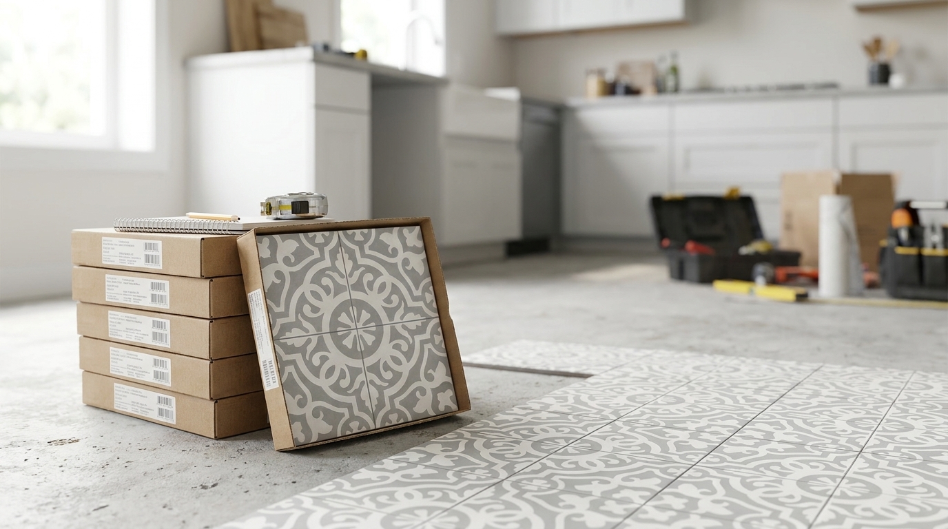
How do you make a checkerboard tile pattern feel permanent rather than picturesque for a season?
Most advice stops at color pairing. It shows a black and white floor, mentions “timeless style,” and skips the material decisions that determine whether that floor will still look sharp after daily traffic, repeated cleaning, shifting light, and years of use. That gap matters. A checkerboard layout is simple enough to sketch in seconds, but hard to execute well without discipline around scale, calibration, grout, and finish.
Used properly, a checkerboard tile pattern does more than decorate a room. It gives structure to an interior. It can widen a narrow hall, steady a busy kitchen, add ceremony to an entry, or make a small bath feel composed instead of cramped. It also reacts differently depending on whether the surface is handmade cement, glazed ceramic, porcelain, or stone. The pattern may be the same. The experience underfoot is not.
The most successful checkerboard floors share a few traits. The pattern suits the room's proportions. The tile material matches the use case. The installation is tightly planned. And the finish ages in a way the owner wants. That's where handmade cement tile becomes especially interesting. It brings a matte, velvety, inlaid surface that feels architectural rather than printed on. But it also asks for informed specification and proper care.
An Introduction to Timeless Checkerboard Tile
A checkerboard tile pattern is one of the rare design moves that can feel formal, playful, rustic, or refined depending on the material and layout. The basic idea is straightforward. Two contrasting tiles alternate in a grid. What changes everything is the execution.
In a foyer, the pattern can read as classic and ceremonial. In a mudroom, it can feel grounded and practical. In a restaurant, it can lean graphic and energetic. On a bathroom floor, especially in a matte handmade finish, it can soften a hard-surfaced room and make it feel collected instead of sterile.
Why the pattern still works
Checkerboard survives changing trends because it solves two design problems at once. It adds movement, and it also imposes order. Many decorative surfaces do only one of those things. A floral motif brings energy. A plain slab brings calm. Checkerboard balances both.
That balance is why designers keep returning to it when a room needs visual rhythm but not clutter. It's especially effective in spaces with straightforward millwork, painted cabinetry, plaster walls, unlacquered brass, or natural wood. The floor contributes character without demanding ornate surroundings.
Practical rule: Don't choose checkerboard because it's recognizable. Choose it because the room needs geometry, contrast, and a clear visual cadence.
What separates a good checkerboard floor from a bad one
The failures are predictable. The tile size is wrong for the room. The two colors don't share the same finish. The grout line is too wide, too bright, or too inconsistent. Or the material itself fights the use case.
The successes usually come from restraint and precision:
- Right scale: The tile size matches the room and furniture.
- Right material: Cement, ceramic, porcelain, or stone is chosen for actual wear conditions.
- Right calibration: The field lays flat and the joints stay disciplined.
- Right finish: Matte, honed, or glazed is selected for the desired feel and maintenance level.
Those are the decisions that give checkerboard staying power.
The Enduring Legacy of Checkerboard Patterns
Checkerboard didn't begin as a nostalgic design trope. It began as architecture.
Archaeological evidence indicates that checkerboard and similar grid patterns have been used in built environments for at least 5,000 years, with some of the earliest examples emerging in Mesopotamia. Excavations of Sumerian and Babylonian sites dating to roughly 3100–2500 BCE revealed checkerboard-like pavements in palaces, temples, and ziggurats using alternating light and dark elements, as described in this history of checkerboard tiles.

From ceremonial floors to everyday rooms
That history explains why the pattern still carries weight. It has long been used to define thresholds, procession routes, and important rooms. Even now, when you place a checkerboard floor in an entry or corridor, the room immediately feels more intentional. The pattern directs movement and gives the floor a sense of order.
Later eras kept adapting it. Roman interiors spread geometric mosaic flooring through baths, atriums, and villas. Much later, Victorian houses used checkerboard to sharpen hallways and service spaces. Parisian cafés and bistros made it feel urbane and lived-in. American kitchens and porches gave it a more democratic, practical personality.
Why history matters in current work
This long arc matters because it changes how you specify the pattern today. You're not reaching for a novelty. You're using one of architecture's oldest organizing devices. That makes it flexible.
A black and white floor can still feel crisp and formal. A softer pairing can feel quiet and residential. Handmade surfaces can make the motif feel older and more tactile. Cleaner edges and tighter joints can pull it toward a more contemporary expression.
If you want to study a classic interpretation, a good reference point is this collection of black and white tile layouts and colorways. It shows how much range exists inside a pattern people often reduce to a single look.
The checkerboard floor has survived because it isn't tied to one era. It adapts to the material, the room, and the hand of the installer.
Mastering the Art of Checkerboard Design
Designing a checkerboard tile pattern well starts before tile selection. It starts with proportion. The pattern is unforgiving. Every choice becomes visible because the eye can read the grid instantly.

Get the scale right
Large tiles simplify the room and give checkerboard a more architectural presence. Small tiles make it busier and more decorative. Neither is necessarily better. The room decides.
In a compact bath or vestibule, a smaller checker can feel nimble and appropriate. In a broad kitchen or dining room, a larger module prevents visual chatter. The goal isn't to fill the room with as many squares as possible. The goal is to make the pattern legible without turning it into noise.
Scale note: If furniture legs, island bases, door casings, and transitions all compete with the grid, the checkerboard will feel fussy. The floor should support the room, not pixelate it.
Choose orientation with intent
A straight lay reads calm, orderly, and classic. It suits formal rooms, traditional kitchens, utility areas, and spaces where cabinetry already creates strong orthogonal lines.
A diagonal lay changes the energy. It can make a small room feel more expansive because the eye moves corner to corner rather than wall to wall. It also introduces more perimeter cuts, so it asks for tighter planning and cleaner installation.
Use straight lay when the architecture is already expressive. Use diagonal when the room needs movement.
Build a color pairing that fits the house
Black and white is iconic because the contrast is immediate. But many of the strongest checkerboard floors rely on subtler pairings. Cream with clay. Sage with bone. Charcoal with warm gray. Dusty blue with off-white. The softer the contrast, the more the pattern behaves like texture from a distance.
Three principles help:
- High contrast creates drama and graphic clarity.
- Mid-tone contrast feels layered and residential.
- Low contrast gives you rhythm without visual sharpness.
If the cabinetry, wall paint, and stone counters are already varied, reduce the floor contrast. If the room is minimal and tonal, a stronger floor can carry the composition.
Don't ignore surface finish
Materiality changes the entire effect. A glossy ceramic checkerboard bounces light and feels brisk. A honed stone checkerboard reads quieter. Handmade cement has a dry, powdery depth that makes the pattern feel less printed and more embedded in the architecture.
That tactile distinction is one reason designers increasingly model floor options before ordering. When a project has custom millwork, islands, banquettes, or unusual sightlines, production-focused 3D models can help test tile scale, orientation, and transition conditions before the installer snaps lines on site.
Use grout and borders strategically
Grout can either sharpen the grid or soften it. A close-match grout keeps attention on the field of color. A contrasting grout makes every square read more crisply, which can be excellent in a café and exhausting in a small residential bath.
Borders are equally powerful. A perimeter band can keep cut tiles away from the wall and make the pattern feel framed. In older-style interiors, that's often the difference between a floor that feels finished and one that feels merely installed.
| Decision | What it does visually | Where it tends to work |
|---|---|---|
| Straight lay | Stable, architectural grid | Kitchens, halls, mudrooms |
| Diagonal lay | More movement, broader feel | Entries, small baths, transitional spaces |
| Blended grout | Softens the pattern | Tonal palettes, handmade tile |
| Contrasting grout | Sharpens every module | Graphic interiors, commercial settings |
Choosing Your Material Cement vs Ceramic Tiles
A checkerboard floor can be made from several tile categories, but the choice isn't cosmetic alone. Cement and ceramic may deliver a similar layout, yet they age, feel, and perform differently. For checkerboard specifically, those differences become obvious because the pattern amplifies every edge, surface variation, and change in sheen.

What handmade cement tile does best
Handmade cement tile has a depth that glazed products rarely replicate. The color is inlaid, not just sitting as a surface treatment. That gives the checkerboard tile pattern a softer, denser look, especially in natural light. Underfoot, the matte finish feels velvety rather than slick.
For design work, cement also opens the door to quieter, more nuanced color. The palette tends to read mineral and architectural. That makes it especially strong in Mediterranean, Spanish Colonial, historic renovation, boutique hospitality, and newer homes that want character without distressing.
There's also an honest irregularity to handmade tile. Slight tonal shifts and surface variation give the floor life. In a checkerboard layout, that can be a major advantage because it prevents the pattern from feeling too synthetic.
Where ceramic and porcelain have the edge
Ceramic and porcelain are usually easier for clients who want a lower-maintenance routine and a more uniform result. Glazed surfaces clean up quickly. Factory production often delivers a more standardized visual field. If the brief calls for crisp repetition and a cleaner, more machine-finished look, ceramic or porcelain can make sense.
They're also practical in situations where the owner wants checkerboard style without accepting the maintenance rhythms of a more porous handmade surface.
The climate and maintenance trade-off
This is the point many guides skip. Existing content on checkerboard tile patterns rarely addresses regional and climate-specific durability trade-offs for cement installations, even though unglazed cement tiles can be more susceptible to staining and efflorescence in high-humidity or frequently wet spaces unless properly sealed and maintained, as noted in this discussion of how to avoid making a checkerboard pattern look dated.
That doesn't mean cement is unsuitable. It means specification has to be more exact. In a powder room, entry, dining room, or covered patio, handmade cement can be a beautiful choice. In a wet bathroom, pool zone, or humid commercial environment, the sealing plan and maintenance expectations need to be explicit from the start.
Cement rewards owners who appreciate patina and are willing to care for the surface. Ceramic suits owners who want predictability first.
A useful selection framework
Rather than asking which material is “better,” ask which one matches the project.
- Choose cement tile when tactile depth, artisanal variation, and a matte architectural surface matter most.
- Choose ceramic or porcelain when lower-absorption surfaces, easy cleanup, and stronger visual uniformity take priority.
- Check the room conditions before choosing either. Moisture, cleaning chemicals, direct exterior exposure, and traffic matter more than trend.
For a broader side-by-side review of use cases and handling, this guide to cement tile vs ceramic tile is a practical reference.
One manufacturer that offers handmade cement tile in checkerboard-specific styles is Original Mission Tile, including stock and custom configurations that let designers build the pattern with coordinated plain colors or patterned fields.
Beyond Black and White Modern Checkerboard Ideas
The checkerboard tile pattern becomes much more interesting once you stop treating black and white as the only valid answer. Some of the freshest rooms use muted contrast, unusual formats, or checkerboard in places people don't expect.

Softer palettes for quieter rooms
A bedroom-adjacent bath can use cream and pale sage instead of hard contrast. A pantry can take warm white and terracotta. A laundry room can carry two grayed blues. These pairings let the pattern remain visible without turning every room into a statement space.
That approach works especially well with matte surfaces. Handmade tile, honed stone, and low-sheen finishes keep soft checkerboards from looking washed out.
Smaller fields and unexpected applications
Checkerboard doesn't need a full foyer to succeed. It can be excellent in a backsplash, shower floor, bar front, or niche wall. In these smaller areas, the pattern acts less like architecture and more like punctuation.
A compact checker in a shower can feel well-suited. Behind open shelving, it can add rhythm to an otherwise plain wall. In a café restroom, a floor-to-wainscot checkerboard can shift from charming to graphic depending on grout and contrast.
A good way to study how motion and finish change the reading of handmade surfaces is this installation video:
Shape can reinterpret the idea
The checkerboard logic can survive even when the tile isn't square. Hexagons, elongated rectangles, and modular groupings can produce a checker effect without copying the classic board exactly. That's useful when a project wants historical reference without a literal period look.
Two moves work especially well in contemporary interiors:
- Tone-on-tone checkerboards in warm neutrals, where the pattern appears gradually as light changes.
- Grouped modules where several small tiles form a larger alternating square, giving the floor more texture and less starkness.
A checkerboard floor doesn't need to announce itself from the doorway. Some of the strongest versions reveal the pattern only after you've entered the room.
Layout and Installation Best Practices
A checkerboard floor either looks disciplined or slightly wrong. There's not much middle ground. Good installation begins before the first tile is set.
Start with the room, not the tile carton
Check the substrate first. Flatness matters because the eye catches irregularities faster in an alternating pattern than in a single-color field. Then establish the room's controlling lines. In older houses, don't assume the walls are your guide. They often aren't.
Dry-lay enough material to understand where the cuts fall at all visible edges, doorways, and transitions. The center of the room isn't always the right visual starting point. Sometimes the best layout prioritizes the main sightline from the entry or aligns the pattern with a kitchen island rather than with imperfect perimeter walls.
Calibration is not optional
For a visually balanced checkerboard tile pattern, both tile types need matching dimensions and thickness tolerances, typically within ±1 mm, to avoid step differences at joints and uneven wear, according to this expert guide on checkerboard floors.
That one detail separates many professional installs from disappointing ones. If one color runs slightly thicker or larger than the other, you'll see lippage, drifting joints, and stressed edges. Checkerboard makes those flaws obvious because every tile is compared against its opposite.
Setters can finesse a lot on site. They can't make mismatched tile calibers behave like a single system.
Grout width, cuts, and sequencing
Tighter grout joints usually produce the cleanest checkerboard look, but only if the tiles are calibrated and the installer can maintain control across the field. Wider joints may hide minor variation, though they also soften the geometry and can make the pattern feel less crisp.
A few practical habits help:
- Sort before setting: Blend and inspect both colors before installation, especially with handmade tile.
- Cut symmetrically where possible: Uneven slivers at one wall immediately weaken the effect.
- Watch transitions carefully: The checkerboard should land cleanly at thresholds, stair noses, and cabinet toekicks.
- Confirm measurements early: This guide on how to measure for tile is useful for planning waste, room breaks, and perimeter conditions before ordering.
Installers who work slowly at the layout stage usually move faster later. The pattern rewards preparation.
Create Your Custom Checkerboard with Original Mission Tile
A checkerboard tile pattern lasts when the design and the build are handled with equal care. The pattern itself is ancient. The room around it is current. What makes the floor feel right is the combination of proportion, material honesty, and installation precision.
Handmade cement tile is especially compelling when the project calls for depth, softness, and visible craft. It doesn't mimic a printed surface. It brings its own texture and patina. Ceramic and porcelain remain useful options where a project needs a more uniform finish or a simpler maintenance routine. The right answer depends on the room, the climate, and the owner's expectations.
For custom work, flexibility matters. Original Mission Tile offers handmade cement tile in stock colors and formats, plus custom options through its Design Studio for designers who want to build their own checkerboard palette. That's useful when black and white isn't the point, or when the project needs a very specific tone, scale, or border strategy.
A strong checkerboard floor never looks accidental. It feels measured, grounded, and appropriate to the architecture. That's why this pattern keeps returning. Not because it's trendy, but because it still does the job beautifully.
If you're planning a checkerboard floor, wall, or custom colorway, Original Mission Tile offers handmade cement tile, stock selections, and custom design support for residential and commercial projects.