You're probably standing in a kitchen that no longer matches the way you want to live in it. The cabinets may still be fine. The layout may even work. But the counters feel flat, generic, or impossible to keep looking clean, and now you're trying to sort through a flood of advice that treats all tile countertops like they're the same thing.
They're not.
Modern tile countertops can look crisp, architectural, warm, handmade, or boldly decorative. A small square ceramic tile counter from decades ago is a very different animal from a matte handcrafted cement surface with inlaid pigment, tight layout planning, and the right grout specification. That difference is where many remodels go right or wrong.
The confusion usually starts in two places. First, people hear “tile countertop” and picture busy grout lines and dated kitchens. Second, they price the tile itself and assume that tells them the whole story. Neither shortcut works, especially if you're considering handcrafted cement tile. Cement has a distinct surface, different installation needs, and some grout interactions that most general guides barely mention.
If you want a surface with character instead of another slab that looks like every showroom sample, tile deserves a serious look. You just need to approach it with clear eyes.
Understanding modern tile countertops
A homeowner once described their remodel problem to me this way: quartz felt too uniform, marble felt too risky, and old-school tile reminded them of a rental kitchen. What they wanted was something with texture, depth, and enough personality to anchor the room without making it feel themed. That's the sweet spot where modern tile countertops often fit.
What makes tile feel modern is more than using tile on a counter. It's the combination of surface finish, scale, edge treatment, color choice, and restraint. Today's best versions lean toward matte finishes, quieter palettes, thoughtful pattern use, and details that feel intentional rather than nostalgic.
What looks modern now
A modern tile countertop usually avoids the shiny, heavily gridded look many people associate with older ceramic installations. Instead, you'll often see:
- Matte surfaces that soften light instead of reflecting it harshly
- Inlaid color rather than a printed surface look
- Simpler field tile layouts with one focal moment instead of pattern everywhere
- Clean transitions at sinks, edges, and backsplashes
- Handcrafted variation that reads as character, not defect
Handcrafted cement tile sits in an interesting place here. It doesn't pretend to be stone. It doesn't try to mimic quartz. It offers a silky, grounded surface and color that feels embedded in the material itself. In the right kitchen, that can feel more architectural than flashy.
Practical rule: If the counter will carry a bold pattern, let nearby finishes calm down. Flat-front cabinetry, simple hardware, and one dominant metal finish help the tile look deliberate.
Why tile still matters
Tile isn't the dominant countertop material today, but it hasn't disappeared. The broader countertops market was valued at USD 157.74 billion in 2025 and is projected to reach USD 267.38 billion by 2033, with 6.8% CAGR from 2026 to 2033, according to Grand View Research's countertops market report. Tile remains part of that larger story, especially in custom, heritage, and artisan-led projects.
Its design roots also run deep. Tile became mainstream in U.S. residential kitchens in the 1920s and 1930s as a durable, affordable alternative to stone, and it still appeals to homeowners who want a surface with visible craft rather than factory sameness.
That historical thread matters because modern tile countertops aren't a novelty. They're a reinvention. The best ones keep tile's strengths, color permanence, heat tolerance, and strong visual identity, while correcting many of the old mistakes through better layout planning and better grout choices.
Comparing tile materials
Choosing a tile countertop material is less like picking a paint color and more like choosing a type of flooring for a busy entry. You're balancing appearance, wear, upkeep, and how forgiving the material will be once daily life starts.

Tile also carries design baggage. In the U.S., tile countertops had a major resurgence during the 1970s and 1980s, when rustic and country kitchen styles favored handmade, earthy materials over polished surfaces, as noted by Mordor Intelligence's countertops market coverage. That history explains why some people still think “tile countertop” means dated. Modern material choices can shift that impression fast.
How the materials differ
Here's the simplest way I explain the four most common contenders.
| Material | What it tends to look like | Where it shines | Where people get tripped up |
|---|---|---|---|
| Ceramic | Familiar, versatile, often more traditional | Wide style range, easy to understand visually | Can feel less refined if the glaze or edge details are basic |
| Porcelain | Crisp, dense, often more contemporary | Clean visual lines, strong wear resistance | Some styles can feel a bit sterile in warm kitchens |
| Engineered quartz | Seamless, uniform, slab-based look | Low-maintenance daily use | If you want handcrafted variation, it may feel too consistent |
| Handcrafted cement | Matte, layered, artisanal | Rich color depth, strong identity, custom potential | Needs careful installation and realistic maintenance expectations |
For a broader renovation-side comparison of countertop categories beyond tile, Northpoint Construction's countertop guide is a useful cross-check because it helps homeowners compare slab and tile options through a remodel lens.
Where handcrafted cement stands apart
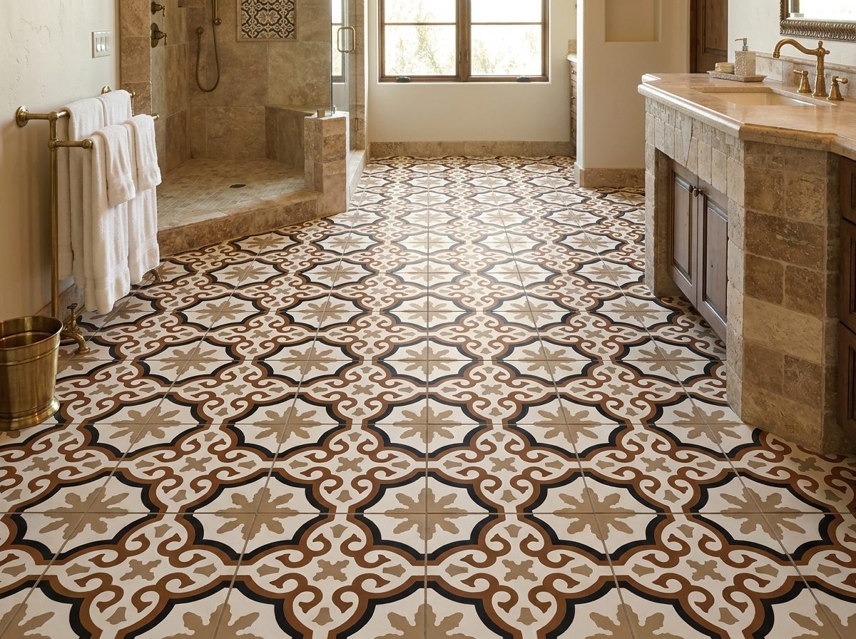
Handcrafted cement tile doesn't behave like porcelain, and it doesn't look like ceramic with the shine turned down. Its character comes from the way the material is made. The pigment is part of the tile's surface layer, which gives it visual depth and a soft, powdery elegance that many factory-made materials can't replicate.
That's why designers often choose it when they want the countertop to feel collected rather than mass-produced. Shapes also matter. Hex, fish scale, star and cross, and classic square formats each change the rhythm of the counter. If you want to compare those options before narrowing your palette, this guide to tile types helps you match shape to style.
Porcelain is often the easiest recommendation. Handcrafted cement is often the most memorable one.
A practical way to decide
If your priority is a low-fuss surface, quartz usually wins. If your priority is a handcrafted look with pattern, matte texture, and old-world depth, cement tile becomes much more compelling.
Use these filters:
- Choose porcelain if you want a tile look with a more uniform finish.
- Choose ceramic if your design leans classic and you want broad style availability.
- Choose quartz if maintenance tolerance is low and a continuous look is paramount.
- Choose handcrafted cement if the countertop is meant to be a focal surface with visible craft.
The right answer depends less on trend and more on how you want the room to feel when you walk into it half awake on a Tuesday morning.
Creating patterns and layouts
Pattern is where modern tile countertops stop being “a material choice” and become part of the architecture of the room.

A good countertop layout works like a well-fitting jacket. It should fit the shape beneath it. The same pattern that looks sharp on a compact coffee bar can feel frantic on a long island if you don't adjust scale, border treatment, and where the eye lands first.
Start with the shape of the countertop
Before choosing any motif, map the actual counter geometry. A straight run, L-shape, narrow island, and wraparound bar each ask for a different strategy.
For most projects, I suggest deciding which of these roles the tile should play:
Quiet field surface
Use one color or a low-contrast pattern across the full top. This works well when the backsplash or cabinetry already carries detail.Centered focal composition
Place the strongest pattern on an island or bar top and keep perimeter counters simpler.Bordered layout
Frame the outer edge with a band or contrasting course, then let the interior field breathe.
The biggest mistake is trying to use a lively pattern across every surface at the same intensity. That usually makes grout lines and seams feel louder than the design itself.
Scale the pattern before you order
Pattern scale matters more on countertops than many people expect because counters are seen from close range. Your hands, cutting boards, bowls, and appliances all interrupt the surface. A tiny repeat can start to look busy once daily objects pile on top of it.
A few layout habits help:
- Mock up the repeat full size with paper or taped printouts on the actual countertop footprint
- Test corner conditions so you don't discover awkward cutoffs at sink openings or returns
- Use plain field tiles nearby if a decorative tile appears on the island or bar
- Keep grout joints consistent so the pattern reads clearly rather than looking wobbly
If you need inspiration for motifs that hold up well at countertop scale, browse these tile pattern ideas.
A quick visual walkthrough can help you spot how pattern behaves across different kitchen forms:
Match contrast to the room
High-contrast tile and grout combinations sharpen the geometry. Low-contrast combinations soften it. Neither is automatically better.
If the cabinetry is dark and the hardware is crisp, a softer countertop contrast can keep the room from feeling overdrawn. If the room is mostly neutral and flat-fronted, a stronger tile pattern can supply the personality.
A countertop pattern should read clearly from standing height. If it only makes sense in a sample square on your desk, it probably isn't scaled right.
Also think through transitions. A countertop and backsplash don't need to match exactly. In fact, they often look better when one leads and the other supports.
Planning installation and specifications
A beautiful tile countertop can fail for boring reasons. Not because the tile was wrong, but because the specification was vague. If you leave decisions like substrate, edge treatment, and grout type to be solved in the field, you're asking the installer to improvise on one of the most visible surfaces in the room.
Build the assembly from the bottom up
The tile is only the finish layer. What sits beneath it determines whether the surface stays flat, resists movement, and holds its grout lines cleanly.
A sound specification usually addresses these items clearly:
- Stable substrate so the counter doesn't flex under daily use
- Water-managed underlayment appropriate for a kitchen work surface
- Planned edge condition rather than a last-minute trim decision
- Sink cutout detailing that avoids weak slivers and awkward joints
- Tile layout approval before anything is set in mortar
Handmade cement tile adds another layer of care because the pieces can have slight dimensional variation. That's normal. It's part of the product character. But it means the setter has to work from an approved layout and maintain control over joint consistency rather than forcing a rigid factory-grid expectation onto a handcrafted material.
Specify the edge before anyone starts
Most first-time remodelers focus on the field tile and forget the perimeter. Then installation day arrives and someone asks, “How do you want to finish the front edge?” That's far too late.
Common countertop edge approaches include:
| Edge approach | Best use | Watch-out |
|---|---|---|
| Simple eased edge with coordinated trim | Clean, quiet kitchens | Can look thin if the build-up isn't planned |
| Mitered or built-up edge look | More substantial appearance | Needs careful alignment to avoid visual drift |
| Contrasting border tile | Decorative or heritage-inspired designs | Can overpower small counters |
| Bullnose-style solution | Softer profile | Must suit the tile body and overall style |
The edge should relate to the cabinet style below. A heavy decorative edge over minimal cabinetry often feels mismatched. A plain edge over a richly patterned handcrafted surface usually reads more modern.
Grout is not a side note
The ultimate success or disappointment of many modern tile countertops often comes down to this. General advice often treats grout as an accessory. It isn't. It's the most vulnerable part of the installation and, in many kitchens, the true maintenance story.
Coverage gaps remain around epoxy grout performance with handmade cement tiles. Existing guidance rarely addresses how epoxy's rigidity interacts with the slight dimensional variance and unglazed matte surface of cement tile, which can create a risk of micro-cracking at the tile-grout interface, as discussed in Homes & Gardens coverage of the tile countertop trend.
That doesn't mean epoxy is a bad idea. It means the installer needs to treat handcrafted cement tile like a specific material, not like generic porcelain.
Ask direct questions before approving the install:
- Has the crew worked with unglazed cement tile before
- Will they test grout interaction on a sample board
- How will they handle slight tile size variation
- What joint width are they recommending and why
- How are movement and transition points being treated
Don't accept “we always do it this way” as the full answer. Handmade cement tile needs methods that respect the material's surface and variation.
A good tile countertop installation feels uneventful once it's done. That calm result usually comes from very specific decisions made before the first tile is set.
Getting custom designs with the Design Studio
Custom tile starts to make sense when an off-the-shelf pattern gets close, but not close enough. Maybe the project needs a border color pulled from a brand palette. Maybe the scale has to change so the pattern reads properly on a bar top. Maybe the room needs a motif that nods to a historic building without directly replicating it.
A design studio workflow helps turn that vague idea into something buildable.
A simple custom request flow
Think about a restaurant bar project. The owner wants a monochrome pattern that feels classic from across the room but has enough detail to reward close-up viewing. That request sounds creative, but the process should stay practical.
A solid custom workflow usually moves like this:
Upload the concept
Start with a sketch, reference image, or even a marked-up screenshot of a pattern you like.Set the color direction
Narrow the palette early. It's easier to revise shape than to redesign the whole project after color expectations drift.Adjust scale to the installation
A repeat that works on a floor may feel crowded on a narrow counter. Countertop scale needs its own review.Review proofs carefully
Don't just approve the prettiest rendering. Check how borders terminate, how corners resolve, and whether plain companion tiles are needed.
If you're exploring that route, the custom design studio shows the kind of submission process that helps move from concept to production with fewer surprises.
Questions worth settling early
Custom work goes smoother when the designer, homeowner, and installer all answer the same practical questions up front.
Where will the eye land first
On a kitchen island, the focal face may matter as much as the top.What needs to stay quiet
If the countertop carries the pattern, other surfaces may need simpler supporting materials.How exact does matching need to be
Handmade materials bring variation. Decide whether you want perfect regularity or a more relaxed artisanal look.When do swatches need approval
A screen proof is helpful, but physical color review is often where the final decision is made.
This part of the process isn't about making the design fancier. It's about making it coherent. The best custom countertop projects don't look custom because they're loud. They look custom because every choice feels connected.
Ensuring longevity through maintenance and grout
Tile itself usually isn't the weak link. The joints are.
That's why homeowners sometimes have totally different opinions about tile countertops even when the surfaces look similar on day one. One installation stays clean and stable for years. Another starts collecting stains, showing hairline grout problems, or needing touch-ups long before the tile surface itself looks worn.
Why grout deserves most of your attention
The primary technical failure point in modern tile countertops is the grout matrix, not the tile body. Cement-based grout has a life-limiting cycle of 10 to 15 years in hard-working kitchens, while epoxy grout can match the life of the tile installation at 20 to 50+ years because it eliminates capillary water absorption, according to this technical guide to ceramic tile kitchen countertops.
That difference explains why grout choice isn't cosmetic. It shapes the long-term behavior of the whole countertop.
A realistic maintenance routine
Even a well-built countertop still needs sane habits. Think of maintenance as routine care, not a rescue mission.
| Task | What to do | Why it matters |
|---|---|---|
| Daily cleaning | Wipe with a gentle, neutral cleaner and soft cloth | Keeps residue from building in textured areas or along joints |
| Spill response | Clean oils, wine, citrus, and sauces promptly | Reduces the chance of lingering discoloration |
| Joint inspection | Look closely at grout lines during regular cleaning | Catches small issues before water and grime get involved |
| Surface protection | Use boards, trivets, and felt under rough items | Preserves finish and avoids unnecessary wear |
For handcrafted cement tile, maintenance also means respecting the finish. Don't treat it like glossy porcelain. Aggressive cleaners and rough scrub tools can create problems that aren't really “stains” so much as surface abuse.
Check the grout lines first when a tile countertop starts looking tired. Homeowners often blame the tile when the joint is really what changed.
Watch for the early warning signs
Small signs matter:
- Darkening at isolated joints can mean moisture or residue is settling where it shouldn't.
- Fine edge cracking may point to movement or a grout compatibility issue.
- Dull patches near prep zones often reflect cleaner choice or residue build-up rather than tile failure.
- Rough grout texture can be the start of wear that gets worse if ignored.
If the countertop was built with the right assembly and maintained with a light hand, tile can age gracefully. The goal isn't to keep it looking untouched. The goal is to keep it looking intentional.
Estimating costs and budgeting
Tile countertop budgets go sideways when people price the tile and stop there. A handcrafted surface isn't just a stack of square pieces. It's material, waste allowance, layout time, skilled labor, finishing details, and maintenance over the years that follow.

What people usually miss
Many consumer guides focus on tile pricing at $3 to $8 per square foot, but they often leave out the 10% overage for cuts and breakage, the premium for skilled installation, and long-term sealing needs that can double lifetime expenses compared to maintenance-free quartz, as explained in this tile countertop budgeting guide.
That doesn't mean tile is a bad value. It means the honest budget is the installed and maintained budget, not the showroom-tag budget.
Think in cost layers, not one number
A more useful budgeting approach separates the project into categories:
Material purchase
This includes field tile, trim or edge pieces, grout, setting materials, and seal-related products when required.Waste allowance
The overage matters because countertops involve cutouts, exposed edges, and visible layout alignment. Running short can create delays or lead to mismatched replacements.Installation labor
Handcrafted cement tile usually rewards a patient installer. That labor isn't the place to bargain aggressively.Long-term upkeep
Sealing, grout renewal decisions, and repairability affect the true ownership cost.
The infographic above shows one way those categories often stack within a project budget. It's a helpful reminder that labor and support materials can rival or exceed the headline tile price.
For homeowners trying to decide where renovation money delivers the best overall return, Pinnacle Property Media renovation insights are worth reading alongside material-specific estimates.
A good budgeting question
Don't ask only, “What does this countertop cost to install?”
Ask, “What will it cost to own, maintain, and still like five years from now?”
Quartz often wins that math because it asks less from the owner later. Handcrafted cement tile can still be the right answer, but the choice is strongest when you're paying for design character, not expecting it to behave exactly like a maintenance-light slab.
Real-world modern tile countertop examples
The best way to judge modern tile countertops is to look at how different project goals change the right answer. The material isn't one style. It's a system that can lean quiet, bold, or sculptural depending on the space.
If you want more visual references before locking in a direction, discover practical tile surface designs that show how tile can shift from subtle to statement-making depending on pattern and placement.
Coastal home island with a restrained hex layout
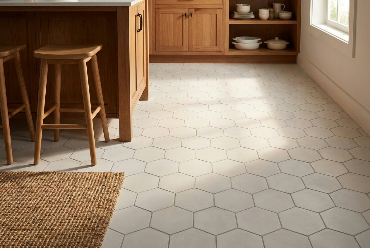
A coastal kitchen often needs texture without fussiness. In that setting, a small- to medium-scale hex tile can work well if the color range stays narrow and the grout doesn't shout. The island becomes the focal point, but the pattern reads more like surface rhythm than decoration.
This kind of project succeeds when the designer resists over-styling it. Flat-front cabinets, simple stools, and a plain backsplash let the counter carry the craft. The edge should stay clean. The sink cutout should avoid tiny leftover slivers. If the layout is centered properly, the result feels calm and custom.
The lesson here is that a geometric tile doesn't need high contrast to feel intentional. Sometimes the smartest move is letting shape do the work while color stays quiet.
Boutique café with a bold encaustic-style statement
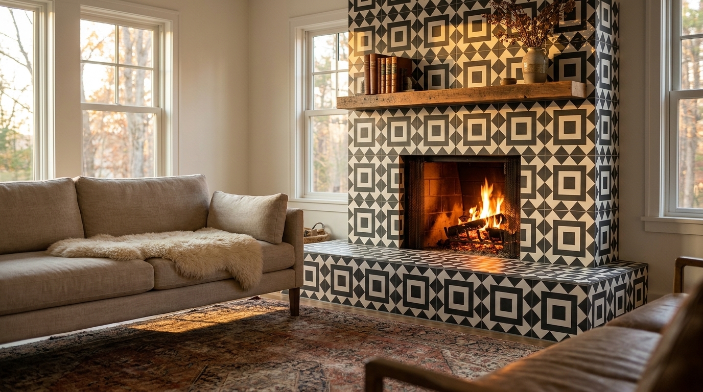
Commercial hospitality projects often want the opposite. They need a bar or service counter that people remember. A patterned handcrafted cement tile can do that beautifully because the surface has depth and presence even before the motif kicks in.
But this is also where specification discipline matters most. A café counter sees spills, repeated wiping, and constant visual scrutiny at close range. The pattern has to align. The edge has to look resolved from the customer side. The grout choice and installation quality become part of the brand impression, whether the owner realizes it or not.
In a project like this, the strongest design move is often limiting the statement to one surface. The front bar face or the top gets the pattern. Nearby walls, shelving, and service details stay simpler. That keeps the tile from turning into visual noise.
A countertop can be the star of the room. It just can't compete with five other stars at the same time.
Luxury apartment bar top in a monochrome fish-scale format
A bar top in a luxury apartment asks for another kind of control. Here, fish-scale or arabesque forms can feel modern if the palette stays monochrome and the grout is tuned carefully to the tile. The shape supplies softness. The color restraint keeps it from reading ornate.
This is the kind of installation where craftsmanship shows up in small things. Are the curves aligned cleanly at the edge? Does the grout fill consistently without making the pattern muddy? Does the transition to adjacent surfaces feel crisp? Those details decide whether the result looks bespoke or merely busy.
Monochrome tile countertops also prove that “modern” doesn't require minimalism in the strict slab sense. A shaped tile can still feel contemporary when the composition is disciplined.
What these examples have in common
These projects look different, but they share the same decision framework:
| Project type | Best tile move | Main risk to avoid |
|---|---|---|
| Relaxed residential kitchen | Low-contrast geometry | Over-patterning the whole room |
| High-traffic hospitality bar | Bold focal motif | Weak specification at edges and joints |
| Refined apartment bar | Monochrome shaped tile | Letting grout overpower the form |
The common thread is simple. Successful modern tile countertops balance aesthetics, installation realism, and ownership expectations.
If you want the lowest-maintenance path, another material may fit better. If you want a countertop with tactility, history, and a sense that human hands were involved, tile earns its place. Handcrafted cement becomes especially compelling when you value matte surface character, inlaid color, and design flexibility enough to plan for the details that come with it.
That's the real decision. Not whether tile is “back,” but whether your project calls for a surface with personality and whether you're ready to specify it well.
If you want a handcrafted cement tile surface with real design depth, Original Mission Tile is a strong place to start. You can explore ready-made patterns, review material options, or develop a custom concept that fits your kitchen, bar, or hospitality project without settling for a generic slab look.