You're probably looking at a kitchen that already has some of the right bones. Maybe there's quarter-sawn oak, a stout window trim, a sturdy old footprint, or at least a remodel plan that leans warm rather than slick. Then you get to the backsplash and the easy answers start to feel wrong. Too plain, and the room falls flat. Too decorative, and the kitchen starts reading like a stage set.
That tension is where most Craftsman kitchens succeed or fail. A good craftsman style tile backsplash doesn't copy the past tile for tile. It carries the same values: restraint, order, material presence, and a sense that the surface belongs to the architecture around it.
Achieving the Authentic Craftsman Backsplash in a Modern Home
A lot of homeowners start with a similar dilemma. They want the kitchen to feel grounded and soulful, but they also have a stainless range, better lighting, wider openings, and storage expectations that no early kitchen had. The result is often hesitation right where it matters most: the wall surface between counter and cabinet.

That's why broad advice like “choose artisan tile” usually isn't enough. The design problem is making a Craftsman look work with contemporary appliances and open-plan layouts, while balancing details like a modern range hood or floating shelves and deciding how far to push historic accuracy versus an updated interpretation, as discussed in this Craftsman kitchen design guide.
Where authenticity actually comes from
In practice, authenticity comes less from copying a photograph and more from choosing a tile language that feels architecturally believable. The backsplash should look settled. It should read as part of the cabinet line, the counter line, and the window trim, not as a separate decorative event pasted onto the wall.
A few moves usually help:
- Keep the geometry disciplined. Repeated shapes and straightforward alignment feel more believable than busy novelty patterns.
- Let the material show itself. Matte surfaces and slight variation usually support the room better than hard shine.
- Treat accents carefully. One framed focal area can work. A patchwork of unrelated details usually doesn't.
A better standard than strict reproduction
The kitchen doesn't need to become a period replica to feel right. In fact, forcing strict reproduction into a modern layout often creates visual friction. A wide range hood, slab-front appliance panels, or open shelving can coexist with a Craftsman backsplash if the tile field remains calm and proportionate.
If you're studying precedents, it helps to look at historic tile patterns used in traditional interiors and then edit them for the room you have. That approach keeps the spirit intact without making the kitchen feel frozen in time.
The strongest Craftsman kitchens feel lived in and settled. They don't look themed.
The Soul of Craftsman Design Key Backsplash Principles
The backsplash only works when the underlying design logic is sound. Craftsman design came out of the Arts and Crafts movement in the late 19th and early 20th centuries, with an emphasis on honest materials, restraint, and handcraft. In kitchens, tile wasn't a decorative afterthought. From 1900 to 1940, simple, matte, geometric forms helped define the visual language of the style, as described in this history of Craftsman kitchen tile.
Honest materials over imitation
A Craftsman backsplash should look like what it is. If the tile is ceramic, porcelain, or cement, let it behave like that material. Surfaces that try too hard to imitate marble veining, reclaimed wood, or industrial metal usually pull the room away from Craftsman discipline.
That's one reason matte finishes work so well here. They support wood grain, painted millwork, and natural light instead of competing with them.
Simplicity of form
Craftsman rooms can handle pattern, but they don't respond well to fussiness. Straight grids, orderly repeats, and geometric shapes feel at home. Ornate arabesques, loud contrast, and highly polished mosaics tend to fight the architecture.
A practical check is this: if the backsplash grabs more attention than the cabinetry and trim, it's probably overshooting.
Practical rule: In a Craftsman kitchen, tile should support the room's structure first and decorate second.
Handcraft without chaos
Handmade character matters, but there's a line between healthy variation and visual noise. A little shift in edge, color depth, or surface texture gives the wall life. Too much variation makes the installation look accidental.
That same principle carries into furniture and adjacent work zones. In homes where the kitchen opens into a study nook or family workspace, even the furniture choice affects whether the room feels coherent. For built-ins or adjacent millwork with similar architectural weight, it's useful to discover functional file cabinet desks that share that grounded, furniture-grade presence instead of introducing something flimsy or overtly contemporary.
Harmony with the architecture
The best backsplash decisions come from what's already in the room:
- Wood species and stain depth should guide tile warmth.
- Counter edge profile should influence how crisp or softened the tile field feels.
- Window and door casing should help determine whether the backsplash stays quiet or takes on a small border detail.
When people miss the mark, it's often because they choose a tile in isolation. Craftsman design doesn't reward isolated choices. It rewards relationships between surfaces.
Choosing Your Craftsman Tile Material and Format
Material choice decides more than maintenance. It sets the visual temperature of the room, the amount of variation you'll see from tile to tile, and how believable the backsplash feels next to old-style woodwork or modern cabinetry.
Material comparison that matters in real kitchens
For an authentic look, many people gravitate toward handmade surfaces because they carry a softness and visual depth that factory-perfect tile often lacks. Cement tile fits that instinct well when the goal is a matte, substantial wall surface with visible material character. It has a silky appearance, strong body color, and enough variation to keep the wall from feeling sterile. The tradeoff is care. It needs proper sealing and a little respect during installation and cleaning.
Ceramic can also work, especially when the glaze is muted and the tile shape stays simple. It's often easier for homeowners who want a traditional look without the maintenance expectations that come with more porous materials. The caution is finish selection. Once ceramic gets too glossy or too mechanically perfect, the room can lose the warmth that makes Craftsman interiors persuasive.
Porcelain is often the technical upgrade path for wet areas because it is denser and typically lower in water absorption than ceramic. One Craftsman-oriented porcelain line is specified for Interior, Wet (IW) use under ANSI A326.3 and comes in 12×12, 12×24, and 25-piece mosaic formats, which shows how current products can blend wet-area durability with modular field-and-border composition in a Craftsman vocabulary, as noted in this porcelain product literature.

A quick side-by-side view
| Material | What it does well | Watch for | Best fit |
|---|---|---|---|
| Handmade cement tile | Matte depth, tactile surface, visible handcraft | Sealing, careful cleaning, installer familiarity | Character-driven kitchens where material richness matters |
| Ceramic tile | Traditional feel, easier upkeep, broad availability | Overly glossy glazes, overly slick styling | Classic remodels that need simplicity and practicality |
| Porcelain tile | Strong moisture performance, stable formats, durable finish | Can look too hard-edged if the finish is wrong | Busy kitchens and households that want low-fuss durability |
A useful technical and design overview appears in this homeowner's guide to choosing and using cement tile, especially if you're comparing handmade cement against factory-made alternatives.
Format is just as important as material
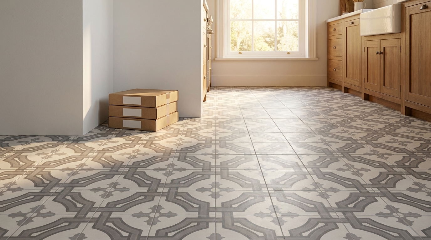
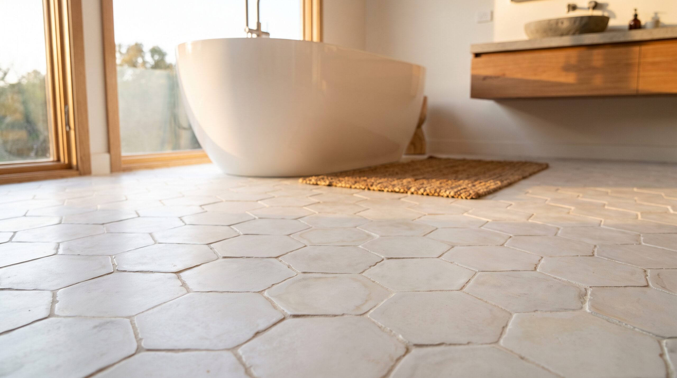
Historically accurate Craftsman-style backsplashes are strongly associated with matte off-white hexagonal tile in 1-inch, 2-inch, or 3-inch widths, or with larger square tiles laid in simple, rectilinear fields, according to this backsplash history reference. That matters because size changes the visual rhythm of the wall.
Here's how those formats behave in practice:
- Small hex tile works well when you want a period-leaning look and a softer, more articulated surface.
- Square tile is often the safest route when the room already has strong wood grain, prominent cabinet rails, or heavy trim.
- Modest rectangles can work in updated Craftsman kitchens, but they need restraint. Keep them matte and avoid slick, high-contrast installations.
What tends to work and what usually doesn't
Good choices often include muted square fields, small-format hex, or modestly scaled handmade tile with a soft surface. These formats sit comfortably with painted inset cabinetry, stained wood, soapstone-like counters, and aged brass or bronze hardware.
Less successful choices usually share one problem: they're trying to inject trend into a room that wants permanence. Oversized glossy slabs, bold graphic veining, and stark black-and-white contrast can all be beautiful in the right kitchen. They rarely feel native to a Craftsman one.
Designing Your Backsplash Layout and Pattern
Layout is where good tile choices either settle into the room or start fighting it. The right material in the wrong pattern still looks wrong.

Early 20th-century tile trends favored compact formats such as hexagon, 1-inch square, penny rounds, and pinwheel patterns. Those modular shapes adapted well to counters, wainscot lines, and openings while preserving the ordered, handcrafted look associated with Craftsman interiors, as shown in this historic floor tile pattern reference.
Start with the field, not the accent
The strongest craftsman style tile backsplash usually begins as a quiet field. A straight grid of squares or a tightly organized small-format layout gives the room backbone. Once that field is right, you can decide whether the kitchen needs any additional emphasis at all.
In many projects, the answer is no. The cabinetry, hardware, wood trim, and countertop already provide enough information. The backsplash's job is to connect them.
Three layout approaches that hold up
Simple full-height field
This is the most dependable option. Use one tile shape, one main color family, and a consistent layout from counter to the underside of the cabinet or shelf. It's especially effective when the room has strong millwork or a noticeable hood.Field tile with a restrained border
A narrow border can help define the top of the backsplash or frame a change in plane near a window or cooking alcove. The key is restraint. The border should read like architectural trim, not like jewelry.Framed focal panel over the range
This can work well in a modern kitchen that needs a visual anchor. The surrounding field should stay calm so the feature area feels intentional rather than busy.
Don't force a focal point above the range if the hood already provides one. Two competing centers make the wall feel unsettled.
Pattern should follow architecture
A good Craftsman layout respects the room's lines. Tile edges should terminate cleanly at casings and shelves. Pattern breaks should happen where the architecture gives them permission. Random starts and stops are what make handcrafted work look amateur.
If you want to study layouts that lean Craftsman without becoming fussy, this collection of Craftsman style tile patterns is a useful reference point for fields, borders, and framed compositions.
Common layout mistakes
- Using too many tile shapes at once creates visual chatter.
- Centering everything on the room instead of the architecture often throws off windows, outlets, or hood lines.
- Treating the backsplash as a mural can make the kitchen feel disconnected from the rest of the house.
The guiding idea is simple. Pattern should reinforce the architecture already present. If it calls attention away from the room's structure, pull it back.
Installation Details That Perfect the Craftsman Look
Most backsplash problems aren't caused by the tile selection. They come from the last decisions made on site. Grout, cut placement, outlet trimming, edge conditions, and sealing all decide whether the finished wall feels composed or careless.
Grout is part of the design
In a Craftsman kitchen, grout shouldn't be treated as filler. It shapes the visual rhythm of the wall. A tonal grout often gives square, rectangular, or mosaic fields a calmer appearance, especially when the goal is to preserve a handcrafted look rather than outline every tile.
High-contrast grout can work in other design styles. In Craftsman interiors, it often creates too much graphic separation. The wall starts reading as a pattern exercise instead of a material surface.

Detail the edges before installation starts
A backsplash looks more architectural when edge decisions are settled early. That includes:
- Outlet placement so cuts don't fall awkwardly across decorative elements
- Shelf and hood alignment so the tile field has a clean stopping point
- Cabinet return conditions so the installation doesn't die into drywall clumsily
If the room includes field tile plus border work, dry-lay the hierarchy before setting. Installers need to know which line governs the composition.
On-site reminder: A handmade-looking backsplash still needs disciplined layout. Craft isn't the same as improvisation.
Sealing and moisture performance
If you choose a more absorbent handmade material, sealing is not optional. It protects the surface from kitchen staining and helps preserve the intended finish. That's especially important behind ranges, prep areas, and any wall likely to see oil, splatter, or repeated wiping.
For homeowners who want the Craftsman look with more technical forgiveness, porcelain can be a sensible choice. Contemporary lines designed for Interior, Wet (IW) use under ANSI A326.3 show that you can get modular field-and-border options while still prioritizing moisture performance. That's a practical match for families who cook heavily or want less maintenance pressure.
The room should feel finished, not tiled
The final pass is visual editing. Switch plates, cabinet scribes, shelf brackets, and countertop transitions all need to belong to the same language. If one detail goes glossy, oversized, or overly modern, it can break the spell of an otherwise well-composed wall.
Good Craftsman installations feel integrated. You don't notice the cuts first. You notice the room.
Budgeting and Planning Your Craftsman Backsplash Project
A Craftsman backsplash project usually involves a clear tradeoff between character, maintenance, and scheduling. The most economical route is often a simple ceramic field tile in a straightforward layout. That keeps labor more predictable and avoids some of the care requirements that come with more porous or handmade materials.
Porcelain sits in a practical middle ground for many kitchens. It offers a broad range of sizes and dependable performance, especially for households that want a matte look without extra upkeep. Handmade cement tile asks for more planning, both because installation standards matter and because sealing and long-term care need to be discussed before the first box is opened.
Where the real value sits
The smartest budgeting move is deciding where authenticity matters most in your kitchen. Some clients spend on material and keep the layout quiet. Others choose a simpler field tile and put their budget into a border, framed panel, or more careful trim integration.
A few planning points usually keep the project on track:
- Order samples early. Matte surfaces, grout pairing, and color variation read differently in person than on a screen.
- Confirm installer experience. A backsplash with borders, handmade variation, or specialty sealing needs a setter who respects layout and finish requirements.
- Build your schedule around lead times. In-stock tile supports tighter remodel timelines. Custom work needs more patience and earlier decisions.
- Match maintenance to household habits. A low-maintenance kitchen and a character-rich kitchen can overlap, but they aren't always the same thing.
A kitchen like this earns its keep over time. It doesn't depend on trend. It depends on proportion, material honesty, and careful execution.
If you want a craftsman style tile backsplash that feels rooted rather than theatrical, Original Mission Tile offers handmade cement tile, stock patterns, and custom design options that fit both historically informed kitchens and updated interpretations. It's a useful starting point when you need a matte surface, architectural pattern, and material presence that can hold its own beside wood cabinetry and modern appliances.