What if your tile did more than finish a surface? Most articles about ideas for tiles stop at style boards and color trends. They show pretty rooms, but they rarely explain why one pattern feels architectural, why another falls apart in an awkward room, or how grout, layout, and maintenance change the result.
That gap matters because tile has always been more than decoration. It's one of the oldest building finishes still in continuous use, with archaeological evidence placing the earliest known tiles in Egypt at about 4,700 BC, giving the material a documented history of roughly 6,700 years according to Sunwood Development's tile history overview. The reason tile has lasted that long is simple. It solves real problems well. It holds up, resists water, and cleans easily.
In 2026, the strongest ideas for tiles still need that practical backbone. The difference is that handmade cement tile lets you push much harder on pattern, color, shape, and customization without losing the grounded, architectural feel that makes tile worth specifying in the first place. Inlaid pigment, matte surfaces, and traditional hydraulic-press construction give cement tile a depth that printed surfaces often miss.
The ideas below are built for real projects. They connect design intent to layout decisions, grout strategy, sight lines, and maintenance. If you're sourcing for a fast-moving remodel, a hospitality concept, or a custom residential build, these are the tile moves that create character without turning installation into chaos.
1. Geometric Patterns with Bold Color Blocking

Strong geometry works best when the room already has clean lines. Think entry halls, powder rooms, restaurant vestibules, and kitchen backsplashes framed by slab-front cabinetry. Handmade cement tile is especially good here because the color is inlaid into the tile body rather than sitting on a glossy printed surface, so the pattern reads as material, not graphic overlay.
The mistake people make is scale. Large, high-contrast geometrics can overwhelm a compact room if every plane competes for attention. I've had the best results using bold color blocking on one dominant surface, then giving the eye a place to rest with plain cement field tile, simple plaster walls, or quiet millwork.
Where bold geometry lands best
A hotel-style entry is the easiest place to be brave. The pattern greets you, sets the tone, and then stops. In a residential kitchen, I prefer using geometric tile either on the floor under an island zone or on a backsplash with minimal upper cabinetry, where the pattern can breathe.
- Use contrast with discipline: Black with warm white, terracotta with sand, or muted green with cream usually ages better than stacking too many saturated colors.
- Plan for sight lines: A pattern seen on approach reads differently than one viewed from above. Dry-lay enough tile to check how the geometry hits doorways and focal points.
- Let plain tile do some work: A border of solid color can make a bold pattern feel framed instead of busy.
Practical rule: If the pattern is the first thing you notice, that's good. If it's the only thing you notice, it's probably too much.
For irregular rooms, geometry needs even more discipline. General layout guidance for awkward spaces notes that diagonal layouts can visually absorb angled walls and uneven corners, while centered starts and border strategies can reduce imbalance, according to Spenza Ceramics' guidance on tiling irregular rooms. That matters with cement tile because small edge cuts can make a crisp geometric pattern look accidental fast.
2. Zellige-Inspired Handcrafted Moroccan Designs

Some spaces need geometry with a softer hand. That's where zellige-inspired motifs shine. They bring history, rhythm, and ornament, but they don't have to feel heavy or old-world when the palette is controlled and the surrounding materials are simple.
What I like about this direction in cement tile is the balance between hand-crafted character and everyday durability. You still get the layered, artisan look associated with Moroccan influence, but in a format that suits floors, walls, baths, and hospitality settings that need more predictability in wear.
How to keep it sophisticated
Use zellige-inspired patterns where people naturally pause. A vanity wall, a powder room floor, a boutique hotel niche, or a dining room feature panel all give the motif enough importance without turning the whole room into a theme.
Pairing matters more than is commonly understood. Natural wood, aged brass, limewash, and quiet stone all work. Busy veined countertops and highly decorative wallpaper usually don't.
Keep the palette grounded. Earth-tone grout, warm whites, olive, sand, and faded blue tend to support the handmade look better than bright, sharp contrast.
If you want that look in a cement-based product family, browse Original Mission Tile's zellige-inspired collection. It's a useful option when you want the visual language of Moroccan craft but need a material story that integrates with the rest of a cement tile scheme.
For real projects, I'd use this style in a bohemian bath, a Santa Fe hospitality concept, or a Mediterranean-influenced kitchen pantry wall. The key is restraint. One memorable tile surface with solid companions almost always looks better than wrapping every wall.
3. Terrazzo and Aggregate Finishes
Terrazzo-style tile solves a very specific design problem. You want movement, but not a formal pattern. You want visual richness, but not a motif that dictates the entire room. Aggregate finishes do that well because the eye reads them as texture first and pattern second.
That makes them useful in kitchens, office lobbies, bar fronts, and bath floors where a plain tile would feel dead but a decorative encaustic-style pattern would fight the architecture. Speckling also hides dust and daily wear better than many flat mid-tone solids, which is one reason designers keep coming back to terrazzo looks for active spaces.
Why terrazzo works in busy programs
In the larger global ceramic tiles market, floor tile accounted for about 49.3% of market share in 2024, and residential end use generated over 60.1% of revenue, according to SkyQuest's ceramic tiles market report. That tracks with what specifiers see in practice. Floors still carry the main performance burden, especially in homes, and surfaces that can take visual traffic without looking tired have real value.
Terrazzo-style cement tile fits that need well when you want a matte, grounded finish instead of a slick polished look. It also plays nicely with brass, oak, walnut, painted cabinetry, and exposed concrete.
- Seal on schedule: Aggregate surfaces need regular sealing if you want them to resist staining well.
- Use lighting intentionally: Side light and daylight bring out chips and mineral variation better than flat overhead light alone.
- Mix with calm companions: Pair terrazzo with simple field tile or quiet plaster so the speckling reads as refined, not noisy.
If you're comparing options, Original Mission Tile's cement terrazzo tile collection is worth reviewing alongside broader hardscape references like Moore Construction Co. outdoor living solutions when you're thinking through texture, surface character, and how aggregate reads in different settings.
4. Three-Dimensional Textured Tiles
Flat tile reflects light. Relief tile shapes it. That difference is why three-dimensional tile can make a wall feel architectural even before you add art, mirrors, or shelving.
This category works best on vertical surfaces where shadow is part of the design. Fireplace surrounds, reception walls, spa corridors, powder room feature walls, and hotel check-in backdrops all benefit from a tile that changes through the day as light shifts. Cement tile's matte finish helps here because it gives you shadow and form without the glare that can flatten detail.
Here's a quick visual reference for the kind of dimensional effect designers are leaning into:
What works and what doesn't
Textured tile needs restraint. Covering an entire small room in relief usually creates visual fatigue and a dusting chore. One feature plane is stronger. Two can work if one is subordinate and the color stays quiet.
Lighting is not optional. If the wall only gets flat recessed light from directly overhead, much of the depth disappears. Add sconces, side lighting, or even a well-placed lamp and the surface comes alive.
A dimensional tile wall without good light is like a carved door painted shut. The craft is there, but you won't feel it.
For current examples and applications, Original Mission Tile's 3D tile design page shows where sculptural wall surfaces fit in contemporary interiors. I'd keep grout close to the tile color on most relief work. High-contrast grout can make the wall look grid-heavy instead of sculptural.
5. Brass and Metal-Accented Tiles
Metal-accented tile is a statement move, but it's only convincing when the room earns it. A powder room with warm lighting, a cocktail bar backsplash, a boutique retail fitting area, or a dramatic vanity wall can support brass or copper details. A casual family mudroom usually can't.
The appeal is obvious. Metal catches light, breaks up matte surfaces, and gives cement tile a dressier edge without changing the fundamental material language. The risk is just as obvious. Too much metal turns elegant detail into novelty.
Where metal belongs
I like brass-accented tile in smaller fields. Borders, inset panels, vanity backsplashes, niche surrounds, and medallion moments all make sense. Whole floors are harder to pull off unless the palette is very disciplined and the room is designed around the tile from the start.
Cleaning also needs a reality check. Metal details shouldn't be treated with aggressive chemicals or abrasive pads. In working hospitality settings, that maintenance conversation needs to happen before the tile is specified, not after installation.
- Use metal where people notice it up close: Powder rooms and bar areas reward detail better than large transitional corridors.
- Pair with matte neighbors: Limewash, stone, and plain cement field tiles keep metallic accents from feeling flashy.
- Expect change over time: Patina is part of the story. If the client wants perfectly static shine forever, this may be the wrong direction.
A good brass-accented floor can feel refined and luxurious. A bad one feels like costume jewelry. The difference usually comes down to scale and restraint.
6. Custom Monogram and Personalized Designs
Personalized tile can be fantastic or a mistake. The dividing line is whether the custom element feels architectural or merely personal. A hotel logo at an entry, a family crest in a historic foyer, or a winery insignia in a tasting room often makes sense because the mark belongs to the place. An oversized set of initials in the middle of a main kitchen floor usually ages poorly.
Handmade cement tile is one of the few surfaces where customization still feels rooted in craft. Because color and motif are built into the tile language itself, a custom design can read as part of the architecture rather than an applied graphic.
How to personalize without dating the room
Keep the custom moment localized. Entries, thresholds, landings, fountain surrounds, and fireplace hearths are ideal because they naturally frame a motif. You want the monogram or emblem to be discovered, not shouted.
I also recommend keeping the surrounding field classic. If the personalized tile is complex, use simple border tile and muted grout. If the monogram is minimal, you can afford a little more surrounding pattern.
Field note: The best custom tile doesn't ask for attention. It rewards it.
For resale-sensitive residential work, I usually steer clients toward heritage references, house names, abstract family symbols, or custom borders instead of literal initials across major public rooms. That gives them something personal without making the house feel overclaimed.
If you're developing a branded environment, a monogrammed cement tile floor in a reception area or boutique hospitality lobby can be one of the most memorable ideas for tiles because it ties design and identity together in a durable way.
7. Hexagon and Specialty Shape Tiles
Square tile is dependable, but shape changes how a room moves. Hexagons, arabesques, fish scales, star-and-cross systems, and other specialty formats create rhythm before you even add pattern. That's why shape-driven tile often works well when you want interest without a highly decorative printed look.
The caution is installation. Specialty shapes ask more from the setter. In the U.S., flooring installers and tile and stone setters earned a median annual wage of $52,000 in May 2024, and the occupation is projected to grow 6% from 2024 to 2034, with about 8,400 openings each year on average, according to the Bureau of Labor Statistics profile for tile and marble setters. Those figures matter because layout-heavy work depends on labor availability and skill, not just material selection.
Shape is design. Shape is labor.
Hex tile can look effortless when it's done well, but it rarely is. Specialty formats increase layout time, perimeter cuts, and the need for a clear setting plan. That's especially true in bathrooms with out-of-square walls, kitchen backsplashes broken by outlets, or historic homes with irregular geometry.
- Draw the layout before ordering: Don't assume the installer can solve every transition on the fly.
- Choose grout deliberately: Darker grout outlines shape. Closer grout softens it.
- Use shape for emphasis: A hex floor under a freestanding tub or an arabesque backsplash inside a niche can be enough.
Specialty shapes are some of the most effective ideas for tiles when the room itself is simple. Let the format create movement, then keep color and surrounding materials calm.
8. Patchwork and Mixed Pattern Collections
Patchwork can be brilliant because it feels collected rather than decorated. It can also become visual clutter in a hurry. The best mixed-pattern floors look curated, with a clear color family and a reason for the variation. The worst ones feel like leftovers.
Cement tile is particularly good at patchwork because the matte surface and mineral-based color soften the transitions between motifs. Even when the patterns differ, the material language stays consistent. That unity is what keeps a multi-pattern floor from looking chaotic.
How to make patchwork feel intentional
Use patchwork where a field can be clearly contained. Entryways, breakfast nooks, small bathrooms, covered patios, and hospitality vestibules are good candidates because the pattern area reads as a defined zone. Opening patchwork directly into several adjoining rooms without a visual boundary often weakens the effect.
A border can help. So can a strong perimeter condition like cabinetry, a threshold, or a wall return. If you're mixing motifs, keep one element stable. Usually that's the color palette.
For broader interior context, designing with mixed patterns offers useful thinking on balance and restraint that translates well to tile. In practice, I'd combine no more than a few clearly related motifs in most residential spaces. Hospitality can push further because those interiors are built for stronger visual identity.
Patchwork is also one of the smartest ideas for tiles when you want a handmade, traveled feel without relying on a single dominant pattern. The room gets richness, but each motif carries only part of the visual load.
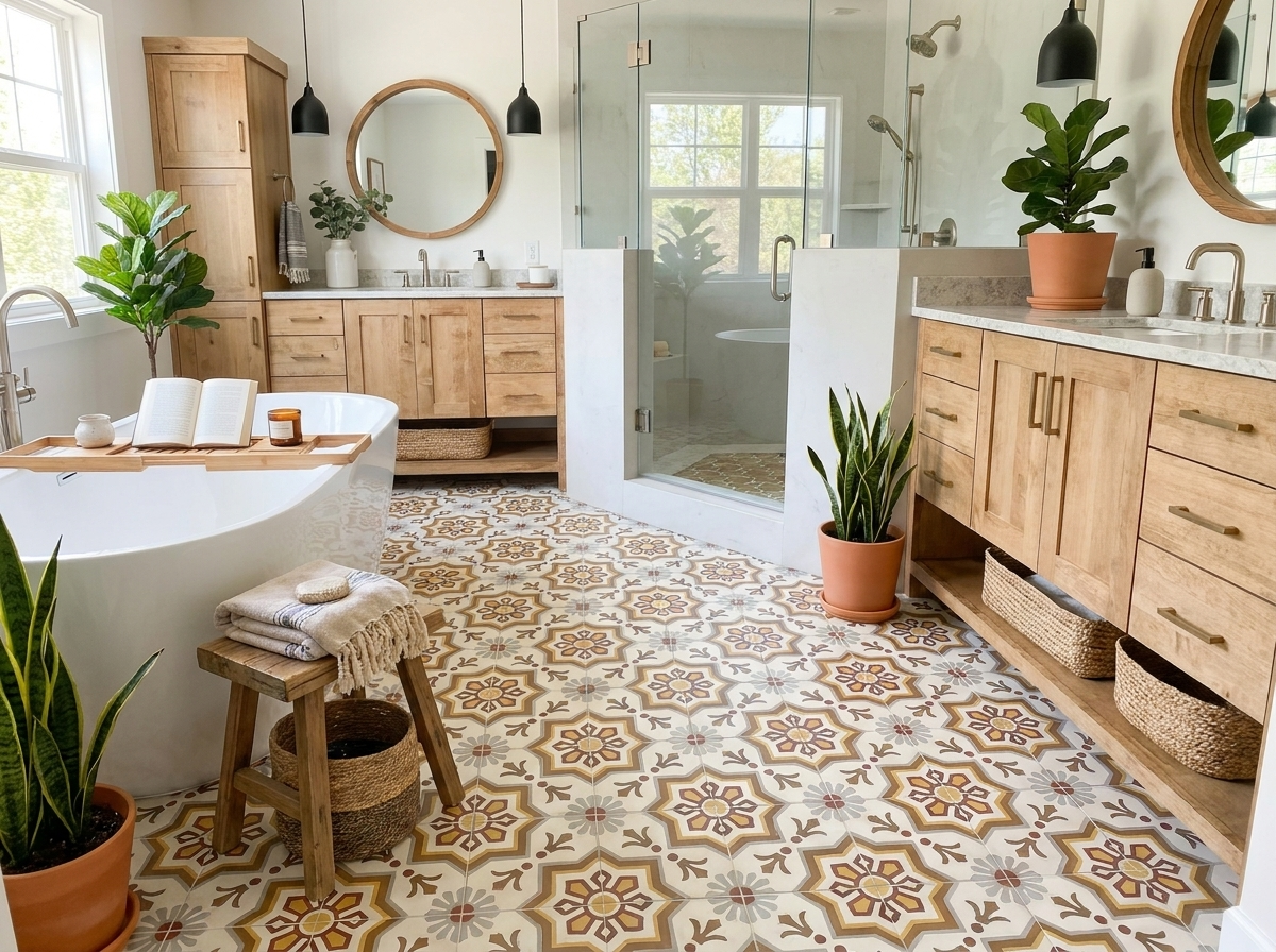
9. Terracotta and Warm Earth Tone Tiles
Warm earth tones are back for a reason. They make rooms feel settled. Not trendy, not shouty, just grounded. Terracotta-inspired cement tile brings that warmth without locking you into literal rusticity.
This is one of the easiest directions to live with long term. Burnt orange, clay, rust, ochre, tobacco, and dusty rose tones pair naturally with plaster, white oak, linen, unlacquered brass, and darker painted cabinetry. They also hide day-to-day dust and wear better than crisp white floors in many settings.
Why warm tones are gaining ground
Sustainability has become part of the buying conversation too. The global eco-friendly tiles market is estimated at USD 8.84 billion in 2024 and is projected to reach USD 25.43 billion by 2035, implying a 10.08% CAGR, while North America holds about 45% of global share according to Market Research Future's eco-friendly tiles market report. That doesn't mean every warm-toned tile is automatically sustainable, but it does show buyers are actively looking at tile through a broader material lens.
Terracotta-inspired cement tile fits that mood well because it feels elemental and durable. It can suit a Spanish Colonial entry, a farmhouse pantry, a resort lobby, or a contemporary kitchen that needs warmth.
- Match grout temperature to tile temperature: Cool gray grout can flatten a warm palette.
- Mix solids and motifs: A mostly solid terracotta field with patterned accents often feels more timeless than pattern everywhere.
- Seal and maintain properly: Earth tones age beautifully when the surface is protected and cleaned with the right products.
If you want warmth without nostalgia, this is the direction I'd consider first.
10. Fish Scale and Curved Pattern Tiles
Curved tile changes the emotional tone of a room. While squares and hexagons feel architectural and ordered, fish scale and scallop profiles feel softer, more fluid, and a little more atmospheric. That's why they're so effective in powder rooms, spa baths, pool houses, and hospitality settings that benefit from a less rigid mood.
The challenge is alignment. Curved profiles demand careful setting so the arcs feel continuous and the grout joints stay visually controlled. This is not the tile to improvise with once the thin-set is open.
Curves need a clear plan
I like fish scale tile on a vanity wall, shower feature wall, or bar front where the shape can be appreciated at close range. On a full floor, the pattern can be striking, but it asks much more from the installer and from the room around it. Too many competing curves in mirrors, millwork, and fixtures can make the whole composition feel overly themed.
Transitions matter even more when the tile field changes shape or orientation. Independent design guidance on tile transitions notes that clean lines depend on careful prep and pre-layout, while contrasting transitions can define areas intentionally, according to Mercury Mosaics' article on unique tile transitions. That's especially relevant in open-plan baths, wet-room concepts, and mixed-material hospitality interiors where curved tile meets stone, wood, or plain field tile.
Curved tile looks effortless only after someone has done the hard work of lining it up.
For color, I usually prefer soft neutrals, sea-glass greens, warm whites, clay tones, or smoky blues. Light tones show the curve clearly. Dark tones can be beautiful too, but they make the shape subtler and put more pressure on lighting to reveal the pattern.
10 Tile Design Ideas Comparison
Which tile direction gives the strongest result for the room you are building, and which one asks the most from layout, grout, maintenance, and labor? A comparison table helps, but the useful version is the one that reflects how handmade cement tile behaves on site, not just how it looks on a mood board.
| Tile Style | 🔄 Implementation Complexity | ⚡ Resource Requirements | ⭐ Expected Outcomes | 📊 Ideal Use Cases | 💡 Key Advantages / Tips |
|---|---|---|---|---|---|
| Geometric Patterns with Bold Color Blocking | Medium to High. Precise layout and sight-line planning matter. | Moderate material cost, skilled installer, Design Studio customization | ⭐⭐⭐⭐, strong visual impact and clear architectural definition | Entry foyers, feature walls, backsplashes, accent flooring, commercial lobbies | Handmade cement tile holds crisp color fields well. Dry-lay first, then choose grout that supports the pattern instead of competing with it. |
| Zellige-Inspired Handcrafted Moroccan Designs | High. Intricate layouts and careful placement take time. | Skilled labor, attention to natural color variation, more layout time | ⭐⭐⭐⭐, handcrafted character with durable cement performance | Bathrooms, backsplash accents, spa features, hospitality settings | Best used where the surface can be seen up close. Pair with quieter field tile and use grout in a close earth tone to keep the pattern cohesive. |
| Terrazzo and Aggregate Finishes | Medium. Substrate prep and sealing affect the final result. | Moderate materials, heavier tiles, periodic sealing and maintenance | ⭐⭐⭐⭐, refined texture and strong wear-hiding performance | Kitchen counters, flooring, hotel lobbies, bathroom vanities | A good choice for busy rooms because visual movement softens everyday wear. Check slip resistance if the tile is going on a floor. |
| Three-Dimensional Textured Tiles | High. Grout choice, lighting, and alignment all need control. | Specialized installers, higher cost, careful maintenance | ⭐⭐⭐⭐, strong shadow play and a tactile architectural surface | Feature walls, fireplace surrounds, galleries, spa installations | Relief tile reads best on walls, not hard-working floors. Keep grout joints clean and plan lighting early so the texture is visible. |
| Brass and Metal-Accented Tiles | Medium. Inlay handling must stay precise. | Higher material cost, careful cleaning to protect metal | ⭐⭐⭐⭐, reflective detail that can improve depth and contrast | Powder rooms, backsplashes, entry features, bars and restaurants | Use as an accent rather than a full field in most projects. Expect patina over time and specify pH-neutral cleaners from the start. |
| Custom Monogram and Personalized Designs | High. Proofing, layout, and lead times require coordination. | Higher cost, made-to-order production, possible minimums | ⭐⭐⭐⭐, customized identity and strong project-specific character | Grand entryways, luxury lobbies, historic restorations, private suites | Custom cement tile works best when the graphic belongs to the architecture. Original Mission Tile's in-stock and custom programs are useful here because they let designers balance lead time, budget, and one-of-a-kind detail. |
| Hexagon and Specialty Shape Tiles | High. More cuts, more waste, more layout decisions. | Labor-intensive install, higher labor cost, detailed planning | ⭐⭐⭐⭐, distinctive geometry and flexible pattern options | Bathroom floors and walls, backsplashes, entryways, feature installations | Specialty shapes can solve awkward proportions or make them worse. Mock up corners, edges, and transitions before install day. |
| Patchwork and Mixed Pattern Collections | Medium. Coordination is easier, but placement still matters. | Moderate cost, pre-coordinated sets reduce design time | ⭐⭐⭐⭐, layered, collected-looking results with controlled variety | Entryways, bathrooms, kitchen backsplashes, hospitality features | Handmade cement tile is especially effective here because the material keeps mixed patterns feeling related. Use a calm border or plain field tile to give the eye a place to rest. |
| Terracotta and Warm Earth Tone Tiles | Low to Medium. Installation is straightforward, sealing is usually recommended. | Moderate materials, regular sealing to protect the finish | ⭐⭐⭐⭐, warm, grounded character that pairs well with natural materials | Kitchen floors, bathrooms, entryways, covered outdoor porches | These tones hide dust well and age gracefully. Warm grout usually reads better than stark white in this palette. |
| Fish Scale and Curved Pattern Tiles | High. Alignment is exacting and cuts can multiply quickly. | Skilled labor, careful planning, potential waste | ⭐⭐⭐⭐, soft movement that suits water-adjacent spaces | Bathrooms, shower surrounds, spas, pool areas, powder rooms | Curved profiles show every layout decision. Use simple companion tile, control grout joint consistency, and order enough extra material for cuts and sorting. |
The practical takeaway is simple. Handmade cement tile gives more design freedom than many factory-made options, but the more expressive the pattern, shape, or finish, the more the installation details matter. If the project needs faster decisions, in-stock options reduce lead time. If the room calls for a specific motif, colorway, or identity marker, custom production makes more sense.
Ready to Bring Your Tile Ideas to Life?
Tile has lasting power because it does two jobs at once. It performs, and it communicates. It protects a wall or floor, but it also tells you what kind of room you're in. That's why the best ideas for tiles don't start with trend chasing. They start with mood, architecture, and use.
A bold geometric floor can sharpen a clean modern entry. A zellige-inspired motif can soften a bath with craft and history. Terrazzo-style tile can bring movement to a high-traffic room without introducing a formal pattern. Relief tile can turn a wall into architecture. Warm terracotta can make a new build feel settled. A custom monogram can give a hospitality project or historic renovation a sense of identity when it's handled with restraint.
What matters most is pairing the idea with the right application. Some tile concepts want to be focal points. Others work better as supporting surfaces. Some benefit from contrast grout that outlines every edge. Others need a close grout match so the surface reads as one field. Some are forgiving in awkward rooms. Others require exacting layout and a setter who understands pattern continuity, transitions, and cut management.
That practical side shouldn't be treated as a footnote. It's central to whether the finished room feels composed. Tile is a material category with deep design history, but it's also a working trade. When layout complexity increases, labor, timing, and specification clarity matter just as much as the pattern itself. The smartest selections balance ambition with buildability.
If you're still narrowing options, start by deciding what role the tile should play. Do you want it to anchor the room, highlight one surface, define a zone, or personalize the space? Once that answer is clear, shape, pattern, grout, and border strategy get easier. So does the conversation with your installer.
For projects on a short timeline, ready-to-ship inventory can keep momentum without sacrificing character. For signature spaces, custom work opens up a much wider design range, especially in handmade cement tile where pattern, color, and format can be tuned to the architecture. Original Mission Tile is one relevant option for both paths, with in-stock selections and custom design capabilities that support residential and commercial work.
The best tile choices don't just look good on a sample board. They hold up in real light, with real traffic, and in rooms that aren't perfectly square. That's the standard worth designing to.
If you're ready to turn these ideas for tiles into a real specification, explore Original Mission Tile for in-stock handmade cement tile, custom design options, and project support for residential, hospitality, and trade applications.