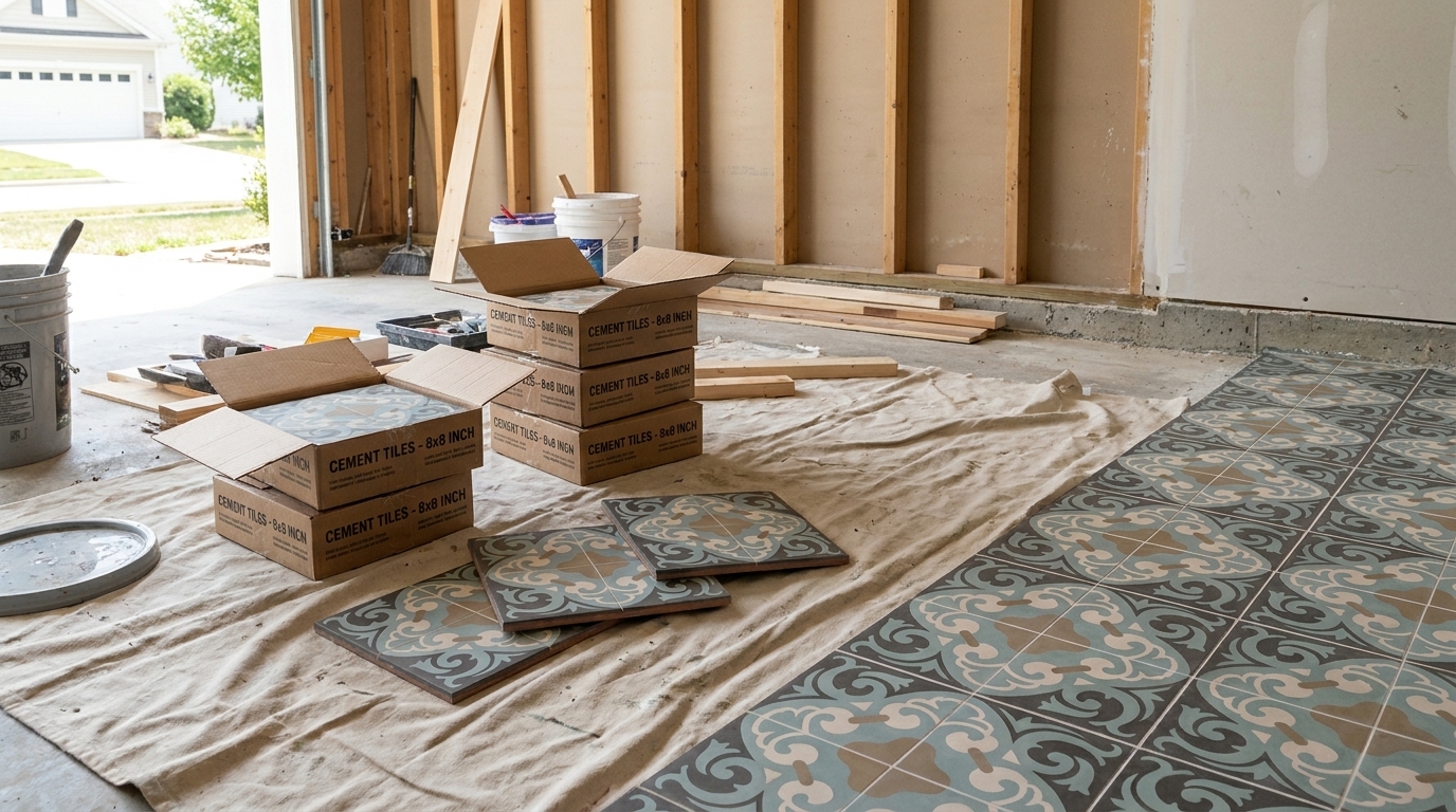
Why do so many specifications still treat color as the easy part?
Design teams will debate stone finish, grout joint, slip resistance, and maintenance protocol in exhausting detail, then reduce pigment to a swatch name on a board. That works when color is a surface coating or a factory-standard formula. It doesn't work as well when the color comes from geology.
That difference matters in heritage tile. The most memorable handmade cement tiles don't get their character from gloss or printed pattern. They get it from dense, matte, mineral color that sits in the material with a quiet depth synthetic finishes often miss. Designers respond to that because it reads as permanent. Homeowners respond to it because it feels settled, not trendy. Hospitality spaces respond to it because it ages with dignity instead of announcing every year it was installed.
Natural mineral pigments deserve more than a romantic description about earth, craft, and authenticity. They need to be understood as a specification issue. Source matters. Processing matters. Particle size matters. Binder compatibility matters. Sustainability claims also deserve scrutiny. “Natural” is not a free pass.
For anyone selecting cement tile for a residence, restaurant, hotel, or restoration project, the useful question isn't whether mineral pigments sound beautiful. They do. The useful question is whether you know how to specify them well enough to get consistent, durable results.
Why Earths Oldest Colors Define Timeless Design
Long before synthetic chemistry offered endless color menus, people built palettes from the ground beneath them. Natural mineral pigments are among the oldest colorants used by humans. Archaeological evidence shows that by about 8,000 BC Egyptian artists were already processing minerals and other natural materials into more stable pigments, as described in this history of historical pigments.
That history isn't just decorative trivia. It explains why these colors still carry authority in architecture. Browns, reds, yellows, whites, and blacks made from soils, chalks, oxides, crushed bone, and charred wood formed the visual language of early objects, surfaces, and ritual materials. Those weren't novelty colors. They were the first durable system of color.
In practice, that legacy still shows up in the way mineral color behaves on a finished surface. A deep iron red in a cement tile doesn't read like a printed red. A soft ochre wall tile doesn't behave like a coated yellow. The color feels grounded because it comes from particulate material with body and density.
Why designers still reach for them
Timeless design usually has less to do with nostalgia than with restraint. Natural mineral pigments help because they tend to produce colors with subtle variation, lower glare, and a visual weight that sits comfortably beside wood, stone, lime plaster, aged brass, and hand-finished masonry.
Good mineral color doesn't shout from across the room. It holds the room together.
That's why these pigments belong in serious contemporary work as much as in restoration. In a clean modern interior, they prevent a hard, over-finished look. In a traditional setting, they keep a new installation from feeling artificially “old world.”
What timeless actually means in material terms
For specifiers, timelessness has to be more than mood. It should mean three things:
- The color stays relevant: Earth-based hues are less tied to short trend cycles than highly saturated synthetic effects.
- The surface ages well: Matte, inlaid color usually wears more gracefully than applied coatings.
- The material stays believable: Handmade tile looks strongest when the color language matches the physical honesty of the tile itself.
That's its true value. Not rustic charm. Material coherence.
Understanding Natural Mineral Pigments
At the practical level, natural mineral pigments are inorganic colorants derived from earths and minerals. They're typically prepared through drying, grinding, washing, and sieving, rather than chemical synthesis or firing, and that mineral origin gives them the high density and larger particle size associated with inorganic pigments. In cementitious systems, that contributes to lower surface staining risk and a more opaque, matte color behavior, as explained in this overview of organic and inorganic pigments.
That single distinction clears up a lot of confusion. A mineral pigment is not a dye. It is not a liquid tint. It is not color floating on the surface. It behaves more like a finely milled colored stone than a transparent stain.
Think spices, not food coloring
A simple analogy helps. Food coloring disperses quickly and intensely, changing liquid from within. Ground spices behave differently. They have body, texture, and opacity. They affect appearance through suspended particles, not just dissolved color.
Mineral pigments work more like the second category. In cement tile, that physical presence helps produce the velvety, matte face designers want. It also changes the way color scatters light. Instead of a slick, coated look, you get softness and depth.
Pigment types at a glance
| Pigment Type | Source | Key Properties | Typical Use in Tiles |
|---|---|---|---|
| Natural mineral pigments | Earths, clays, and minerals processed by drying, grinding, washing, and sieving | Inorganic, dense, larger particle size, opaque, matte, lower surface staining risk | Inlaid color layers in handmade cement tiles where depth and permanence matter |
| Synthetic inorganic pigments | Manufactured mineral-like compounds | Can offer strong durability and consistency | Used where repeatability across large production runs is the priority |
| Organic pigments and dyes | Carbon-based colorants, often chemically produced | Can be vivid, but tend to behave differently from mineral particulate color | More common in coatings, inks, and applications where brightness matters more than matte body |
What they do well, and what they don't
Mineral pigments excel when the design intent calls for grounded color, low sheen, and a surface that feels architectural rather than decorative. They're especially effective in cementitious materials because opacity is an asset there.
They're less useful when a project demands hyper-clean, highly saturated, perfectly uniform color across every unit with no visible variation. Some teams expect mineral color to behave like a digital swatch. That expectation causes problems before installation even begins.
Practical rule: If you want the emotional tone of hand-finished material, don't specify the color the way you'd specify a powder-coated appliance.
The Science of Unfading Color and Lightfastness
Why do some colors stay believable for decades in hard use, while others drift, bleach, or turn flat within a few seasons?
The answer starts in the pigment itself. Many mineral pigments get their color from stable metal oxides and related compounds that already exist in a durable state. Iron oxide reds and yellows, manganese browns and blacks, and chromium-based greens do not depend on a fragile dye structure to create color. In tile work, that matters because sunlight, alkalinity, moisture, and cleaning all test the material at once.
That chemical stability is why mineral color has remained reliable across long-lived building materials and decorative surfaces. It also explains an important specification point. "Natural" does not automatically mean superior. Some mineral pigments perform exceptionally well in cementitious systems because their chemistry suits the environment. Others need closer review for tone variation, particle size, or interaction with white versus gray cement.
Why mineral color lasts
Lightfastness is a pigment's resistance to change under light exposure. In practice, specifiers should treat it as one part of a broader durability picture that includes alkali resistance, moisture behavior, and abrasion.
Mineral pigments tend to hold their color well because UV light has less ability to break down their structure. Organic colorants often fail there first. In a sunlit entry, courtyard, or glazed interior, that difference shows up over time as a floor that keeps its intended balance instead of developing patchy shifts between exposed and protected areas.
The tile assembly still matters. A stable pigment can be undermined by poor dispersion, inconsistent water ratios, weak curing, or an ill-chosen sealer that yellows the surface. Good color starts with chemistry, then gets protected by process.
What this means on real projects
I advise designers to separate three questions that often get blurred together:
- Will the pigment fade? Many mineral pigments have a strong record here.
- Will the tile look uniform from batch to batch? That depends on raw material variation, processing, and shop control.
- Will the finished surface age well in service? That depends on installation, sealing, cleaning, traffic, and exposure.
Those are different risks. Treating them as one usually leads to bad approvals.
A useful review method is to assess the color in mockups under the actual light conditions of the project, then compare that with the maker's batching and blending practice. Teams specifying hand-finished tile often benefit from seeing how workshops manage tonal range through disciplined color blending techniques for cement tile production.
The trade-off specifiers need to accept
Long-term color stability and perfect visual uniformity are not the same thing.
A natural iron oxide can be highly lightfast and still show slight batch-to-batch movement because the source mineral, calcination, grinding, or wash process shifts the final tone. That is not a defect by itself. It is a material characteristic that needs to be controlled, sampled, and approved intelligently. For heritage work and many architectural interiors, that subtle variation gives the surface depth. For a retail rollout that expects exact repetition across multiple phases, the tolerance may need to be tighter.
The right specification language makes the difference. Ask for approved control samples, stated batch tolerances, and clear mockup review under site lighting. That is how you get the permanence people associate with mineral color, without pretending that every pallet should read like a printed chip.
Color permanence is real. So are the trade-offs that come with honest mineral material.
How Pigments Create Inlaid Color in Cement Tiles
What gives a cement tile pattern its depth years after installation, even as the surface sees foot traffic, washing, and sun? The answer is simple in concept and demanding in execution. The color sits in the tile's wearing face from the moment the tile is made.
That distinction matters on real projects. Designers often review a tile sample as if color were only a visual choice. In cement tile, color is also a construction method. The way the pigment is dispersed, poured, pressed, and cured affects edge definition, surface density, and how the floor will look after years of use.
To make that process easier to visualize, this workflow shows the sequence clearly:

From pigment powder to color slurry
The face mix starts with measured mineral pigment, white or gray cement, fine marble dust, and water. Those ingredients are proportioned to produce a slurry that will pour cleanly into the pattern mold while still carrying enough body to hold a sharp line.
This stage is less forgiving than it looks. If pigment is not fully dispersed, the finished face can show clouding, pinholes, weak color, or slight shifts from one tile to the next. If the slurry is too wet, colors can creep under the divider. If it is too stiff, the face layer may not settle evenly and can leave thin spots at corners or fine details.
Good workshops control that through weighing, mixing time, and disciplined handling rather than intuition alone. Handcraft still depends on repeatable process.
Pattern first, pressure second
Traditional cement tiles use a metal divider mold, often called a cloisonné-style form, to separate each color area in the design. The maker pours each colored slurry by hand into its compartment, then lifts the divider once the face layer is set enough to hold its shape.
That moment decides much of the finished tile. Clean geometry requires steady pouring, consistent viscosity, and close attention to how adjoining colors meet. Fine motifs expose weak technique immediately.
Specifiers who want movement in color without losing control over the overall field should review these color blending techniques for cement tile. They show how tonal range can be planned instead of left to chance.
After the face layer is in place, the maker adds a dry or semi-dry backing mix, usually cement and sand. The tile then goes under hydraulic pressure, which compresses the layers into one dense unit.
Later in the process, the sequence is easier to understand in motion:
What the press actually accomplishes
Hydraulic pressing does more than shape the tile. It bonds the colored face to the body, drives out excess water, and tightens the matrix so the surface can wear evenly over time.
The practical result shows up in three places:
- The color has depth: the pattern occupies the face layer itself rather than sitting as a surface coating.
- The finish stays matte: the character comes from cement and mineral aggregate, not glaze.
- The edges read cleanly: accurate molds and proper pressure preserve crisp boundaries between colors.
That does not mean every handmade tile will look mechanically identical. A well-made tile should be consistent in proportion, face thickness, and pattern clarity, while still showing the slight tonal life that comes with mineral color and hand pouring. For design teams, that is the key trade-off. A lively surface and absolute uniformity rarely come from the same production logic.
Inlaid color rewards careful fabrication. It also exposes shortcuts immediately.
Curing is where performance is won
Pressed tiles still need controlled curing so the cement can hydrate fully and develop strength. Pigment may catch the eye, but curing determines whether that beautiful face stays sound.
Rushed drying can lead to surface weakness, uneven absorption, or a chalky appearance that has nothing to do with the pigment itself. Proper curing supports density, color clarity, and long-term wear. In practice, the best results come from workshops that treat pigment selection, mix control, pressing, and curing as one system rather than separate steps.
A Specifiers Guide to Sourcing and Consistency
Many projects frequently go off course. A drawing set may call for “umber,” “yellow ochre,” or “red earth” as if those names alone guarantee a repeatable result. They don't.
A key challenge is that natural mineral pigments vary by source, not just by color name. An umber from one region can differ in hue and particle size from an umber from another, affecting color consistency in larger architectural work if the variation isn't managed through testing and clear specification, as noted in this discussion of earth and mineral pigment variation.
For specification work, that means provenance is not background information. It is part of the color itself.

What to ask before approving a color
A sound specification process starts with tighter questions. Not “Do you have terracotta?” Ask where the pigment comes from, how it is processed, whether the supplier tracks lots, and whether approval samples come from the same production run intended for the project.
For flooring applications especially, it helps to review finished assemblies rather than loose pigment references. A tile face tells you more than a pigment label ever will. For project planning around field conditions and installation context, these cement tile flooring considerations are useful to review early.
A practical framework for consistency
Use this checklist when the project depends on repeatable mineral color:
- Approve the actual lot: Don't sign off on a historical sample if current production will come from different source material.
- Request mockups at meaningful scale: A single chip can hide variation that becomes obvious across a full floor or feature wall.
- Document tolerance expectations: Decide in writing what level of shift is acceptable between batches and within the installed field.
- Coordinate reorders early: If the job may need attic stock or a later phase, address pigment continuity before the first shipment leaves.
- Match the binder system: Pigment behavior changes with the cementitious matrix, water ratio, and finishing process.
What works and what doesn't
What works is specifying natural material like a natural material. Set a target range. Review production samples. Allow for slight movement in tone. Align everyone on what “consistent” means before fabrication begins.
What doesn't work is demanding synthetic-level uniformity while selecting a geological color system. That contradiction usually lands on the installer or tile maker, and by then the problem is expensive.
The better brief is not “make every tile identical.” It's “keep the variation controlled, intentional, and within approved character.”
Natural variation can be an asset. Unmanaged variation is a liability. The difference is almost always in the specification.
The Real Story of Sustainability in Mineral Pigments
“Natural” is one of the least disciplined words in material marketing. It often implies virtue without forcing anyone to account for extraction, transport, processing, service life, or replacement cycle.
That's why mineral pigments deserve a more honest sustainability discussion. While natural pigments avoid chemical synthesis, a full assessment still has to consider mining and transport. Their strongest green credential is often longevity. A product that doesn't need replacement for decades avoids repeated manufacturing and disposal impacts, as discussed in this overview of natural pigments and sustainability.

Longevity matters more than the label
If a tile installation remains serviceable and visually strong for decades, that durability counts for a lot. It reduces demolition, replacement materials, freight, packaging, and labor over the life of a building. In real projects, that can matter more than whether the pigment story sounds artisanal.
The harder question is whether the entire assembly earns its place. A mineral pigment in a short-lived product is not automatically responsible. A durable floor with integrated color often makes the stronger lifecycle argument.
A better way to evaluate the claim
When clients ask whether natural mineral pigments are the sustainable choice, use a wider lens:
- Start with lifespan: How long will the surface remain functional and visually credible?
- Ask about sourcing distance: Local or regional supply can matter as much as the pigment category itself.
- Look at replacement risk: Materials that fail aesthetically are often replaced long before they fail structurally.
- Review health and interior impact: Pair pigment selection with broader material choices, including low-VOC building materials.
This same discipline helps when you find high-quality sustainable furniture. The label alone doesn't tell the full story. Construction quality, material transparency, and useful service life do.
Where sustainability claims often fall apart
They usually fail in two places. First, when extraction and transport are ignored. Second, when durability is treated as secondary.
A material professional should be skeptical of both shortcuts. Natural mineral pigments can be part of a responsible specification. They are not responsible by default. The project has to prove that.
Testing Quality and Maintaining Color for Life
How do you know a mineral pigment will still read the same after fabrication, installation, cleaning, and years of foot traffic? You test the color in the tile, not just in the bag.
Serious tile shops start with incoming batch control. Each pigment lot should be checked against an approved standard, then mixed into the actual cement matrix for sample review. Dry powder can mislead. The same iron oxide that looks rich in a jar can shift once it meets white cement, aggregate, water ratio, cure conditions, and finishing. That is where costly surprises usually begin.
Good specification work also accepts a basic truth. Natural mineral pigments are stable, but they are not perfectly uniform from deposit to deposit or lot to lot. That does not make them unreliable. It means the project needs tolerances, retained control samples, and signoff on production mockups before full runs begin.
What deserves attention in service
Long-term color performance usually depends less on the pigment than on the surface system around it. Inlaid color has a real advantage because it sits within the wear layer of the tile, but maintenance still matters.
Focus on the practical points:
- Test cleaners before broad use: Acids and aggressive degreasers can dull or etch the cement surface, changing how the color reads.
- Match sealer choice to the project: A penetrating sealer behaves differently from a topical treatment, especially in wet rooms, kitchens, and commercial entries.
- Expect wear patterns in high-traffic zones: The pigment remains in the tile, but abrasion can alter sheen and make color variation more visible.
- Keep maintenance consistent: A floor cleaned gently and regularly ages better than one stripped hard at long intervals.
I tell designers to separate color failure from surface failure. They are not the same problem. If a tile looks tired, the cause is often residue, etching, or neglected sealer maintenance rather than pigment instability.
A realistic standard for lifetime performance
No material stays untouched by use. The goal is not a frozen, just-installed appearance. The goal is color that remains credible as the building ages.
That is why mockups, field samples, and maintenance instructions belong in the specification package. They protect the design intent long after submittals are approved. They also help owners understand the trade-off that comes with authentic mineral color. You get depth, permanence, and repairability, but only if fabrication discipline and maintenance discipline are both in place.
Original Mission Tile is one example of a manufacturer that documents the hydraulic-press process, custom design options, and installation guidance clearly enough for designers and builders to make informed material decisions before ordering.