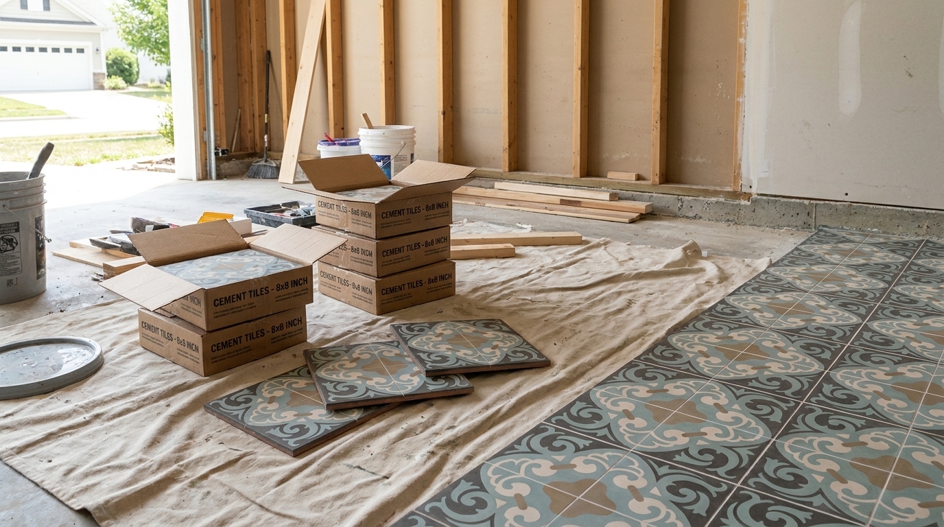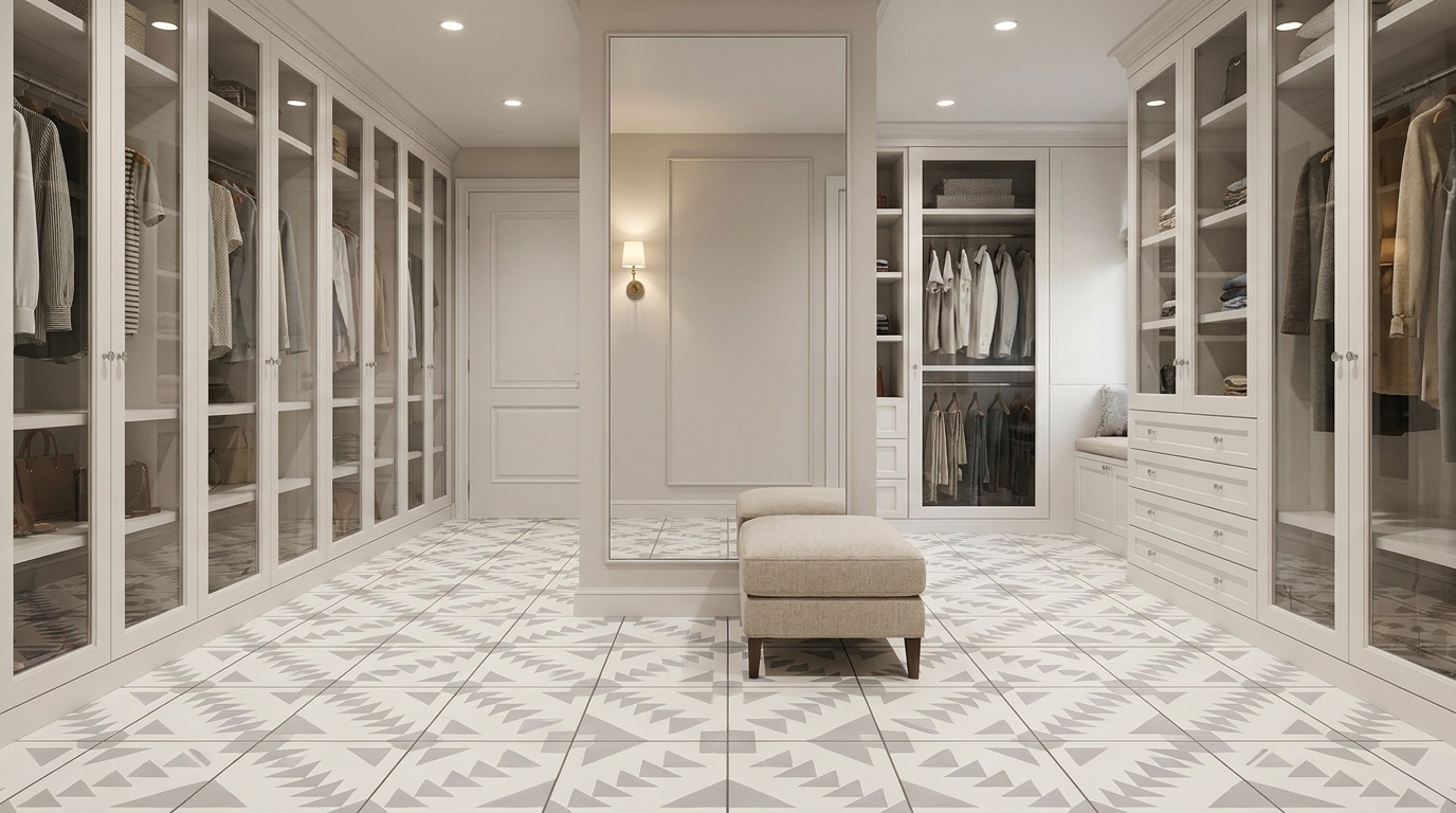
A lot of people arrive at color blending from the same frustration. They've seen too many flat installations where every tile is one exact tone, repeated without relief, and the surface ends up feeling rigid even when the pattern is well chosen. What they want instead is movement. A floor that shifts gently from one mineral tone to another. A wall that holds depth when daylight crosses it. A handmade surface that doesn't look machine-decided.
That's where color blending techniques matter in tile work. In cement tile, color isn't a film sitting on top. It's part of the face layer itself, built from cement, marble dust, and mineral pigment. That changes the craft completely. You're not just brushing on color. You're planning how hue, value, moisture, and pressure will behave inside a dense, matte material.
For designers, builders, and homeowners, that's good news. Cement tile rewards subtle handling. It can carry soft gradients, broken tonal fields, weathered transitions, and blended geometric work in a way glossy, factory-perfect materials often can't. The finish absorbs light softly, and that softness gives blended color room to breathe.
Beyond Solid Color A Guide to Blending
The most successful blended tile surfaces rarely announce themselves from across the room. They reveal themselves as you move. A hallway floor might begin with warm sand tones near an entry and shift into olive and slate as it approaches a garden door. A backsplash might hold one pattern, but vary the pigment load from tile to tile so the field feels alive instead of printed.

That kind of surface sits between craft and control. It isn't random, and it isn't sterile. The best blends feel composed, but they still show the hand of the maker. Handmade cement tile is especially suited to this because mineral pigments produce a dry, grounded character. Instead of loud shine, you get depth through variation.
Why blended tile feels different
A solid color tile can be beautiful, but it asks one note to carry the whole installation. Blended tile spreads the visual load. It gives the eye places to rest and places to travel. That matters on large floors, hospitality walls, courtyards, and kitchens where a single flat tone can feel heavy.
Practical rule: If a surface needs warmth, age, or visual movement, blending usually works better than adding more pattern.
Blending also solves a common design problem. Many spaces need custom color, but not a custom motif. You may not want a busy pattern. You may just want a field of color with tonal drift, a shadowed edge, or a soft ombré through repeated shapes. That's where these techniques earn their place.
Where cement tile has an advantage
Cement tile takes blended color well because the material already has natural variation. Tiny shifts in pigment, water, and curing create a more human finish than sprayed-on coatings. Used properly, those shifts become a feature rather than a defect.
A matte mineral surface also makes transitions easier to read. You don't get the same glare that can flatten nuanced color changes on glazed products. The result is a surface that looks settled and architectural, not decorative in a temporary way.
Planning Your Palette and Gradients
Before any pigment hits the mix, the palette has to make sense in material terms. That means planning for subtractive color mixing, not screen color. The distinction goes back to a foundational split in color history. In 1704, Isaac Newton's Opticks established additive light mixing, where colored light can combine to create white light, while later pigment practice developed around subtractive systems such as CMY, where combining pigments removes wavelengths instead of adding them (reference). On a monitor, color grows brighter as light is added. In cement, pigments usually move toward density and dulling as they combine.

Start with relationships, not isolated swatches
When I plan blended tile, I don't begin by asking whether an individual color is attractive. I ask whether the neighboring colors can carry a transition without collapsing into mud. Analogous palettes are usually the safest place to start. Sand into ochre, olive into moss, blue-gray into green-gray. They share enough structure to blend without conflict.
Complementary pairings can work, but they need distance or a buffer tone. If you push opposites directly into each other in a mineral mix, you often lose clarity. The blend turns flat before it turns beautiful.
A practical planning sequence looks like this:
- Choose the dominant family. Decide whether the field lives in warm earths, cool mineral tones, or a balanced neutral range.
- Set the value range. Pick where the lightest note sits and where the darkest one lands.
- Test the bridge colors. Transitional hues matter more than dramatic endpoints.
- Lay out the installation view. A blend on one sample tile can behave very differently across a full room.
For additional inspiration on assembling coordinated tones across materials and furnishings, this guide for harmonious color palettes is a useful companion to tile-specific planning.
Value controls the smoothness
Most failed gradients aren't hue problems first. They're value problems. If one tile reads much lighter or darker than its neighbor, the eye sees a jump even when the hues are related. A successful ombré usually depends on controlled light-to-dark stepping.
Adjacent colors never sit quietly. They change each other in use.
That's not just workshop wisdom. One early material milestone in color blending dates to about 40,000 years ago, when artists mixed soil, animal fat, burnt charcoal, and chalk into a basic palette of five colors: red, yellow, brown, black, and white. Much later, in 1839, Michel Eugène Chevreul described the law of simultaneous contrast, showing that adjacent colors visually shift toward their complements (reference). On tile walls and floors, that means the same green may read warmer beside blue and cooler beside tan.
Storyboard the room, not just the tile
A blend should be tested in the orientation it will be installed. Horizontal drift feels different from vertical fade. Tight transitions feel different on hexagons than on 8×8 fields. Black also changes the equation fast. If your project includes dark anchors, this overview of colors that go with black is useful for seeing how surrounding tones shift the reading of adjacent surfaces.
Here are the palette mistakes I see most often:
- Too much hue distance. Colors look exciting in isolation, then fight each other when placed edge to edge.
- No middle values. The design jumps from pale to deep without enough steps between.
- Ignoring room light. North light, warm lamps, and exterior greenery all alter the perceived blend.
- Testing too small. A tiny sample can hide contrast that becomes obvious across a floor.
Mixing Mineral Pigments for Cement Tile
Blended tile transitions from theory to craft. With cement tile, the color layer is integral to the tile face. That means a weak mix, a rushed measurement, or a poorly dispersed pigment will show up not as a minor cosmetic flaw, but as part of the finished material. Good blending starts at the bucket.

Treat pigment recipes like shop documents
If you want repeatable color blending techniques, document everything. Dry pigment weight. Cement quantity. Marble dust proportion. Water added. Ambient conditions. Batch order. If a tile color has to be extended weeks later, memory won't save you.
In workshop production, I recommend keeping one master board with cured sample pulls and handwritten recipe notes. Digital records help, but cured physical references matter because wet slurry never tells the whole truth.
A disciplined recipe sheet should include:
- Pigment identity. Record the exact mineral pigment used, not just “blue” or “red oxide.”
- Batch size. Small test ratios don't always scale perfectly without adjustment.
- Water behavior. Note whether the mix tightened quickly or stayed open.
- Cured appearance. Log the final dry color, not only the fresh mix color.
Build the slurry for even dispersion
Dry pigment likes to clump, especially dark colors and dense oxides. If those clumps survive into the face mix, they create spotting and streaking. The cure is patience. Pre-blend dry ingredients thoroughly before introducing water, then add moisture gradually until the slurry is smooth and workable.
The target isn't just color. It's even suspension. Pigment needs to disperse through the cementitious body so one part of the tile doesn't read chalky while another reads overloaded. A rushed mix often looks acceptable in the pail and disappointing after cure.
Workshop note: The eye reads inconsistency more harshly on a matte cement face than on a glossy coating. Small mixing errors become visible fast.
For readers comparing traditional handmade methods with product options, encaustic cement tile is a useful reference point for how pigment-based cement surfaces are built and specified.
Control water with discipline
Water affects more than workability. It influences saturation, edge behavior, and how the pigment settles in the mix. Too much water can wash character out of the color and make transitions harder to control. Too little can leave the mix stiff, under-dispersed, and prone to rough application.
In custom work, I'd rather adjust in very small increments than rescue an over-watered batch. Cement gives you less forgiveness than people expect. Once the mix crosses from creamy to slack, the blend gets harder to place cleanly.
A few habits help:
- Use measured additions instead of free-pouring.
- Mix longer than feels necessary when introducing darker pigments.
- Strain concern, not every batch. If a pigment has shown clumping before, screen it before mixing.
- Make test pours first. Even experienced shops verify before committing to a production run.
Blend while the material is still open
For on-site custom colorwork, the best paint guidance translates surprisingly well to cementitious washes and tinted slurries. In wet-media blending, the core sequence is to place colors side by side while wet, then use a clean damp brush to feather across the seam. The key benchmark is speed. Both colors need to remain wet long enough to merge, or the seam locks in and has to be reworked (reference).
That principle matters on cement surfaces. If you're applying a tinted mineral wash or refining a transition in place, don't overwork a seam after it has started to set. You'll roughen the surface and dirty the color. Lay the two tones, feather with a clean damp brush, then leave it alone long enough to properly judge.
Test batches save expensive corrections
Color in cement always needs a cured reading. What looks restrained in the wet stage can dry flatter, cooler, or more opaque than expected. Make a small panel. Let it cure. View it in the same light the installation will live in.
That's especially important when the design depends on close tonal stepping. A blend can fail even when each individual mix looks good, because the transitions between them are too abrupt once dry.
Mastering Color Application Methods
Once the pigment is mixed properly, application decides the character of the blend. Two installations can use the same palette and still look unrelated because one was feathered, another masked, another sponged, and another built in layered passes. Method shapes mood.

Choosing the right method for the effect
Here's the simplest way to compare the main options used on cement surfaces and sample boards.
| Technique | Best For | Difficulty |
|---|---|---|
| Sponging | Soft mottling, aged variation, broken mineral texture | Easy to moderate |
| Dry-brushing | Weathered edges, directional texture, rustic surfaces | Moderate |
| Color washing | Subtle tonal veil, broad softening across a field | Moderate |
| Ombré blending | Controlled gradients and directional color drift | Moderate to advanced |
| Masking and stenciling | Sharp transitions, geometric blends, repeated motifs | Advanced |
Sponging works when you want the blend to feel irregular and natural. A natural sea sponge gives a broken deposit that reads more geological than painted. Synthetic sponges can be useful when you need repeatability, but they often create a more predictable mark.
Dry-brushing is different. It catches the high points and leaves a drag pattern. On a cement tile face, that can be useful for weathered or old-world effects, but it's the wrong choice if you want a smooth fade.
Build gradients in layers, not force
A reliable layered blending principle comes from pencil technique, and it applies well to tile sampling and pigmented surface work. Start with a very light base layer, overlap the second color gradually, and finish by smoothing the transition. Expert guidance recommends light pressure and repeated layers rather than forcing the blend early (reference).
On tile, the equivalent is simple. Don't try to get full depth in one pass. Establish the lightest field first. Add the second tone in controlled overlap. Then refine. Heavy early application usually creates hard stops and dirty seams.
A short demonstration helps clarify the feel of layered application in practice:
Five methods and where each earns its place
Sponging
Use this when the goal is softness without obvious brush marks. Load the sponge lightly, blot off excess, then tap in irregular passes. Rotate the sponge so the texture doesn't repeat. This method suits patchwork fields, softly aged backsplashes, and transitional borders.
Dry-brushing
Use a stiff brush with very little tinted medium. Pull in one direction and stop before the surface gets slick. Dry-brushing is good for antique character, less good for contemporary ombré. If the room already has a lot of grain or texture, it can become too busy.
Color washing
This method lays a translucent mineral veil over the surface. It's useful when a pattern needs to be unified without losing its geometry. Keep the brush damp and the strokes long. A wash can soften a palette that feels too contrasty after initial sampling.
Work from restraint. You can always deepen a blend, but it's much harder to recover clarity once the surface has gone muddy.
Ombré blending
This is the most requested and the easiest to overdo. Separate several close values, then place them in sequence rather than trying to fade from one dramatic endpoint to another. Broad installations benefit from stepping that is almost invisible tile by tile.
Masking and stenciling
Masking is for precision. It lets you keep one edge clean while blending another. This works well in geometric layouts, stepped arches, repeated borders, and modern feature walls. The trade-off is labor. Precision always costs time.
Finishing Sealing and Long-Term Maintenance
A blended cement tile surface isn't finished when the color looks right. It's finished when the color is protected without losing its intended character. Sealant choice affects appearance. Some sealers deepen color and tighten contrast. Others keep a flatter, drier matte look. That decision belongs to the design, not just the maintenance manual.
Sealing changes the reading of the blend
Penetrating sealers usually preserve more of the mineral feel, while topical products can alter sheen and make transitions read differently. Neither is automatically wrong. The issue is fit. If a blend relies on whisper-soft value shifts, a sealer that darkens everything may compress those differences. If the palette needs more depth, that same darkening may improve it.
That's why I always treat the finish sample as part of the color sample. Review the blend before sealing, then again after sealing. They are not the same object.
For product-specific maintenance considerations, ceramic tile sealers offer a useful comparison point when evaluating how different protective approaches affect appearance and upkeep across tile categories.
Blended surfaces often age better than flat fields
There's a good practical parallel from another trade. In salon work, gray blending maintenance can run 10–16 weeks versus 4–6 weeks for full coverage, which supports the idea that blended finishes can be more forgiving than uniform ones (reference). The lesson for tile is straightforward. A surface designed with tonal variation tends to hide minor wear, dust, and small inconsistencies better than a perfectly even field.
That doesn't mean you can skip maintenance. It means the visual tolerance is higher. A blended cement floor can absorb daily life with more grace because it was never pretending to be flawless and uniform to begin with.
Practical maintenance habits
- Seal with a sample-first mindset. Always test the finish on cured material from the same batch.
- Clean gently. Harsh cleaners can alter the surface character even when the tile itself remains sound.
- Reassess traffic zones. Entries, service paths, and kitchen work areas may need earlier attention.
- Match touch-ups to the original logic. Repairs should preserve the tonal rhythm, not replace it with a flat patch.
Troubleshooting Common Blending Issues
Most blending failures can be traced to one of three stages. Planning, mixing, or application. The surface tells you where the mistake happened if you know how to read it.
When the color looks muddy
Muddy blends usually begin before the brush or sponge touches the tile. The palette may have been built from colors that are too far apart, or too many unrelated pigments may have been forced into one transition. Overworking also causes trouble. Once a seam starts to lose clarity, repeated fussing rarely improves it.
Fix it by simplifying. Go back to a narrower family of hues and insert an intermediate tone. If the muddiness appeared during application, reduce your passes and let each layer settle before judging it.
When hard lines appear in a gradient
A hard edge almost always points to timing or pressure. The material started to set before the neighboring color was feathered, or one area received too much pigment too early. In layered work, this is the equivalent of pressing hard on the first pass and leaving a boundary the later layers can't hide.
Try one of these corrections:
- Reopen the transition carefully with a compatible dampened medium if the surface allows it.
- Add a bridge tone between the two values instead of forcing them directly together.
- Widen the overlap zone so the eye reads a shift, not a dividing line.
If a blend feels abrupt, don't ask the endpoint colors to do the middle color's job.
When saturation varies from tile to tile
Inconsistent saturation is usually a mixing problem. Pigment wasn't dispersed evenly, water changed from batch to batch, or the recipe wasn't measured tightly enough. Sometimes installers mistake this for a sealing issue, but the clue is whether the inconsistency existed before finish was applied.
The fix is procedural, not decorative. Standardize batch notes, pre-blend dry components more thoroughly, and compare fresh work to cured sample references instead of wet memory.
When the surface turns blotchy after finishing
Blotchiness after sealing often means the substrate absorbed finish unevenly or the application method changed across the field. One area may have been more porous. Another may have received more product. On blended tile, that unevenness can exaggerate tonal differences in an unpleasant way.
The lesson is to test the complete system. Color, cure, and finish need to be judged together. A beautiful raw sample can still become a disappointing finished installation if the sealer was treated like an afterthought.
If you're developing a custom cement tile palette, refining a gradient, or trying to match a historic mineral tone, Original Mission Tile provides handmade cement tile resources, color options, and custom design support that can help turn a blending concept into a buildable surface.