You're probably looking at a wall right now and trying to solve two problems at once. You want tile that won't feel dated in a few years, but you also don't want another safe, forgettable white backsplash or shower surround.
That's where blue subway tile earns its place. It carries the discipline of a classic format, yet the color shifts everything. A soft dusty blue can calm a bathroom. A glossy cobalt backsplash can sharpen a kitchen. A deep navy feature wall can anchor a restaurant or bar. The true decision isn't just whether blue looks good. It's whether that specific blue, in that specific finish and material, will still work when the room is full of daylight, steam, fingerprints, hard water, and daily use.
Your Guide to Choosing the Perfect Blue Subway Tile
Blue subway tile sits in a sweet spot that few finishes manage well. It feels familiar because the format is established, but it still gives a room a point of view. That matters when you're trying to build a space that feels considered instead of trend-driven.
The selection of tile often starts and stops with color. This typically involves pinning a few navy kitchens, saving a pale blue shower, and assuming the decision is mostly aesthetic. In practice, the better questions come later. Does the finish bounce light or swallow it? Will the glaze show water spots? Will the grout become part of the design or fight the tile? Does the shade read crisp, smoky, coastal, moody, or almost black once it's installed across a full wall?
That's why blue subway tile needs to be chosen as a working surface, not just a sample-board accent.
If you're still narrowing the room itself, this practical guide to find your ideal bathroom tiles is useful because it frames tile selection around moisture, layout, and everyday use instead of just style.
Blue tile changes with light more than many homeowners expect. A sample that feels lively in a showroom can turn heavy in a windowless bath, or become much brighter once it meets daylight and glossy fixtures.
The projects that turn out well usually balance four things at the same time: shade, finish, format, and maintenance tolerance. Get those aligned, and blue subway tile feels intentional for years.
The Enduring Appeal of Blue Subway Tile
Subway tile lasts because it wasn't invented as a fashion statement. It began as a hard-working surface. The format traces back to 1904 in the New York City subway system, where the original standard was a 3×6-inch glazed tile with beveled edges designed for hygiene, durability, and light reflection in underground stations, as noted in this history of the original subway tile specification.

That origin still matters. A tile designed to stay clean, hold up, and reflect available light has a built-in logic that modern buyers still respond to. Even when you change the color, that original discipline stays in the room. The result is a surface that feels settled rather than experimental.
Why blue changes the mood
Blue gives subway tile its emotional range. The shape stays ordered and architectural, but the color sets the atmosphere.
- Pale and washed blues soften a room and pair well with light woods, painted cabinetry, and stone that has gentle movement.
- Mid-tone blues are often the easiest to live with because they introduce color without dominating every surface around them.
- Deep navy tones create gravity. They can look rich and refined, but they need careful handling in small or low-light rooms.
- Brighter cobalt or saturated blue works best when you want the tile to be the focal point rather than the background.
Why it still feels current
Blue subway tile can read traditional or modern because the base language is so simple. The rectangle is disciplined. The color is expressive. That combination gives designers room to tune the effect.
A classic kitchen might use a denser field of smaller blue tiles with visible grout lines. A newer interior might use a longer tile with fewer joints and a flatter overall read. The geometry keeps it grounded.
The strongest blue tile schemes don't rely on color alone. They use color to steer mood while the format carries the architecture.
That's the reason blue subway tile keeps returning in kitchens, baths, and hospitality spaces. It isn't one look. It's a controlled framework with a wide emotional range.
Choosing the Right Material and Finish
A blue subway tile sample can be misleading. Two tiles in nearly the same shade can behave very differently once they're on the wall. Material changes the depth of color, how edges read, how the surface catches light, and how much care the wall asks of you.
The finish matters just as much. One of the biggest gaps in most design advice is performance in real conditions, especially whether different blue finishes change light reflection and how matte versus glossy surfaces handle soap film and water spots in a bathroom, as discussed in this note on blue subway tile performance in real spaces.

What each material does well
Ceramic is often the easiest entry point. It gives you broad color choice, familiar installation, and a large range of glaze styles. For backsplashes and standard wall applications, it's usually a straightforward fit. The caution is visual consistency. Some ceramic blues are beautifully even and clean. Others can feel a little flat if the glaze lacks depth.
Porcelain is the workhorse when moisture resistance and heavy use are priorities. It's a strong option for busy bathrooms, utility areas, and some commercial settings. It usually reads a bit more engineered than handcrafted, which can be a benefit or a drawback depending on the room.
Glass reflects the most light. That can be useful in tight kitchens or dim powder rooms where you need the surface to lift the space. The trade-off is that highly reflective tile tends to show residue more readily, and the look can veer slick if the rest of the palette is also glossy.
Handmade cement sits in a different category because the color is part of the tile body rather than just a surface effect. It gives blue a softer, more grounded character. You don't get the same glossy bounce, but you do get depth, a silky matte presence, and small variations that make the wall feel made rather than manufactured. Original Mission Tile is one example of a manufacturer producing handmade cement tile in stock and custom formats for walls and broader architectural use.
Blue Subway Tile Material Comparison
| Material | Color Quality | Best For | Maintenance |
|---|---|---|---|
| Ceramic | Clean glazed color, from even to slightly varied | Kitchen backsplashes, general wall use | Straightforward routine cleaning |
| Porcelain | Controlled, durable color expression | Bathrooms, utility spaces, heavy-use walls | Low-fuss upkeep in wet areas |
| Glass | Luminous, reflective, depth through light | Small rooms, accent walls, modern schemes | Shows spots and residue more easily |
| Handmade cement | Matte, pigmented, softly varied | Feature walls, design-led interiors, artisanal palettes | Needs material-specific care and sealing where required |
Gloss versus matte in daily life
Glossy blue subway tile does two things very well. It reflects light and it sharpens color. Navy gloss can feel jewel-like. Pale blue gloss can make a room feel cleaner and brighter. In showers and around sinks, though, gloss often tells on the room. Water marks, soap film, and splash patterns can become more visible.
Matte blue tile behaves with more subtlety. It softens reflections and usually hides daily residue better. That doesn't make it maintenance-free; instead, the wall often looks calmer between cleanings. In modern interiors, matte also tends to feel more architectural and less decorative.
A practical way to decide
Use the room, not the sample board, as the judge.
- For a dim room: Lean toward surfaces that help with reflection unless you want a deliberately moody effect.
- For a family bath: Prioritize finishes that won't make every splash obvious.
- For a statement backsplash: Saturation and sheen can carry more drama because the area is smaller and easier to maintain.
- For cabinet-heavy kitchens: Check the tile next to painted doors and hardware, not in isolation. Blue can shift when it meets warm whites, cool whites, oak, walnut, or black metal.
If you're coordinating tile with painted millwork, these Pro tips for cabinet painting help because cabinet sheen and undertone can either support your blue tile or make it read off.
Practical rule: If you love a deep glossy blue on a sample, test it in the actual room before committing. The darker the shade and shinier the finish, the more the room's light will rewrite the color.
Mastering Tile Size and Layout Patterns
A dark blue backsplash can either steady a room or make it feel chopped up. Size and layout decide which way it goes. They control how often the eye hits a grout joint, how wide or tall the wall reads, and how busy the color feels once it covers real square footage.
Subway tile is a proportion more than a fixed format. The category started with the familiar rectangular shape, but current options run from compact pieces to long planks, which is why blue subway tile can read classic in one room and sharply modern in another, as outlined in this overview of subway tile sizes and proportions.

What size changes on the wall
Smaller subway formats create a tighter visual rhythm. You get more joints, more edge lines, and more shadow breaks across the surface. In a soft blue, that can add charm and detail. In a saturated navy or cobalt, it can make the installation feel more active than the sample suggested.
Longer pieces calm the field down. Fewer joints let the color read in larger blocks, which often suits contemporary kitchens and simple bath designs. They also show wall irregularities faster, so layout and prep matter more. On an uneven substrate, long glossy tile will telegraph lippage sooner than a smaller format that can absorb minor variation.
This is one of the trade-offs clients do not always see at the showroom counter. A longer blue tile often looks cleaner and more expensive on the wall, but it asks more from the installer and the surface behind it.
What pattern changes in the room
Pattern directs movement. Blue makes that effect stronger because color and geometry start working together instead of separately.
- Offset brick pattern has the most forgiveness. It softens minor size variation and suits homes where you want the tile to feel established rather than strict.
- Horizontal stack reads orderly and architectural. It works well with slab cabinet doors, floating vanities, and other clean-lined elements because the joints reinforce that structure.
- Vertical stack adds height. I use it when a shower surround feels squat or when a backsplash needs a stronger upward line between countertop and uppers.
- Herringbone brings motion and craftsmanship, but it also creates more cuts, more labor, and more visual energy. Strong blues make that effect even more pronounced.
- Basketweave-style layouts introduce texture and a period feel. They work best when the surrounding finishes are restrained enough to let the pattern register clearly.
If you want to compare the visual effect before choosing, this guide to wall tile patterns is a useful reference.
Matching layout to shade, finish, and architecture
Blue tile does not behave the same way in every pattern. Deep glossy blue in herringbone can feel luxurious in a powder room and too restless on a full kitchen wall. A pale matte blue in the same layout is usually easier on the eye because the finish diffuses the pattern instead of sharpening it.
Room shape matters too. A narrow galley kitchen often benefits from a horizontal layout that supports the room's length rather than fighting it. In a shower, vertical stack can make the enclosure feel taller and cleaner, especially with longer tile. In older homes with more trim detail, a smaller offset pattern usually sits more naturally with the architecture than an oversized stack bond.
Choose one feature to do the talking. If the blue is bold, keep the layout disciplined. If the pattern is active, the tile usually works better in a quieter shade or lower-sheen finish.
Perfect Pairings for Grout and Color
Grout isn't a technical afterthought. It's part of the design language. With blue subway tile, grout can either underline every rectangle or dissolve the pattern into a near-solid field. That one choice changes the room more than many people expect.
Good better best for grout choices
Good: choose a grout close to the tile when you want a calmer wall. This works especially well with mid-tone and darker blues because it lets the color read as a continuous surface.
Better: use a soft contrast if you want the pattern visible without making it graphic. A gentle gray or related tone often gives enough separation to define the layout while keeping the room balanced.
Best: use a high-contrast grout only when you want the geometry to become part of the statement. White or very light grout against navy can look crisp and classic, but it also puts every alignment choice on display. Install quality matters more when contrast goes up.
Pairing blue with the rest of the room
Blue subway tile gets stronger when the surrounding finishes know their role.
Cabinets
White cabinetry keeps the room bright and gives blue tile clean contrast. Wood cabinets, especially those with visible grain, warm blue up and make it feel more grounded. Gray cabinets can work, but the undertones have to be checked carefully. A cool gray beside the wrong blue can flatten the entire scheme.
Countertops
Marble and marble-look quartz bring movement and lightness, which helps offset deeper blue wall color. Butcher block adds warmth and softness, especially with lighter or slightly muted blue tones. Solid-color quartz creates the most controlled look when the tile already has enough personality.
Hardware
Brass adds warmth and can make navy or cobalt feel richer. Black hardware sharpens the composition and pushes the room toward a more architectural look. Nickel and stainless keep things cooler and often feel the most neutral.
What usually works and what doesn't
- Works well: blue tile with one warm element, such as oak, brass, or warmer white paint. That mix keeps the room from feeling sterile.
- Also works: blue tile with restrained surrounding materials. If the tile is saturated, let the countertop and cabinet finish do less.
- Often fails: too many competing cool tones. Blue tile, cool gray cabinets, blue-gray counters, and chrome can make the room feel flat and chilly.
- Also risky: pairing very busy stone with highly varied blue tile. Both surfaces ask for attention, and the room can lose hierarchy.
A good palette gives blue tile something to react against. Without contrast in material, temperature, or sheen, even a beautiful tile can look oddly lifeless.
If you want a monolithic effect, commit to it fully. If you want contrast, make it intentional and clear. Half-measures tend to read accidental.
Blue Subway Tile Inspiration for Any Space
Blue subway tile works because it can shift tone without losing discipline. The same rectangle can support a crisp kitchen, a quiet shower, or a dramatic commercial wall depending on the material, grout, and pattern around it.

A kitchen backsplash that stays sharp
A classic kitchen backsplash often does best with a blue that has enough character to stand out but not so much variation that it competes with cabinetry, counters, and hardware. In this setting, a glossy or lightly reflective finish can be useful because backsplashes usually benefit from a little extra brightness.
A stacked or lightly offset layout keeps the installation orderly. If the cabinets are simple shaker fronts, the tile can carry more color. If the cabinets already have strong detailing, the tile should be quieter. For more layout-driven kitchen references, this collection of tile backsplash ideas is helpful when you want to compare how pattern and color behave in real kitchens.
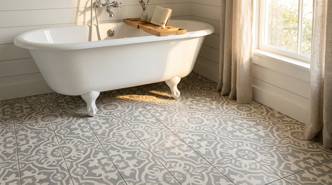
A shower wall that feels calm instead of cold
Blue in a shower can go two ways. It can feel restorative, or it can feel dark and wet. The difference usually comes down to finish and shade. Softer matte or satin surfaces often make a bathroom feel more composed. They don't throw light around as aggressively, and they tend to hide day-to-day residue better than very glossy surfaces.
Vertical stacking is especially effective here because it gives the enclosure a taller, cleaner read. Keep the grout close to the tile if the goal is a spa-like wash of color. Introduce stronger contrast only if you want the wall pattern to become a feature.
This video gives another look at how tile decisions shape finished spaces:
A commercial wall with presence
In hospitality and retail settings, blue subway tile often succeeds when it's treated as a specification material rather than just a decorative accent. A bar front, host stand backdrop, or restaurant feature wall may need repeatability, clean visual impact, and a color that still reads clearly under artificial lighting.
Deeper blues can be effective. They carry atmosphere without requiring a complicated pattern. A longer subway format with restrained grout usually looks more deliberate at commercial scale than a highly fussy layout. If the setting already has patterned flooring, signage, and layered lighting, the wall tile should act as an anchor.
The common thread in all three settings is restraint. Blue subway tile performs best when one decision leads and the others support it. Let the color lead, or the pattern lead, or the finish lead. When all three compete, the room gets noisy fast.
Sourcing Installing and Maintaining Your Tile
A blue tile wall can look exacting in the showroom and disappointing on site if the ordering and install decisions are loose. Blue shows shifts in shade, lippage, crooked joints, and soap film faster than many neutrals, so the practical work matters as much as the color choice.
What to confirm before you order
Start with samples in the intended room. Check them in morning light, at night with the fixtures on, and against the finishes that will surround them. Blue can read cleaner, grayer, or more saturated depending on the light source, and that changes the mood of the whole wall.
Review the product sheet before you commit. Tile size, thickness, edge type, finish, and shade variation all affect layout, trim decisions, adhesive buildup, and labor time. A longer glossy subway tile, for example, may look crisp on a sample board but demand a flatter wall than a smaller handmade piece. Order extra material from the same dye lot or production run when possible. That reduces the chance of a visible color jump if you need more tile later.
What to ask your installer
A capable installer should be able to explain the plan clearly before setting a single tile.
- Wall condition: Ask whether the substrate is flat and sound enough for the tile you chose, especially if the finish is glossy or the format is longer.
- Mockup and layout: Ask where the layout starts, where cuts will land, and how inside corners, edges, outlets, and niches will be handled.
- Joint control: Confirm grout joint width and whether the tile has built-in lugs, irregular edges, or size variation that will affect spacing.
- Material blending: If the tile has shade movement or surface variation, ask how boxes will be mixed so one dark or light patch does not collect in a single area.
- Wet-area prep: In showers and backsplashes behind heavy use, ask what waterproofing or surface prep system is being used before tile goes up.
For a solid technical refresher, review this guide on how to install wall tile properly before installation day.
Good results are usually decided before setting starts. Sample approval, substrate prep, and layout discipline do most of the heavy lifting.
Keeping blue tile looking good
Maintenance depends on the body and finish of the tile. That is the part inspiration galleries rarely address. A dark glossy blue can give you strong light reflection and depth, but it will also show water spots, toothpaste, and cooking residue sooner. A softer matte or lightly varied surface hides daily marks better, though it may hold onto soap film if cleaning gets neglected.
Use pH-neutral cleaners unless the manufacturer calls for something specific. Avoid abrasive pads on glossy glazes. They dull the surface over time. In showers, good ventilation cuts down on residue and makes routine cleaning easier. In kitchens, wipe splatter early, especially around the range and sink, because blue glaze tends to show dried mineral deposits and grease haze.
Blue subway tile holds up well when the material suits the room and the install is done with care. Original Mission Tile offers handmade cement tile collections, custom color capability, and installation guidance that can help during specification and planning.