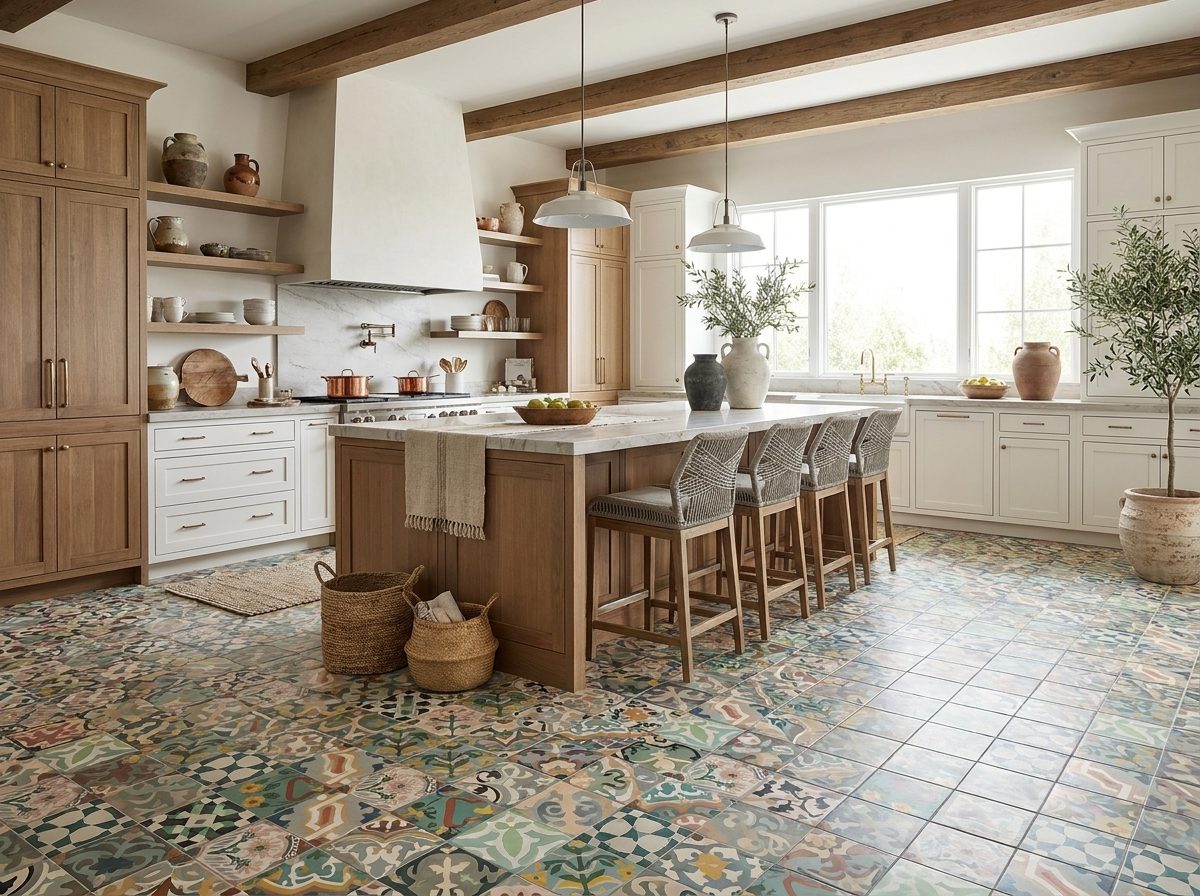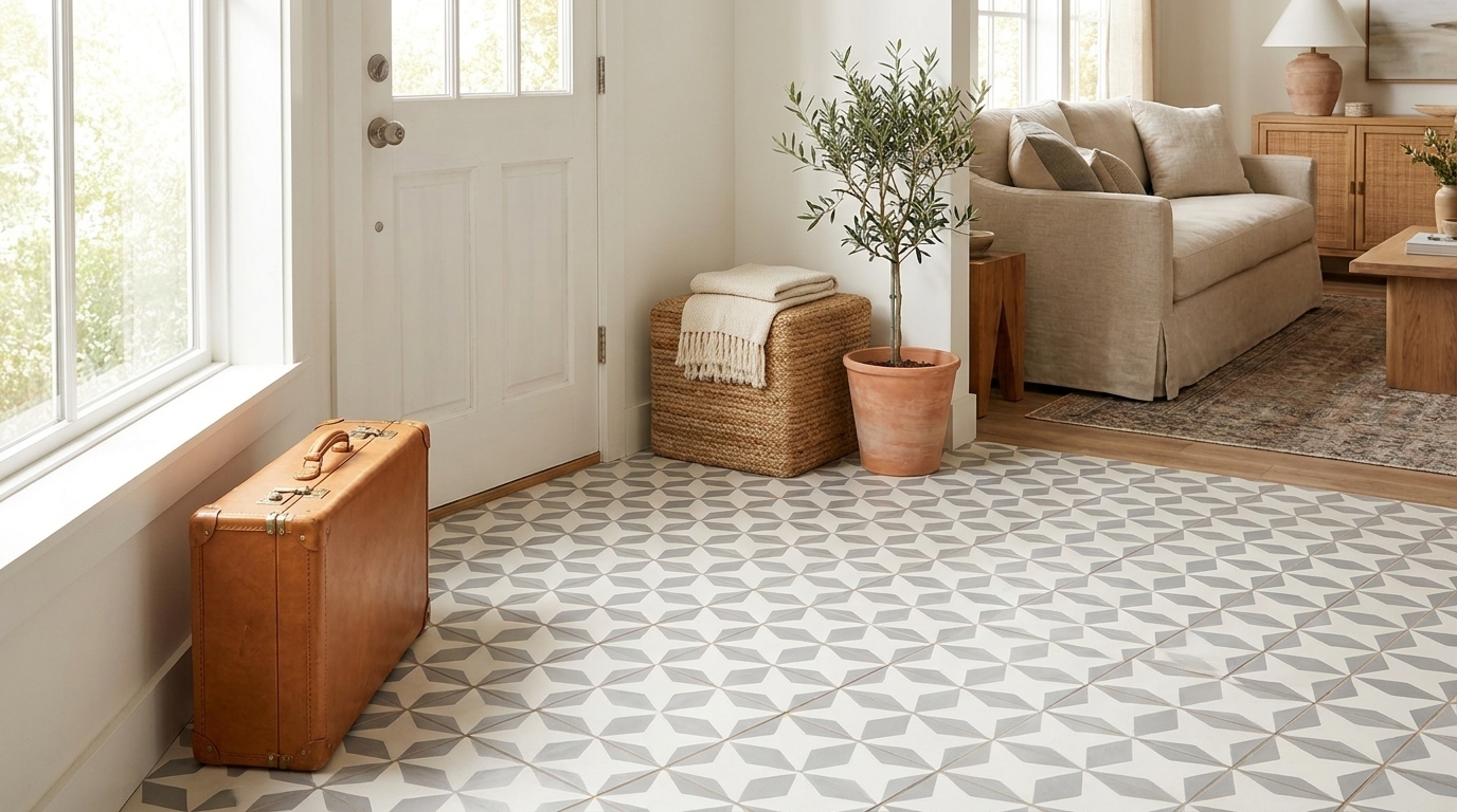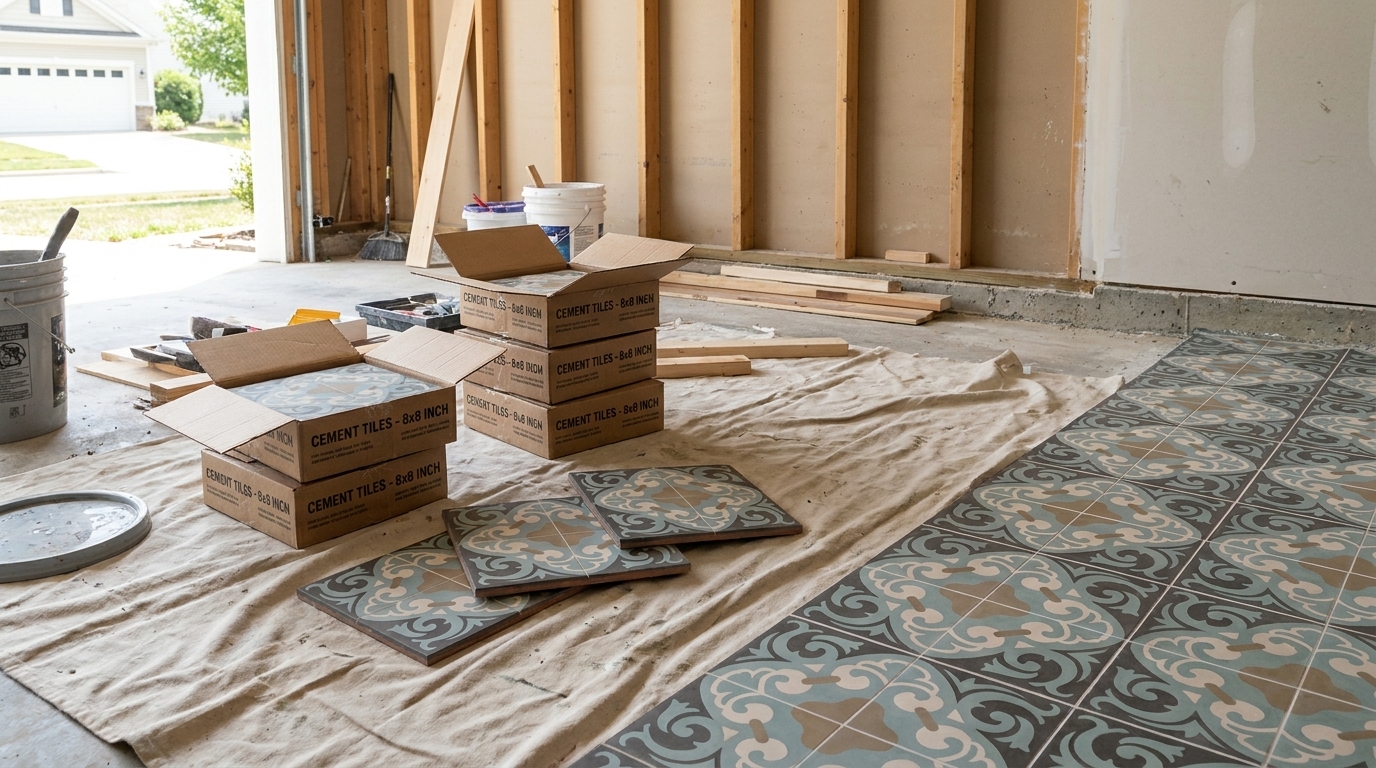
You're probably looking at a sample board, a saved photo, or a half-finished renovation and trying to answer one deceptively simple question. Will light green tile feel calm and timeless, or will it read too sweet, too vintage, or too hard to live with once it's on the wall or floor?
That tension is exactly why light green tile is such a useful design material. It carries color, but it doesn't shout. It softens a room without washing it out. In the right material and layout, it can lean refined, coastal, historic, botanical, or subtly modern.
The mistake I see most often is choosing the color first and stopping there. A pale green in glossy ceramic behaves very differently from a pale green in handmade cement. The sheen changes the mood. The body of the tile changes installation requirements. The finish changes how easily the surface shows soap residue, kitchen splatter, and everyday grime. If you want a result that still feels good after the novelty wears off, you have to evaluate color, material, layout, and maintenance together.
Choosing Light Green Tile for Modern Spaces
A renovation often reaches a point where every hard finish starts to feel too stark, too brown, or too safe. Light green tile solves that problem in a specific way. It introduces color, but it still behaves like an architectural surface, especially when the shade has an earthy or mineral cast.
Clients usually ask for "fresh" or "calm." The finished result depends less on the paint-chip name and more on how the tile is made, where it is installed, and what will touch it every day. A glossy pale green wall tile can sharpen a room and bounce light around. A handmade cement tile in a similar color reads softer, chalkier, and more grounded underfoot. That material difference is what determines whether the room feels crisp, historical, relaxed, or refined.
If you're sorting through those decisions during a remodel, this guide for Northern Colorado homeowners is useful because it addresses real project conditions, including budget, moisture exposure, and maintenance.
Why it works in current interiors
Light green sits comfortably with many of the finishes that define modern work today. White oak, warm whites, unlacquered brass, honed stone, painted cabinetry, and black steel all give it a different read. That range is why I specify it so often for projects that need some color but cannot afford a finish that dates quickly.
It also carries genuine design history. Pale green tile has long been at home in bathrooms, utility spaces, fireplace surrounds, and garden-adjacent rooms. The color feels familiar because it has been used that way for generations, from traditional homes to cleaner-lined contemporary interiors. Original Mission Tile draws from that craft tradition, which matters when you want a surface with depth and irregularity rather than a flat, printed color.
One practical test works well. If the room needs relief from white or greige, and blue feels cold, sample a restrained light green.
Start with the tile type before you commit to the color
This is the decision that saves expensive revisions. The same light green glaze or pigment can perform very differently depending on whether the tile is cement, ceramic, porcelain, or glass. Some materials mute the color. Others intensify it. Some need sealing and more careful maintenance. Others are easier choices for busy family kitchens or secondary baths.
A good starting point is this overview of types of tile. Compare the material first, then judge the shade inside that category. That sequence usually leads to better specifications and a room that still feels right after installation, cleanup, and daily use begin.
Finding Your Shade of Green
“Light green” isn't one thing. Most projects land in one of four directions: sage, mint, seafoam, or pistachio. Choosing the right one has less to do with trends and more to do with undertone, light conditions, and what fixed finishes already exist in the room.

Sage
Sage is the easiest light green to live with if you want something restrained. It usually carries a gray or earthy cast, which helps it sit comfortably beside limestone looks, white oak, unlacquered brass, and off-white paint.
Use it when the room needs softness more than brightness. On a backsplash, sage can calm busy cabinet lines. On a bathroom floor, it gives a natural, quiet backdrop for warmer woods and plaster-like wall colors.
Good pairings include:
- Warm whites for a layered, low-contrast envelope
- Natural oak or walnut when you want the space to feel rooted
- Aged brass if you want warmth without sparkle
Mint
Mint has a cooler, cleaner energy. It can skew retro if you pair it with black and white, but it can also feel sharp and contemporary in simple forms like stacked subway tile or a thin mosaic.
Mint works best when you want the room to feel lighter and more animated. North-facing rooms often benefit from some caution here. A cool green in cool light can drift sterile if you don't add balancing warmth through wood, cream paint, or warmer metal finishes.
For readers thinking through emotional tone as much as palette mechanics, the Striped Circle guide to interior design is a helpful companion.
Seafoam
Seafoam blends green with a noticeable blue note. It's airy, relaxed, and especially effective in bathrooms, laundry rooms, and coastal-adjacent interiors that need color without overt beach references.
This shade pairs well with:
| Shade | Best companions | Design effect |
|---|---|---|
| Seafoam | Crisp white, pale ash wood, nickel | Clean and breezy |
| Seafoam | Sand tones, soft greige, linen textures | More organic and quiet |
Seafoam needs care around strongly yellow lighting. Under warm bulbs, some seafoam tiles lose their freshness and can look muddier than expected. Always review a physical sample in the actual room.
Pistachio
Pistachio is the warmest and most playful branch of light green. It has a yellow-green cast that can feel cheerful, vintage, or Mediterranean depending on the tile shape and material.
A pistachio tile that looks charming on a sample card can become too sugary if you repeat it across a large surface without enough grounding neutrals.
This shade often benefits from contrast. Deep wood stains, charcoal accents, terracotta, or a creamy wall color keep it from becoming overly delicate.
A quick way to choose
If you're stuck between samples, use this filter:
- Look at the room's fixed finishes. Gray countertop, warm oak vanity, red-toned brick, and brass plumbing all push green in different directions.
- Decide whether you want calm or lift. Sage and seafoam tend to calm. Mint and pistachio tend to brighten.
- Check the tile at morning and evening. Pale greens are sensitive to light quality.
- Test grout beside the sample early. The wrong grout can cool it down or dirty it up fast.
A Practical Guide to Tile Materials
A light green tile that looks perfect on a sample board can disappoint after installation if the material does not match the way the room is used. I see this often in kitchens and baths. Clients respond to color first, then discover they also chose a maintenance routine, an installation method, and a certain kind of aging.

The material determines more than performance. It shapes how light green reads in the room. Handmade cement gives pale green depth and softness. Glazed ceramic sharpens it. Glass brightens it. Stone adds movement and unpredictability. That is the point where aesthetics and specification meet.
Handmade cement
Handmade cement gives light green tile a dense, velvety appearance that glazed products rarely match. The pigment lives in the body of the tile, so the color feels built in rather than coated on. That quality is part of why Original Mission Tile and other craft-based makers produce green surfaces with more visual depth and a quieter, more architectural finish.
There are practical consequences. Otto Tiles & Design lists its Light Green 3001 encaustic cement tile at 5.22 lb/sq ft and 0.4 in thick in the 8×8 format on its Light Green product page. That affects substrate preparation, transition heights, and handling on site. Installers need a flat base and a setting system suited to a heavier tile body.
Cement also asks for owner buy-in. It rewards clients who appreciate patina, variation, and a surface that gains character over time, provided sealing and cleaning are handled correctly.
Ceramic
Ceramic is often the easiest way to bring light green into a project without adding much installation complexity. It comes in a wide range of sizes and finishes, and glazed ceramic is often a strong fit for backsplashes, shower walls, and other areas where easy wipe-down care matters.
The trade-off is visual depth. Many ceramic lines deliver excellent color, but a pale green glaze reads differently from a pigmented cement body. It tends to feel cleaner, brighter, and more reflective.
A few details matter in specification:
- Glazed ceramic usually offers the simplest cleanup.
- Handmade-look ceramic can have irregular edges and surface waviness, which changes the finished grid.
- Very glossy ceramic reflects enough light to make a soft green appear lighter or cooler than it did in the showroom.
Porcelain
Porcelain is the workhorse choice. It handles floors, wet areas, and high-traffic conditions well, and it usually brings lower porosity and less maintenance than cement or many natural stones.
For clients who want one green story carried from a bathroom floor into a shower or from an entry into a mudroom, porcelain often solves the problem cleanly. The compromise is tactile. Even when porcelain mimics handmade variation, the result is usually more controlled and less nuanced than a true handcrafted surface.
If the project hinges on floor durability first, this guide to best floor tile material helps sort the options.
Glass
Glass gives pale green a luminous, almost backlit quality. In a darker powder room or a kitchen that needs more sparkle, that can be exactly right.
It is less forgiving in large expanses. Glass can feel cold if the surrounding finishes are also hard and glossy, and it shows layout precision clearly. On site, I use it for highlight areas, not when the goal is warmth or old-world texture.
Natural stone
Natural stone is a narrower path for true light green, but it has a place in projects using green marble, honed mosaics, or serpentine-like material. Its appeal is easy to understand. No printed or glazed surface can fully copy the movement and depth of real stone.
Its limits need equal attention. Stone varies by type, finish, and porosity, and maintenance expectations should be discussed before the order is placed, not after installation. A client expecting porcelain-level ease can end up frustrated.
Cleanability and finish matter more than buyers expect
Finish changes the daily experience of tile. A matte light green wall may look beautiful in a sample presentation, yet require more attention in a busy bathroom than a glazed surface with the same color.
Textured, porous, or poorly sealed finishes tend to hold onto soil more readily. Smooth glazed surfaces usually release it more easily. That does not make matte or handmade finishes the wrong choice. It means they belong in rooms, and on surfaces, where their character outweighs the extra care.
| Material | Strength | Watch-out |
|---|---|---|
| Handmade cement | Depth, matte character, artisanal look | Needs proper sealing and careful substrate planning |
| Ceramic | Versatile, often easy to clean | Handmade-look lines can vary more than expected |
| Porcelain | Durable, practical, broad application range | Often feels more uniform than true handmade tile |
| Glass | Reflective, brightening, modern | Can feel cold or visually busy in large amounts |
| Natural stone | Unique movement and organic elegance | More sensitive to maintenance and finish choice |
Mastering Layouts and Grout Selection
Layout is where a basic light green tile starts to feel intentional. The same tile can read classic, refined, or playful depending on the pattern, joint spacing, and grout contrast.

Layout changes the architecture
A simple stacked layout makes light green feel orderly and current. If the tile has soft variation, stacking lets that variation do the visual work without adding pattern noise. This is often the right move in kitchens with strong cabinet lines or in baths where you want the room to feel taller and cleaner.
Running bond introduces familiarity. It's more forgiving, more traditional, and often more relaxed. If you're using a handmade-look tile with slight irregularity, running bond can support that character.
Herringbone and basketweave increase visual activity. They're effective in smaller moments, such as a shower niche, fireplace face, vanity wall, or entry floor. Used across a large room, they become a stronger design statement and need quieter surrounding finishes.
Match pattern to tile shape
Don't force a dramatic layout onto a tile that doesn't benefit from it. Rectangles usually carry stacked, offset, and herringbone well. Squares often look strongest in straight lay, checker-style color play, or border-based compositions.
A quick decision framework helps:
- Use stacked layouts when the room already has enough detail.
- Choose running bond when you want softness and familiarity.
- Reserve herringbone for focal areas or spaces that can support extra movement.
- Keep scale in mind so the pattern suits the room size and sightline.
If the tile shape and room architecture are already strong, grout should support them, not compete with them.
Grout can sharpen or soften the whole scheme
Grout is not an afterthought. With light green tile, it changes the read immediately.
A close grout match creates a calmer field. The surface feels more continuous, and the color carries across the room with less interruption. This works especially well when the goal is spa-like, tonal, or architectural.
A contrasting grout outlines each piece. That can be useful when you want to emphasize a geometric layout or bring some graphic structure to a pale color. It can also make a room feel busier than expected.
Here's a useful visual reference before you settle on a pattern:
Where people go wrong
The most common issue isn't choosing the “wrong” green. It's mixing a soft tile with a harsh grout, or selecting an elaborate layout in a room that already has loud stone, open shelving, and prominent fixtures.
Keep one element in charge. If the color is delicate, let it stay delicate. If the pattern is the star, simplify the grout. If the room needs order, use a disciplined layout and let the green provide the personality.
Light Green Tile Designs Room by Room
A light green tile that looks perfect on a sample board can behave very differently once it meets steam, cooking grease, muddy shoes, or fireplace soot. Good room-by-room decisions come from matching the look you want to the material performance each space demands.
Kitchen
Kitchens reward restraint. Light green usually does its best work on the backsplash, where it can bring color and softness without asking the floor or countertops to do less.
Glazed ceramic often has the practical advantage here because it wipes clean easily around ranges and sinks. If the goal is a quieter kitchen, a pale sage subway tile with close-matched grout keeps the field calm behind busy utensils, stone counters, or open shelving. If the cabinetry is simple and the room needs more movement, a green tile with visible tonal variation adds life without forcing a complicated pattern. Before you commit, it helps to discover popular backsplash ideas and then filter them through your own tolerance for scrubbing, staining, and visual busyness.
Bathroom
Bathrooms are one of the most natural places for light green tile because the color already carries a long association with cleanliness, calm, and old-house character. In period-minded work, pale green still feels believable rather than nostalgic for its own sake. Tile also has deep roots as a practical finish for wet spaces, which is part of why a tiled bath can still feel both functional and ceremonial.
The specification should change by surface. Wall tile benefits from finishes that reflect enough light to keep the room open and easy to clean. Floor tile needs more attention to slip resistance and visual warmth, especially in a green that could otherwise read cold under bright lighting. In showers, small-format tile often solves more problems than it creates because it follows slope changes better and gives more grout joints underfoot.
I often advise clients to decide what they want to notice first. Color, gloss, or texture. In a bathroom, trying to maximize all three at once usually creates clutter.
Entryways and mudrooms
Mudrooms and entries can carry more pattern and slightly darker grout because they already deal with interruption. Wet shoes, pet traffic, dropped bags, and daily grit all show up at the threshold.
A square or small-format light green floor tile can hide that visual noise better than a pale white scheme, especially if the green has a muted, dusty cast instead of a sugary one. Wood benches, blackened iron hooks, painted trim, and woven runners all sit comfortably with those tones. If you want a room where craft shows up immediately, a handmade cement tile for entry and utility spaces gives you a softer, more grounded surface than many factory-perfect products, though it also asks for correct sealing and more deliberate care.
Laundry rooms and utility spaces
Laundry rooms do not need dramatic color to feel designed. Seafoam, celadon, and soft sage can clean up the mood of a hard-working room without making it precious.
This is also a good place to be honest about budget. A simple field tile in a light green glaze can be enough when the cabinets, sink, and hardware already carry the room. Save the more expressive handmade or specialty tile for a backsplash over the utility sink or a single accent wall where the visual return is higher.
Fireplace surrounds
Fireplaces are one of the best places to use light green tile because the color can soften a heavy architectural mass without stripping it of presence. That matters in living rooms with dark beams, brick, or stained wood, where the surround can easily become too weighty.
A framed application also gives you more freedom with shape and layout. Herringbone, stacked vertical, or a small repeating pattern can work here because the area is contained. In older homes, pale green is especially effective when you want to acknowledge period character and still keep the room livable, edited, and current.
Bringing Your Vision to Life with Handmade Tile
If your goal is a light green tile surface with depth, softness, and visible craft, handmade cement deserves serious consideration. It creates a different result from factory-glazed products. Not better for every use, but distinctly different in feel.

What handmade cement does visually
Handmade cement tile tends to read as more grounded and tactile. The matte surface diffuses light rather than bouncing it back hard, which is one reason pale green often feels calmer in cement than in glossy ceramic. Small shifts in tone from tile to tile also keep the surface from looking flat.
For heritage-driven or highly personal interiors, that matters. Original Mission Tile produces handmade cement tile using traditional hydraulic-press methods and offers green options along with custom color and pattern capabilities. That makes it relevant when a project needs a specific light green, not just the nearest in-stock approximation.
What the installation demands
The fate of many beautiful ideas, whether protected or ruined, hinges on proper execution. Cement tile needs proper substrate preparation, careful setting, sealing appropriate to the product and application, and cleaning methods that respect the material. If the installer treats it like a generic glazed wall tile, problems usually follow.
A successful handmade cement installation depends on a few essential requirements:
- Flat substrate: Cement tile telegraphs irregularities more readily than many people expect.
- Material-specific installation plan: Mortar, joint treatment, and sequencing should align with the tile body and application.
- Sealing and care: The owner needs clear instructions before move-in, not after the first stain scare.
Cement rewards attention. It doesn't reward shortcuts.
Why custom matters with light green
Light green is a subtle color family. Small shifts in undertone change the whole room. That's why custom capability matters more here than it might with a charcoal, black, or bright white tile.
When a designer can tune the green toward sage, mint, seafoam, or a warmer pistachio direction, the tile starts responding to the architecture instead of just occupying it. That's especially useful in hospitality spaces, historic renovations, and houses where surrounding materials are already established.
The right expectation
Handmade tile is for clients who appreciate nuance. The appeal isn't sterile uniformity. It's the combination of craft, pattern potential, and a surface that feels made rather than merely manufactured.
If that matches the project, light green in handmade cement can be one of the most satisfying choices you'll make. It brings color without noise, history without heaviness, and personality without forcing the room into a trend cycle.
If you're narrowing down shades, reviewing material options, or planning a custom layout, Original Mission Tile is a practical place to explore handmade cement possibilities for light green tile, from stock colors to pattern work designed to fit a specific room and design brief.