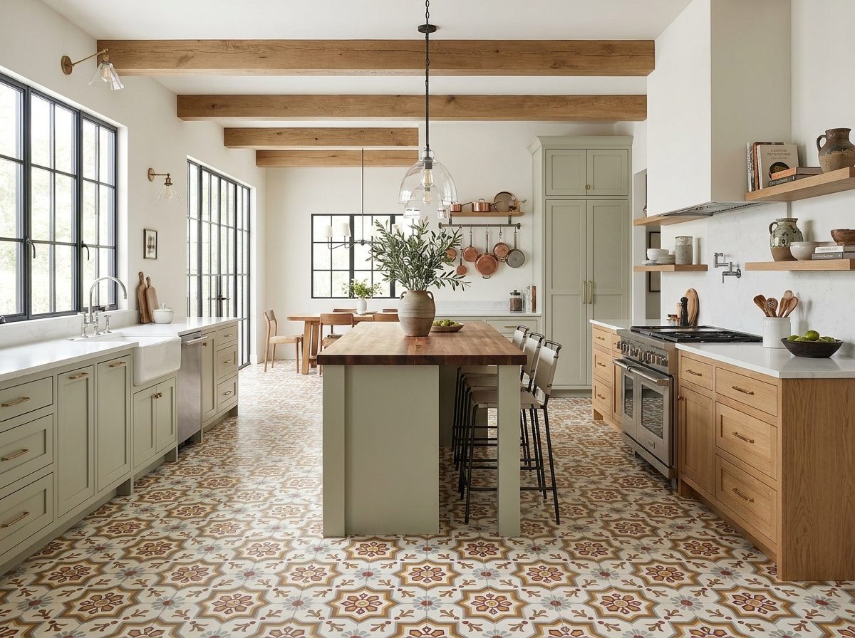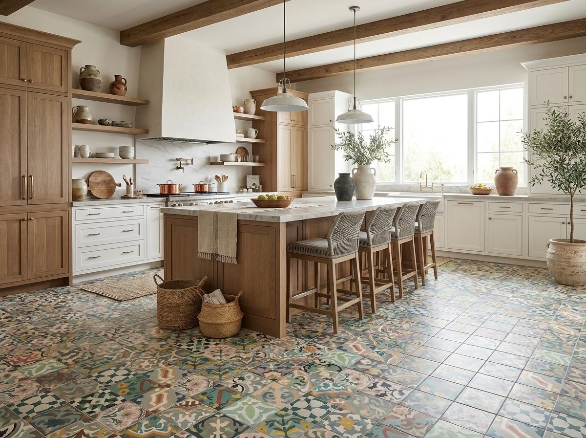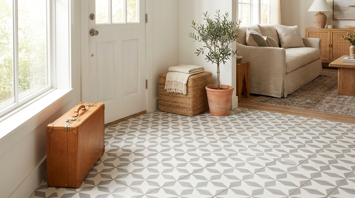
You're probably looking at a sample board, a saved image, or an existing room and asking the same question clients ask all the time. Is olive green tile going to feel rich and grounded, or dated and heavy?
The answer depends less on the color itself and more on the decisions around it. Material, finish, grout, lighting, and layout all change the result. Olive green can read precise and architectural in one room, soft and restorative in another, and muddy in a third if the supporting choices are wrong.
That's why this color rewards a more disciplined approach than trend-driven tile usually gets. Done well, olive green tile has staying power because it sits between neutral and statement. It carries color, but it also behaves like a grounding material.
The Allure of Olive Green Tile A Design Story
Olive green tile has history, and that history explains why it still works. It was a defining material in 1950s American residential interiors, with a documented example in a 1955 bathroom in Lawrence, Kansas, where olive green tile appeared as a standard wall and floor finish in a post-war home boom setting, as shown in Retro Renovation's look at that 1955 olive green bathroom.

That origin matters. Olive green wasn't chosen only because it was fashionable. It answered a mood. Mid-century interiors often leaned toward colors that softened a home and made it feel calm, domestic, and reassuring. Olive did that without becoming sugary or precious.
Why this green has more range than people expect
Designers often divide tile colors into two camps. There are safe neutrals, and there are expressive colors. Olive green lives in the overlap.
It has enough brown and gray in it to relate to wood, stone, unlacquered brass, plaster, black steel, and off-white paint. But it also has enough color to shape the room's personality. That combination is rare, and it's why olive green tile works in homes that want character without visual noise.
Practical rule: Olive green succeeds when the room needs a grounding surface, not a flashy accent.
That's also why it ages better than brighter greens. A saturated emerald can be stunning, but it asks the whole room to keep up. Olive is less demanding. It lets walnut cabinetry, linen drapery, travertine counters, or painted plaster walls carry part of the composition.
A classic, not a nostalgia piece
Olive green tile also has a deeper lineage than many homeowners realize. Green tile has roots in much older decorative traditions, and Traditional Building's ceramic tile history overview traces green ceramic tile from historic architectural use through later mainstream adoption, while also noting standard ceramic and porcelain revivals at about $2 to $15 per square foot and natural stone or glass options at about $10 to $30 per square foot in the context of material comparisons.
The useful takeaway isn't that olive green belongs to one era. It's that the color has moved from luxury rarity to mass-market domestic finish to contemporary revival. That gives it a flexibility most “statement colors” don't have.
A few combinations consistently show why it lasts:
- With warm white walls it feels refined and quiet.
- With dark wood it reads classic and substantial.
- With matte black it turns more graphic and modern.
- With brass or bronze it picks up warmth and looks more layered.
Olive green tile isn't memorable because it shouts. It's memorable because it settles a room.
Choosing Your Material Ceramic vs Porcelain vs Cement
Material changes everything. Two olive green tiles can look similar in a photo and behave completely differently once they're installed. The right choice comes from matching the tile body to the room's use, not just choosing the prettiest sample.

The quick comparison
| Material | Best use | What it looks like | Main trade-off |
|---|---|---|---|
| Ceramic | Walls, moderate-use areas | Broad finish range, often glazed | Can chip more visibly at edges |
| Porcelain | Floors, wet zones, higher-wear areas | Dense, refined, available matte or gloss | Usually feels more manufactured |
| Cement | Feature floors, statement walls, design-led spaces | Velvety matte surface, depth of pigment | Needs sealing and more informed installation |
Ceramic is the easiest place to start. It's often the most accessible route if you want olive green on a backsplash, shower wall, or powder room feature. You get plenty of shape and glaze options, and it's forgiving from a design standpoint because ceramic is available in everything from flat matte to reflective gloss.
Porcelain is the workhorse. If the project involves heavy daily use, repeated cleaning, or a floor that has to stay visually crisp, porcelain usually gives the least drama on the maintenance side. It's the option I reach for when durability needs to lead and handcrafted variation isn't the point.
Why cement feels different under the eye
Handmade cement tile has a presence glazed tile can't really fake. The color reads more integrated, less coated. That comes from how the tile is made. Olive green cement tile uses a pigmented color layer between 3 and 4 millimeters thick, created by hand-pouring mineral oxide slurry into molds, followed by cement-sand layers and hydraulic pressing at about 1,700 PSI, according to Villa Lagoon Tile's technical data on cement tile construction.
That inlaid color is the reason cement tile often looks deeper and softer than a surface glaze. It doesn't have the same reflective bounce. Instead, it gives you a matte, almost velvety read that suits olive especially well.
For a useful side-by-side explanation of how these materials differ in real projects, this comparison of cement tile vs ceramic tile is worth reviewing before you specify.
Cement tile is usually the right answer when texture, pigment depth, and a handmade look matter more than low-maintenance convenience.
What works where
Use the room to make the decision.
Kitchen backsplash
Ceramic is often enough. A glazed olive green subway or square tile can add color without asking for high-maintenance care.Family bathroom floor
Porcelain tends to be the safer pick if the room gets hard daily use and you want simpler upkeep.Powder room floor or statement wall
Cement shines here because people experience it up close. The subtle variation and matte finish become the feature.Hospitality or commercial interiors
Material choice depends on traffic, cleaning routine, and the visual identity of the space. A restaurant host stand wall can prioritize mood. A service corridor can't.
The wrong way to choose is by treating all olive green tile as interchangeable. The right way is to ask what the room needs the tile to do, then choose the body that delivers that result.
Mastering Olive Green Design Palettes and Pairings
Most olive green tile failures aren't color failures. They're palette failures. The tile is fine, but the wood is too orange, the metal is too cold, the wall paint is too sharp, or the lighting strips all the richness out of the green.

Earthy modern
This is the most dependable palette for olive green tile. Pair it with warm whites, oat tones, mushroom, natural oak, walnut, linen, and aged brass. The room feels settled because every material has some warmth and some softness.
Choose this direction if you want the tile to feel architectural rather than decorative. Matte finishes work best here. Too much gloss can pull the room away from that grounded quality.
A few combinations that consistently land well:
- Olive green tile with creamy plaster walls
- Olive and white oak
- Olive with unlacquered brass and honed stone
- Olive with woven textures like linen or cane
If you're still working through the full-room scheme, this guide to choosing your home's colors is a useful companion for building a palette that doesn't stop at the tile sample.
Mid-century without turning theme-y
Olive green naturally connects to mid-century interiors, but there's a difference between referencing that era and reproducing it too precisely. The cleaner route is to borrow the principles, not the clichés.
Use walnut or teak tones, simple geometric forms, and a restrained accent color. Burnt orange, muted teal, and black can all work, but keep them in supporting roles. Let the olive tile be the historical nod.
For softer tonal inspiration, especially if you want a gentler family of greens around your main tile choice, browse these light green tile ideas. It's a good reminder that olive can sit within a wider green story rather than carrying the whole room alone.
Olive green gets stronger when the surrounding materials are edited. It doesn't need a crowded palette to feel interesting.
Industrial and graphic pairings
Olive can also go sharper. In loft-style interiors or commercial spaces, pair it with blackened steel, concrete, exposed brick, or crisp off-white. This works best when the tile shape is clean. Think stacked rectangles, straight-set squares, or disciplined grids.
In this mode, grout becomes part of the architecture. A higher-contrast grout will sharpen the geometry, while a softer grout lets the wall or floor read as a more continuous field.
Light changes the entire color read
Artificial lighting has a major effect on olive green tile. Warm lighting in the 2700–3000K range enhances earthy undertones, while cool lighting at 4000K and above can flatten the color and make it look grayish, according to Edward Martin's guidance on choosing green tiles for bathroom spaces.
That's not a minor detail. In a bathroom with little natural light, the wrong bulb can make a beautiful sample look lifeless once installed.
Use this as a simple rule set:
- Choose warm bulbs if you want olive to feel richer and more relaxed.
- Avoid overly cool light in compact baths and powder rooms.
- Test the sample vertically under the actual fixture before approving the final tile.
People often sample tile in daylight and approve lighting later. With olive green, reverse that habit. Light is part of the color specification.
Ideal Applications for Olive Green Tile
Some materials belong in one place. Olive green tile doesn't. It can be background, focal point, or architectural surface depending on the scale and shape you choose.

Bathrooms where the color earns its keep
Bathrooms are still the most natural home for olive green tile. That mid-century association helps, but so does the color's relationship to water, stone, and softer light. On shower walls, it feels enveloping. On floors, it anchors white fixtures and keeps the room from feeling sterile.
Subway tile gives olive a classic rhythm. Square tile feels calmer and more architectural. Fish scale or scallop shapes make the color read more decorative, which can be beautiful in a powder room but may be too stylized for a primary bath that needs longer design life.
A reliable bathroom composition looks like this:
- Wall tile in olive green
- Warm white sanitaryware
- A wood vanity
- A mirror with a thin metal frame
- Simple stone or composite countertop in a soft neutral
Kitchens that want depth, not brightness
In kitchens, olive green works especially well when the room already has natural wood, painted cabinetry, or warm metals. It's a strong backsplash color because it brings depth without the visual intensity of navy or black.
I like olive behind open shelving, around a range wall, or as a full-height backsplash carried to the underside of upper cabinets. If the kitchen is small, keep the tile shape disciplined and the grout unobtrusive. Too much movement in a compact kitchen can make the green feel busy instead of grounded.
For a visual example of how tile can shape a room's mood, this short video is helpful:
Feature surfaces beyond kitchens and baths
Olive green tile becomes more interesting when you stop limiting it to expected locations. I've seen it work particularly well in these applications:
Fireplace surrounds
A matte olive tile can make a fireplace feel original without becoming the loudest element in the room.Entry niches and mudrooms
Olive handles wear visually well and pairs naturally with wood benches, black hooks, and stone floors.Hospitality feature walls
Restaurants, boutique hotels, and bars often need a surface that feels intimate in low light. Olive is good at that.Tile rugs or inset floor fields
A defined olive tile area can separate a vanity zone, vestibule, or bar area from surrounding flooring.
In larger spaces, olive green tile works best when it's given a clean boundary. A framed wall, a full-height field, or a defined floor panel reads intentional.
Shape decides the mood
The same color can skew traditional, modern, or playful depending on format.
| Shape | Typical effect |
|---|---|
| Subway | Familiar, versatile, classic |
| Square | Calm, architectural, balanced |
| Hexagon | Slightly more graphic |
| Fish scale | Decorative, softer, more expressive |
That's why application isn't just about room type. It's about how much pattern, reflection, and geometry the room can tolerate. Olive green tile is flexible, but it still needs a role.
Installation and Maintenance for Lasting Beauty
A beautiful tile choice can be undone by mediocre installation. Olive green makes this especially obvious because grout color, edge alignment, haze, and sealer residue all show up against it.
Start with the substrate and the sample board
Before any tile goes in, the surface has to be flat, stable, and appropriate for the setting. That's standard practice, but it matters more with darker or medium-value colors because lippage and uneven joints become easier to read. Olive doesn't hide a sloppy layout.
Always approve more than a loose sample. Build a small board with the actual tile, intended grout, and the room's lighting conditions. If it's a floor, view it from standing height. If it's a wall, view it vertically.
Grout is not a minor decision
Grout changes the visual size of the tile field. With olive green tile, that choice can completely shift the room.
Light grout such as beige or soft gray creates a more continuous, expansive look that suits smaller spaces, while dark grout such as black or charcoal emphasizes tile edges and adds rhythm but can make a compact room feel smaller, based on design guidance discussed in this grout and tile design video.
Use that trade-off intentionally:
- Choose lighter grout when you want the tile field to feel calm and continuous.
- Choose darker grout when the tile shape is part of the design statement.
- Be careful with bright white grout beside olive. It often looks too stark.
- Test grout dry-down because the final color can shift once cured.
Dark grout can look striking with olive green tile, but it makes every alignment decision visible. Your installer needs to be precise.
Cement tile needs a different level of care
Handmade cement tile should never be treated like standard glazed tile. It's a porous material and needs a proper sealing sequence. If the installer skips that or uses the wrong products, the room can pick up blotching, haze, or difficult-to-remove grout staining.
For ongoing upkeep, homeowners often need straightforward guidance that goes beyond generic internet advice. If grout cleaning becomes part of the maintenance routine, this roundup of Savera advice for clean grout is a practical reference point.
What keeps olive green tile looking good
Long-term care is mostly about consistency, not intensity.
Use pH-appropriate cleaning methods
Aggressive cleaners can create problems, especially on more sensitive finishes.Wipe standing water in low-ventilation bathrooms
This matters more for appearance than drama. It helps preserve a cleaner surface read.Refresh sealer when the material calls for it
Cement tile in particular depends on proper protection.Treat grout lines as part of the design
Dingy grout can make even a beautiful tile installation look tired.
The best olive green installations don't just start well. They stay legible over time because someone made smart technical choices on day one.
Customizing Your Vision with Handmade Tile
Olive green tile transforms, moving beyond a simple finish to become a design tool. Handmade tile opens up decisions that mass-produced options usually don't. You're not limited to choosing a color from a shelf and hoping the available format suits the room. You can shape the pattern, the scale, the edge condition, and the relationship between olive and every supporting color around it.
Why customization changes the result
Most off-the-shelf tile decisions are reactive. You find a green you like, then compromise around it. Maybe the size is too small. Maybe the pattern is close but not right. Maybe the green works, but only in a gloss finish when the room really needs a matte surface.
Handmade tile changes that sequence. You begin with the room and build the tile to serve it.
That matters with olive because the color sits in such a nuanced range. A more yellow olive can feel rustic. A grayer olive can feel tailored and urban. A deeper, muddier olive can be moody and dramatic. Customization lets you control those subtleties instead of accepting whichever version happens to be in stock.
The smartest way to customize
Not every project needs a fully bespoke pattern. In fact, many of the strongest custom installations are controlled rather than complicated.
A practical framework looks like this:
Start with the field color
Decide what role olive should play. Background, border, accent, or dominant surface.Add one supporting tone
Cream, black, clay, sand, or muted blue can all shift the personality of the green.Match the pattern to the room scale
A tight, busy motif can overwhelm a small powder room floor. A broad pattern can disappear in a large lobby unless it has enough contrast.Use customization to solve architecture
Stair risers, fireplace faces, arched niches, and inset “rug” areas often benefit most from a custom tile approach.
The best custom tile isn't custom for the sake of novelty. It's custom because the room has a specific visual problem to solve.
Handmade tile earns its place when performance matters too
Customization is only useful if the material can handle the application. Handmade cement tile isn't just decorative. In solid colors including olive green, cement tiles have compressive strength of at least 20 MPa and Mohs abrasion hardness of 3 to 4, comparable to black marble, making them suitable for high-traffic indoor and underfloor-heated commercial applications when properly sealed, according to Original Mission Tile's cement tile description.
That's the advantage in design-led commercial and residential work. You can pursue a distinct visual language without moving to a fragile, purely ornamental surface.
What the customization process should include
A good custom process gives you visual control before production starts. That means reviewing pattern geometry, color distribution, and how the olive reads against its companions. It also means checking how the tile transitions at edges, corners, and borders.
Look for a process that allows you to:
- Visualize the pattern before ordering
- Adjust color placement, not just overall hue
- Coordinate field tile and decorative tile together
- Resolve trim, edge, and layout details early
If you're exploring what that looks like in practice, this collection of handmade cement tile options shows the range of formats and design directions available when you move beyond standard catalog tile.
Where custom olive green tile makes the biggest impact
Some projects benefit more from customization than others.
A few stand out:
- Hospitality powder rooms where a memorable floor can define the guest experience
- Residential entries where a custom pattern creates a strong first impression
- Kitchen feature walls that need to bridge cabinetry, stone, and metal finishes
- Boutique commercial interiors where brand identity needs to show up in the architecture
In those settings, handmade olive green tile doesn't feel like an upgrade for its own sake. It feels resolved. The room stops looking assembled from available parts and starts looking designed.
That's the difference people respond to, even if they can't immediately name it.
If you're ready to turn olive green tile from an idea into a finished specification, Original Mission Tile is a strong place to start. Their handmade cement tile collections, custom design capabilities, and practical installation guidance make them especially useful for homeowners, designers, and builders who want a tile that feels personal and performs over time.