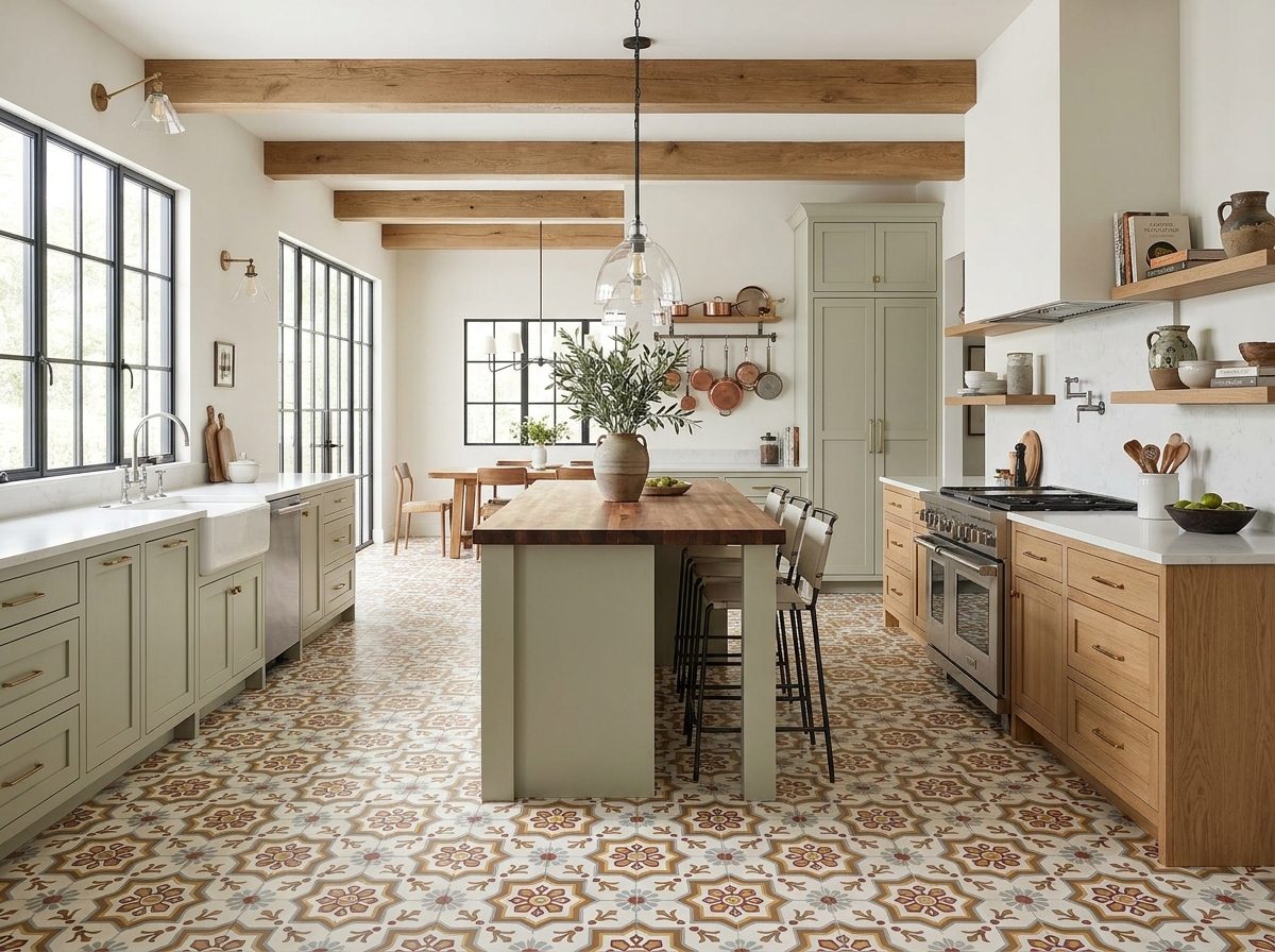
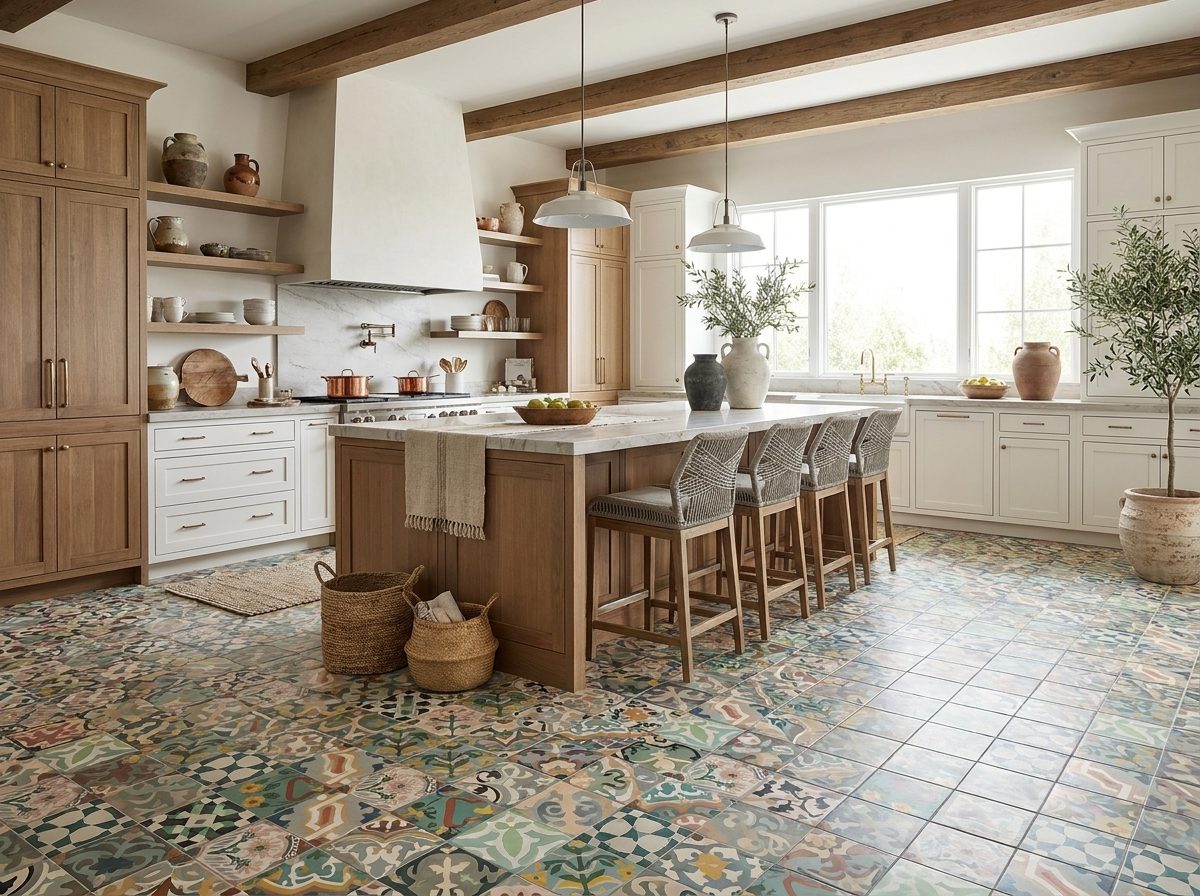
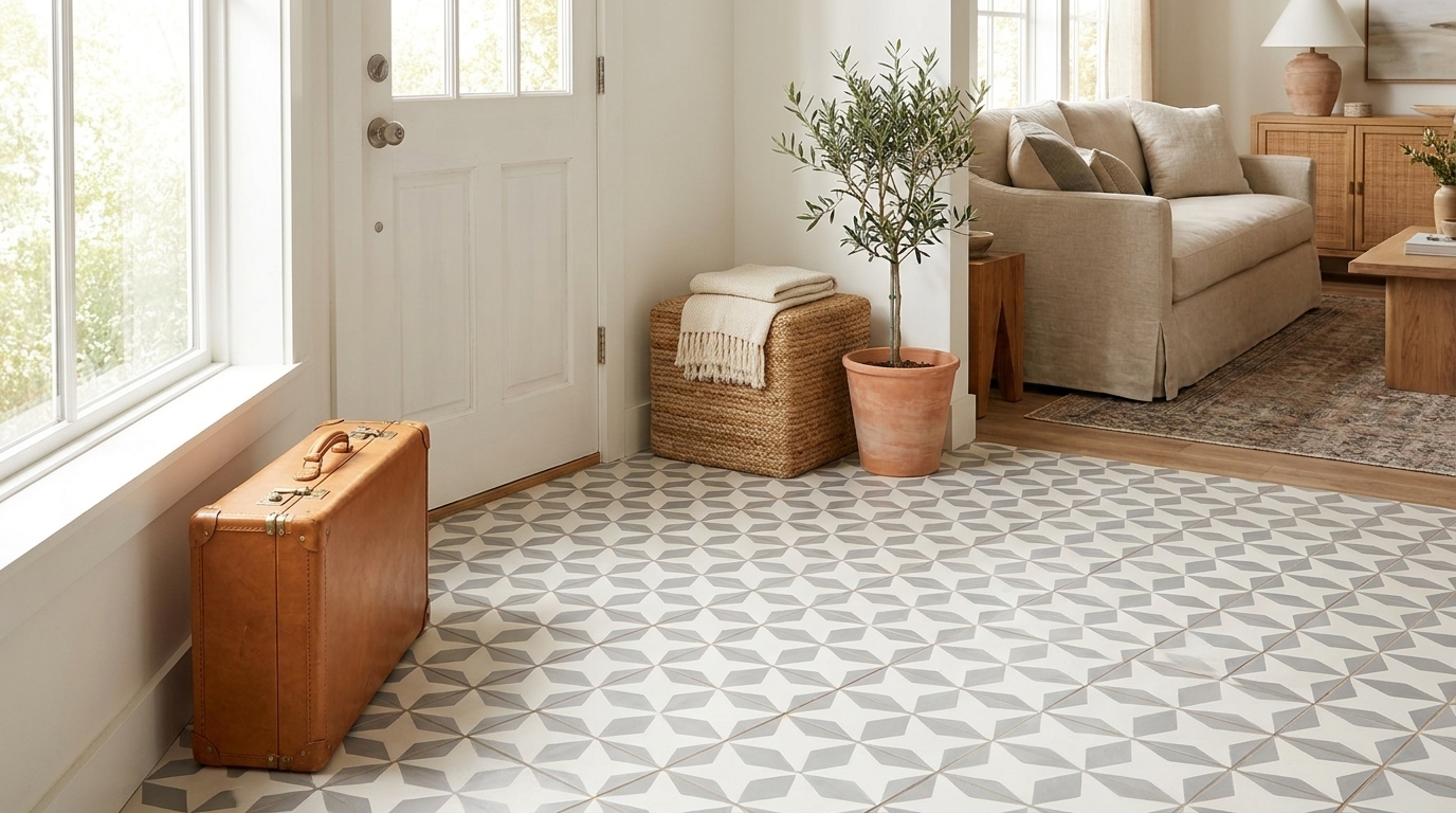
Choosing the right tile is only half the battle. The layout is what gives the surface its rhythm, scale, and character. Too many guides stop at naming patterns, but they don't explain which rectangle tile patterns flatter handmade cement tile, which ones fight it, and where installation risk starts to outweigh the visual payoff.
That gap matters because cement tile behaves differently from glossy factory tile. Its matte surface reads softer. Its color has depth rather than shine. Its handmade variation can make a simple layout feel rich, or make a fussy one feel overcrowded. If you're working with artisanal material, the pattern has to support the tile rather than compete with it.
Rectangle tile patterns also carry a long design lineage. Tilemaking is traced to the Holy Lands around the 4th century BC, and Romans later spread tiling through Europe, a history that helps explain why modular rectangular layouts still feel so natural on floors and walls today, according to Traditional Building's ceramic tile history overview. If you're comparing layout ideas for a bathroom renovation, a mudroom, or a kitchen backsplash, that's part of why the classics keep returning. For broader planning context, this 2026 Melbourne tile guide is also useful.
The patterns below move quickly from foundational to more decorative. Each one can work with handmade cement tile. The difference is knowing when to keep the layout quiet, when to let the geometry do the talking, and when to pull back.
1. Running Bond Pattern
Running bond is the pattern commonly recognized immediately. Each row shifts from the one below, creating the familiar bricklike rhythm that works in old houses, transitional kitchens, and commercial corridors without feeling forced.
With handmade cement tile, that rhythm is especially forgiving. Slight tonal variation from tile to tile looks intentional because the stagger already creates movement. On a backsplash, it softens a plain field of color. On a floor, it gives a room direction without making the surface feel busy.

Where it works best
I like running bond in Mission-style homes, long kitchen walls, hospitality entry sequences, and spa-like bathrooms where you want texture but not visual noise. It's also one of the safest ways to use a strong handmade color, because the pattern feels familiar even when the tile color doesn't.
Subway tile became a defining American rectangular layout when it appeared in New York City subway stations in 1904, then moved into homes and stayed there, as noted in this historic tile pattern roundup. That history still shows in current running bond installations. The layout reads established, not trendy.
Practical rule: If the cement tile has a lot of color depth, keep the running bond simple and let the material carry the surface.
A few details make or break this layout:
- Center the sightline: Start from the most visible wall or entry angle, not from the first corner you reach.
- Control edge cuts: Thin slivers at open ends cheapen the whole installation.
- Choose grout intentionally: Matching grout quiets the pattern. Contrast grout makes every offset more visible.
If you're planning combinations with brick or subway formats, the pattern gallery at Original Mission Tile's tile pattern ideas is a useful place to compare proportions before you commit.
2. Herringbone Pattern
Herringbone adds instant energy. The eye follows the angled joints, so even a quiet cement color starts to feel animated. That's why this pattern works so well when the tile itself is matte and handcrafted. You get drama from geometry instead of relying on gloss or heavy ornament.
In a powder room floor, a shower wall, or a restaurant entry, herringbone can turn a simple rectangle into the focal point. It has that old-world discipline that still looks sharp in contemporary interiors.
What you gain and what you pay for
The gain is movement. The cost is labor. Layout lines matter more, cuts are more visible, and any inconsistency shows up quickly because the pattern repeats so tightly.
Independent tile layout roundups note that a 45-degree herringbone adds movement and visual complexity in a way more straightforward layouts don't, which is why it changes the mood of a room so decisively in practice, as discussed in this floor tile pattern guide. With handmade cement tile, that's often enough visual action on its own.
A quick visual reference helps if you're showing the idea to a client or installer:
Use herringbone carefully in these situations:
- Small feature areas: Shower backs, fireplace surrounds, bar fronts, and compact entries are ideal.
- Plain-color cement bricks: A solid field lets the pattern stay readable.
- Bordered installations: A clean perimeter keeps the zigzag from looking unfinished.
For projects that need a reference point for material style, browse herringbone flooring to compare how scale and color affect the pattern's intensity.
Herringbone is rarely the wrong choice visually. It's often the wrong choice when the room needs calm.
3. Stacked Bond Pattern (Vertical or Horizontal)
Stacked bond is the cleanest of all rectangle tile patterns. Joints line up in both directions, so the surface reads as a grid. That sounds simple, but with handmade cement tile it creates a very specific look. It highlights proportion, color, and grout more than any staggered layout does.
If the tile is beautifully pigmented and consistently sized, stacked bond feels architectural. If the tile choice is weak or the installation wanders, the whole wall looks off immediately. There's nowhere to hide.

Horizontal stack vs vertical stack
Horizontal stack feels wider and calmer. I use it when a kitchen backsplash needs order or when a bathroom wall already has a lot going on in the stone, fixtures, or cabinetry.
Vertical stack changes the room more aggressively. It pulls the eye upward, which can help a low-ceiling bath or a narrow shower feel taller. That makes it one of the most practical pattern choices, not just a stylistic one.
Industry guidance also places continuous-joint layouts among the simplest rectangular installations because all four corners meet in a cross and spacers can help maintain alignment, a point explained in Rubi's guide to rectangular tile layouts. That's one reason stacked bond is often the lower-risk choice when a project needs precision and speed.
For handmade cement tile, I usually recommend:
- Tone-on-tone grout for a soft monolithic field
- Strong saturated colors when you want the tile body to take center stage
- Vertical orientation on shower walls and alcoves
- Horizontal orientation where you want the room to settle visually
Stacked bond isn't boring. It's disciplined. That's exactly why it works.
4. Basketweave Pattern
Basketweave has more charm than most clients expect. It interlocks pairs of rectangles so the floor looks woven rather than tiled. On cement tile, that woven effect feels especially rich because the matte surface absorbs light instead of bouncing it back.
This pattern is strong in traditional bathrooms, vestibules, pantry floors, and classic kitchen renovations. It also bridges styles well. In a bungalow, it feels period-appropriate. In a newer house, it adds age and tactility.
Why handmade cement tile suits it
Basketweave depends on readable edges and subtle shadow lines. Handmade cement tile gives you both. The pattern looks best when the individual rectangles have enough body and color to hold their place, but not so much decoration that the weave becomes hard to read.
I like it with artisan color variation, soft neutrals, dusty reds, olive, charcoal, and mineral blues. If you want more depth, use one tone for the vertical pair and a related tone for the horizontal pair. That keeps the floor interesting without turning it into a puzzle.
A few site-tested rules help:
- Frame the perimeter: Basketweave looks more intentional with a border or clean room edge.
- Watch scale: Oversized rectangles can make the weave lose its over-under effect.
- Keep joints consistent: Irregular grout width weakens the illusion fast.
Basketweave rewards close viewing. That's why it works so well in entries and powder rooms where people actually pause.
For Original Mission Tile's artisan color palettes, this is one of the best patterns for showing handcrafted depth without overcomplicating the surface.
5. Diagonal Pattern (Diamond Pattern)
A diagonal layout takes a basic pattern and rotates it so the room feels less boxy. That's the simplest way to think about it. You haven't changed the tile. You've changed the room's visual geometry.
This can be extremely effective with handmade cement tile because the matte finish keeps the effect elegant. A glossy tile laid on the diagonal can look loud. Cement tile usually doesn't.
Best uses and common mistakes
Use diagonal layouts where you want to loosen a rigid room. Small bathrooms, formal powder rooms, compact entry floors, and feature walls are all good candidates. The angled lines can make a tight footprint feel less confined, especially when the tile color is rich and the grout is restrained.
The mistake is using diagonal purely for novelty. The perimeter cuts increase, the layout takes longer to establish, and a weak centerline throws the whole room off. If the room already has many competing angles, diagonal can feel unsettled rather than elegant.
I recommend it most often when a client wants one of two things:
- A room that feels larger than it is
- A formal, designed floor without heavy patterning on the tile face
With Original Mission Tile's solid-color cement selections, diagonal layouts can create a very composed floor because the pattern supplies movement while the matte surface keeps it grounded. In custom homes and boutique hospitality work, that balance is often exactly what's needed.
Run a full dry layout first. On diagonal jobs, paper planning alone usually isn't enough.
6. Pinwheel (Windmill) Pattern
Pinwheel is more decorative than the patterns above, but it doesn't have to feel busy. When handled well, it creates a rotating rhythm that draws the eye inward. That's why it excels in contained spaces such as a vestibule floor, shower feature panel, or a bar backsplash behind open shelving.
The central accent is what gives the pattern its pulse. With handmade cement tile, that accent can be a small solid square, a patterned insert, or a custom cut piece that ties into nearby colors.

How to keep it elegant
Pinwheel gets messy when every element asks for attention. The surrounding rectangles should usually stay simple. Let the central piece provide contrast, not competition.
This is one of my preferred layouts for clients who love traditional geometry but want something less expected than straight basketweave or brick bond. In Spanish Revival, Mediterranean, and collected eclectic interiors, it can look completely at home.
Try these approaches:
- Single accent color in the center: Best for quiet sophistication
- Patterned center with plain field rectangles: Good for focal zones
- Border around the composition: Helps the pattern feel resolved
If you're working through framed geometric layouts, Original Mission Tile's diamond tile pattern ideas can help you think through how rotated or center-led compositions behave on floors and feature walls.
A pinwheel pattern belongs where you want people to notice the floor. It doesn't belong where you need the floor to disappear.
Planning a rectangle tile layout? Browse our 4×8 cement brick tiles in stock, ready to ship from Texas, and order a sample of your favorite.
7. 1/3 Offset or 1/4 Offset Bond
This is the pattern I recommend when someone asks for classic brick bond but the tile format is long enough that a full half-offset starts to create technical risk. Visually, a one-third or one-quarter offset still feels staggered, but it avoids the hard stair-step look that can make elongated rectangles feel repetitive.
It also tends to flatter handmade cement brick formats. The softer shift reads more refined and a little more current, especially in modern kitchens, shower walls, and plank-like floor layouts.
The technical reason this pattern matters
Offset decisions aren't just aesthetic. The Tile Council of North America's guidance on rectangular installations notes that offset patterns become more problematic with longer rectangular tiles because lippage is more likely when joints are shifted too far, particularly when the tile has warpage, as explained in TCNA's guidance on offset installation challenges. That's why many installers don't treat every brick pattern as interchangeable.
For clients, the takeaway is simple. A 50 percent offset isn't automatically the best default.
I reach for a 1/3 or 1/4 offset when:
- The tile is elongated
- The room needs movement without a strong zigzag effect
- Flatness and clean transitions matter
- The installation surface leaves little room for error
This pattern is especially good on floors where you want the calm of a repeat but not the rigidity of a full stack. On walls, pair it with a grout color close to the tile body so the flow stays smooth.
8. Flemish Bond Pattern
Flemish bond has more historical weight than most modern residential projects need, which is exactly why it can be so effective in the right setting. By alternating full rectangles with half pieces, it creates a masonry pattern that feels rooted, crafted, and slightly formal.
With handmade cement tile, that character comes through beautifully. The matte face and inlaid color make the surface feel architectural rather than printed. In Spanish Colonial Revival kitchens, fireplace surrounds, bakeries, and old-house renovations, Flemish bond often looks like it belongs there.
What installers and designers should expect
This isn't a casual layout. It requires clean cuts, a disciplined module, and a clear understanding of where the headers and stretchers will land at edges and corners. If the proportions aren't settled before installation, the pattern starts to drift visually.
The upside is that Flemish bond makes plain tile look far more custom. A solid terracotta red, deep cream, soot gray, or olive brick can become remarkably expressive once the pattern is in place.
Use it when you want:
- A handmade wall or floor to feel historic
- A fireplace or range wall to have brickwork character
- A pattern that highlights craftsmanship rather than novelty
A contrasting grout often helps the geometry read. If the tile already has strong variation, though, a softer grout may be the better choice.
9. Modular (or Mixed Size) Pattern
Modular patterns combine rectangles with squares or multiple related sizes. The result feels less repetitive and more collected, almost like the floor evolved over time. That's one reason this layout works so well in old-world inspired interiors and hospitality spaces that want warmth rather than strict symmetry.
For handmade cement tile, modular layouts can be especially rewarding because they show off color families. A floor built from related tones and changing piece sizes has depth even when every individual tile is plain.
Where modular layouts earn their keep
This pattern is strongest in larger rooms where the repeat can develop properly. Think wine-tasting spaces, large kitchens, covered patios, breakfast rooms, and residential projects that mix rustic and refined details.
The challenge is discipline. Mixed-size doesn't mean random. Every repeat has to be planned, dry-laid, and checked against actual room dimensions before setting begins.
I usually advise clients to focus on three things:
- One tonal family: Mixed shapes already add complexity
- Consistent grout joints: This is what keeps the pattern from looking improvised
- A true repeat: If you can't map the repeat clearly, don't install it yet
Original Mission Tile's custom and plain-color options make this kind of composition easier to tailor when you want a floor that feels bespoke without relying on printed ornament.
10. Corridor Pattern (Running Bond with Borders)
Some of the best rectangle tile patterns aren't really about the field at all. They're about the frame. A corridor pattern uses a simple center layout, often running bond, then adds a border that gives the surface shape and finish.
This approach is excellent for hallways, formal bathrooms, mudrooms, and dining rooms where the floor needs definition. It also works beautifully with handmade cement tile because borders can showcase artisan color and pattern without overwhelming the entire room.
Why borders work so well with cement tile
A border turns a floor into an intentional composition. It can correct room proportions, echo architectural lines, and make a plain field tile feel more refined. In Mission, Mediterranean, Victorian-inspired, and heritage-style interiors, that extra framing often makes the installation feel complete.
The field can stay quiet while the border does the decorative work. That's often the smartest budget move and the best visual move at the same time.
Consider these combinations:
- Plain running bond field with patterned border
- Same rectangle turned perpendicular for a restrained edge
- Corner pieces for a more formal, resolved perimeter
Before ordering, it's worth checking room dimensions carefully so border widths don't end up pinched on one side or oversized on another. Original Mission Tile's measuring guidance at how to measure for tile is a practical starting point for that planning.
10 Rectangle Tile Pattern Comparison
| Pattern | 🔄 Complexity | ⚡ Resources & Speed | ⭐ Expected Outcome / Quality | 📊 Ideal Use Cases | 💡 Key Tip |
|---|---|---|---|---|---|
| Running Bond Pattern | Low–Medium (straightforward offset, needs alignment) | Moderate speed; waste ~5–10%; more edge cuts | Classic, balanced directional flow, ⭐⭐⭐ | Floors, backsplashes, high-traffic corridors | Plan layout to minimize visible cuts; choose grout to control pattern visibility |
| Herringbone Pattern | High (angled layout, many intersections) | Slow; skilled installers required; waste ~10–15% | High-impact, sophisticated statement, ⭐⭐⭐⭐ | Feature floors, luxury bathrooms, hotel lobbies, focal walls | Start from center, pre-cut tiles and keep consistent grout width |
| Stacked Bond Pattern (Vertical/Horizontal) | Low (grid layout but unforgiving) | Fast; lowest waste ~2–5%; minimal complexity | Clean, modern, geometric look, ⭐⭐ | Minimalist bathrooms, backsplashes, contemporary offices | Match grout to tile for seamless effect; use consistent tile quality |
| Basketweave Pattern | Medium (repeating two-tile units, planning needed) | Moderate speed; waste ~5–8%; longer install than simple bonds | Elegant, textured rhythm, ⭐⭐⭐ | Entryways, classic bathrooms, traditional kitchens | Use 2:1 tiles and plan border cuts to keep the weave clean |
| Diagonal Pattern (Diamond) | High (45° rotation, extensive edging) | Slow; high waste ~10–20%; labor-intensive | Dynamic, space-enhancing visual, ⭐⭐⭐⭐ | Small bathrooms, hallways, feature areas, galleries | Reserve for focal areas; perform a full-scale mockup before installation |
| Pinwheel (Windmill) Pattern | High (grouped units and accents, precise cuts) | Moderate–Slow; waste ~7–12%; skilled install | Dramatic focal pattern, highly engaging, ⭐⭐⭐⭐ | Shower pans, entry medallions, artistic backsplashes | Prefabricate 4-tile units and frame with plain borders for clarity |
| 1/3 or 1/4 Offset Bond | Medium (precise offset control) | Moderate speed; more planning and end-row cuts | Subtle, modern movement, ⭐⭐⭐ | Long-plank floors, contemporary walls, minimalist kitchens | Establish a starting line and use spacers to maintain consistent offset |
| Flemish Bond Pattern | High (alternating headers/stretchers, many half-cuts) | Slow; higher waste ~8–12%; careful layout | Authentic, heritage craftsmanship, ⭐⭐⭐ | Feature walls, fireplaces, heritage-style renovations | Use precise half-cuts and consider contrasting grout to highlight the pattern |
| Modular (Mixed Size) Pattern | High (multiple sizes, needs diagram/design) | Slow; waste ~10–15%; professional planning advised | Rich, customized historic feel, ⭐⭐⭐⭐ | Large floors, rustic kitchens, patios, luxury bespoke projects | Lay out a full pattern repeat dry and keep grout joints consistent |
| Corridor Pattern (Field + Border) | Medium (field plus decorative border transitions) | Moderate; extra border material and careful corner work | Polished, defined “tile rug” effect, ⭐⭐⭐ | Entryways, hallways, large baths, defining zones in open plans | Keep border width proportional to room size and choose complementary patterns |
Choosing Your Perfect Pattern: Key Takeaways
The best rectangle tile patterns don't just fill a surface. They change how the room feels, how the eye moves, and how the material is perceived once it's installed. That's especially true with handmade cement tile. Because the finish is matte and the color has depth, the layout becomes more visible as a design decision. You notice proportion, joint rhythm, and edge treatment more than surface shine.
Start with the room's real need. If the space needs calm, stacked bond or a restrained running bond usually does the job better than a high-motion layout. If it needs energy, herringbone or pinwheel can supply it without relying on busy printed faces. If the room has awkward proportions, orientation matters as much as pattern. Vertical stack can make a wall feel taller. A directional stagger can stretch the eye across the room. A framed corridor layout can make an open floor read as a finished composition instead of leftover square footage.
Budget and installation tolerance matter just as much as style. Running bond, stack, and simple offset layouts are usually easier to control in the field. Diagonal, herringbone, Flemish bond, and modular systems ask more from both the installer and the plan. That's not a reason to avoid them. It's a reason to choose them on purpose. Handmade cement tile deserves that level of intention, because the material itself already carries so much character.
Grout is part of the pattern. Matching grout softens handmade variation and lets the field read as a whole. Contrasting grout sharpens every joint and makes geometry more graphic. Neither is universally better. It depends on whether you want the eye to read color first or layout first.
Order enough material to accommodate cuts, breakage, and layout adjustments. For decorative or border-heavy installations, planning the repeat before the order goes in is especially important. If you're mixing sizes or custom colors, dry-lay decisions early and confirm where focal lines fall from the primary viewing angle.
Most of all, don't choose a rectangle tile pattern in isolation. Choose it in relation to the tile body, room scale, grout, light, and architecture. That's where a good installation becomes memorable. If you're exploring handmade options, Original Mission Tile is one relevant source for plain colors, patterned cement tiles, and custom work that can support both simple and more elaborate layouts. For adjacent outdoor inspiration on pattern and framing, these stunning paver patio designs are also worth reviewing.
If you're planning a project and want rectangle tile patterns that suit handmade cement tile rather than fight it, Original Mission Tile is a practical place to start. You can review in-stock options, explore custom possibilities, and match the layout to the room before installation locks you in.
Shop the look: cement brick tiles in stock
Handmade cement tiles, made in Mexico and ready to ship from our Texas warehouse. Each tile is pressed, never fired, and the pattern is a thick layer of pigmented cement, not a surface print. Order a sample to see the colors in your own space before you decide.