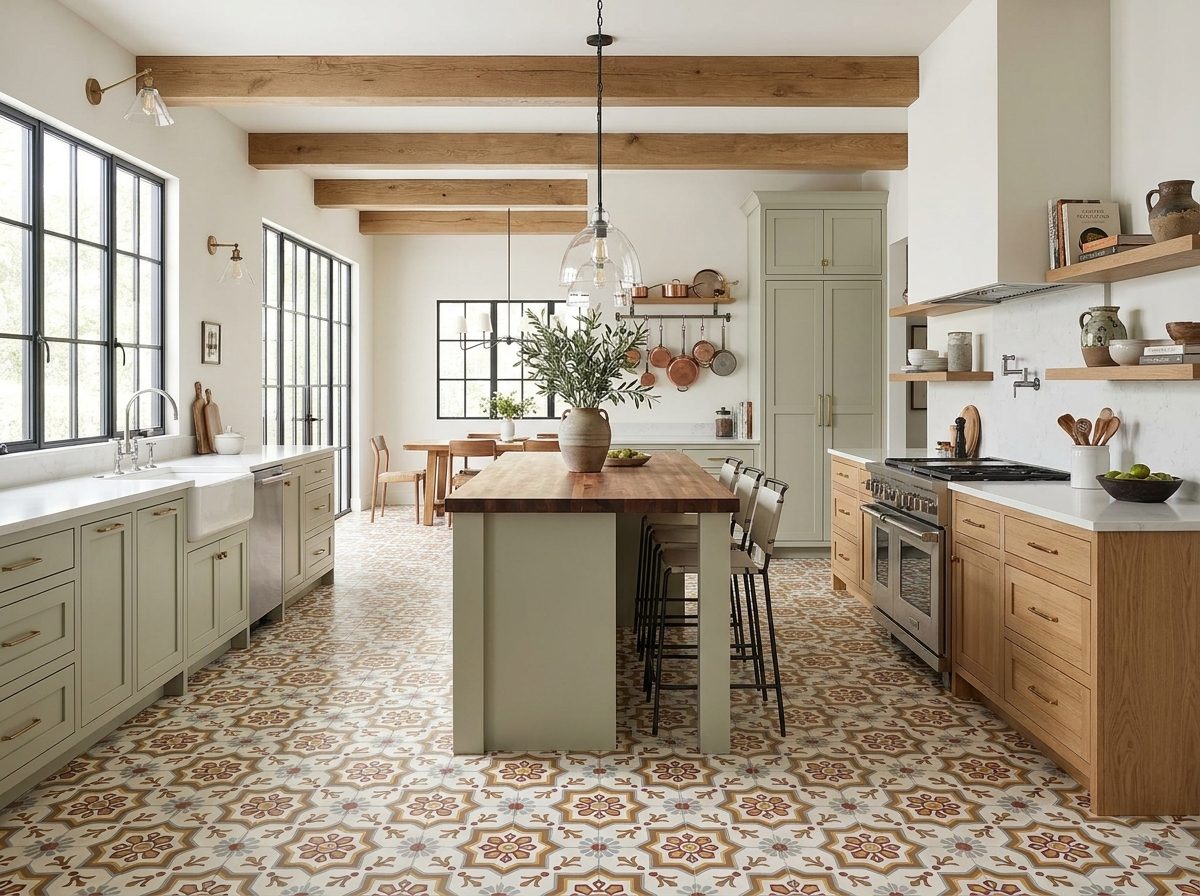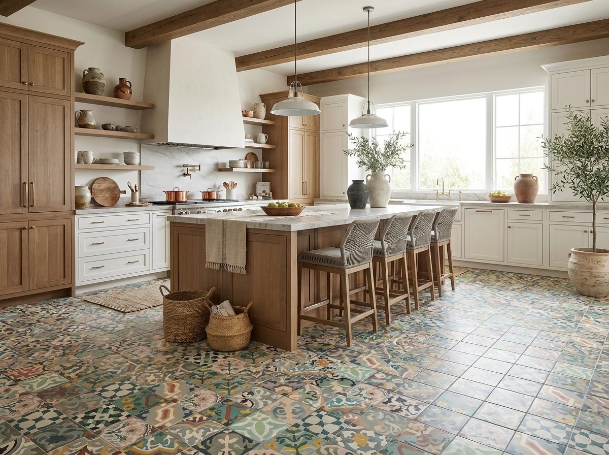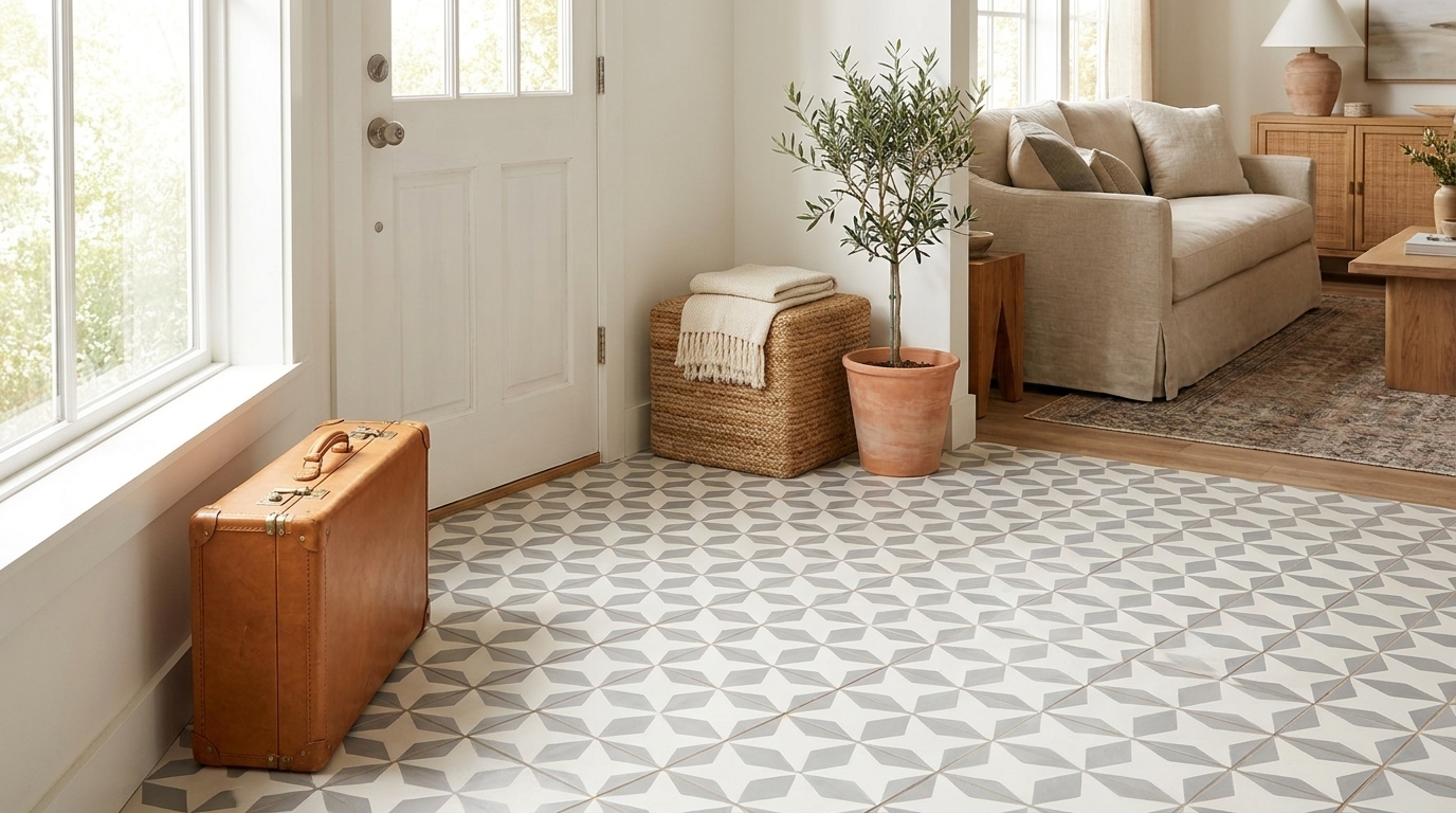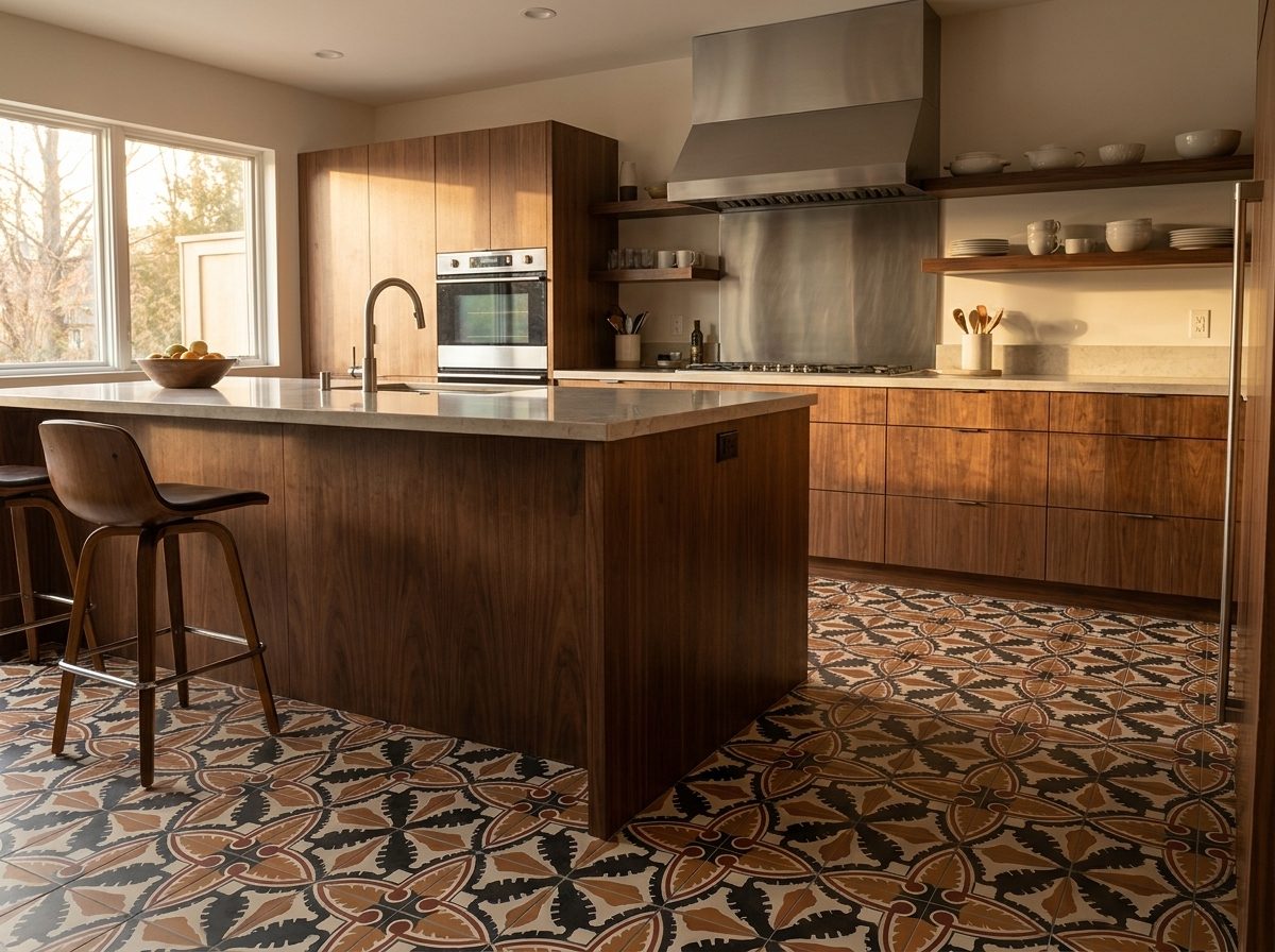
Here’s the fear behind every tile decision: you’re not choosing for this season — you’re choosing for the next twenty years. Paint can change in a weekend; tile is a commitment. So how to choose tile color becomes the highest-stakes question of the renovation, and “just pick what’s trending” is exactly the wrong answer. What you need is a framework — the same one our Design Studio walks clients through when they’re recoloring a pattern or building a palette from scratch.
Start With What Doesn’t Change
Trends rotate; three things in your space don’t:
- Your light. North-facing rooms cool every color down; south light warms everything. The same terracotta reads earthy in Texas sun and muddy in a dim hallway. Always test samples in the actual room, morning and evening.
- Your fixed materials. Wood floors, countertops, brick, cabinetry — the tile must befriend what’s staying, not fight it.
- Your architecture. A Spanish colonial asks for different colors than a minimalist new build. Tile that honors the architecture never looks dated, because it never looked borrowed.
The Three-Color Rule
Nearly every timeless cement tile palette resolves to three roles:
- The ground — a soft neutral doing 60–70% of the work: bone, cream, warm gray, soft white.
- The body — the color you’d call the design by: navy, forest, terracotta, black.
- The whisper — a small accent that makes the motif sing: aqua, mustard, blush, olive.
When a palette dates itself, it’s almost always because the whisper was promoted to ground. Bold everywhere ages fast; bold in proportion ages gracefully.

Palettes With a Century of Proof
- Black + white (+ one accent): the bistro classic — it survived Art Deco, midcentury, and every decade since.
- Blue + white: Mediterranean DNA; from powder blue to cobalt, it simply doesn’t expire.
- Terracotta + cream: the warmth of Mexican and Spanish tradition, very much at home in today’s interiors.
- Charcoal + bone: the softer black-and-white — modern now, legible forever.
- Green + cream: from sage to forest, the palette that ties interiors to gardens and never feels synthetic.

Where to Spend Your Boldness
- Small spaces, big color: powder rooms, entries, and stair risers are where maximal palettes shine — small commitment, huge personality.
- Large floors, grounded palettes: across a whole kitchen or open plan, let the ground color lead and the pattern breathe.
- Vertical moments: a backsplash or fireplace surround can carry a braver palette than the floor beneath it.
- When in doubt, darken the grout, not the tile — contrast can come from the joints while the palette stays calm.
The Sample Ritual (Non-Negotiable)
- Order physical samples — screens lie about pigment.
- Look at them on-site: floor-level for floors, wall-height for walls.
- Check morning, afternoon, and lamplight.
- Place them against the fixed materials (counter, wood, cabinet door).
- Live with them for a week — the right palette gets better; the wrong one confesses fast.
And if the perfect color doesn’t exist in the catalog: it exists in our workshop. Every pattern we make can be recolored to your exact palette through the Design Studio.
Tile Color FAQ
What tile colors never go out of style?
Black-and-white, blue-and-white, terracotta-and-cream, charcoal-and-bone, and green-and-cream — palettes with decades (or centuries) of continuous use. The proportions matter as much as the colors.
Should floor tile be lighter or darker than walls?
There’s no law — but grounded rooms usually keep the strongest value on the floor and lighten upward. Small rooms gain from lighter floors; large rooms can anchor with dark ones.
How many colors should a tile pattern have?
Two to four reads timeless. Our three-color rule — ground, body, whisper — keeps even elaborate motifs in proportion.
Can I get a pattern in my own colors?
Yes — recoloring existing patterns is the most affordable form of custom tile. You approve a rendering (and physical samples for larger projects) before production.
The Takeaway
Colors don’t date floors — proportions do. Choose against your light and your fixed materials, keep the three roles in balance, spend boldness where the square footage is small, and trust palettes that have already survived a century of trend cycles. That’s how a tile choice becomes the thing everyone compliments in 2046.
Building a palette? Browse patterns and colorways, or talk to our Design Studio — samples, renderings, and honest color advice included.